
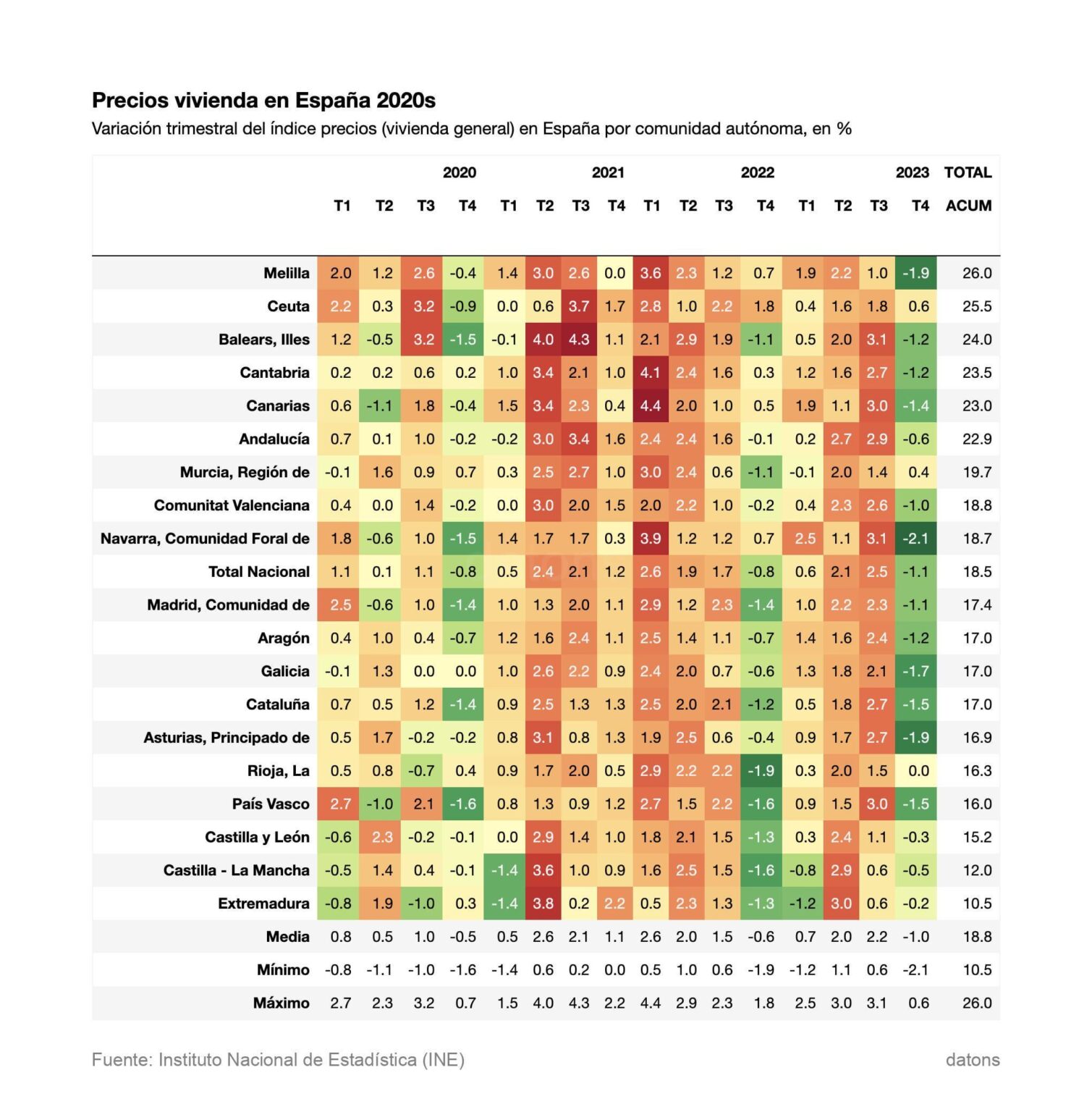
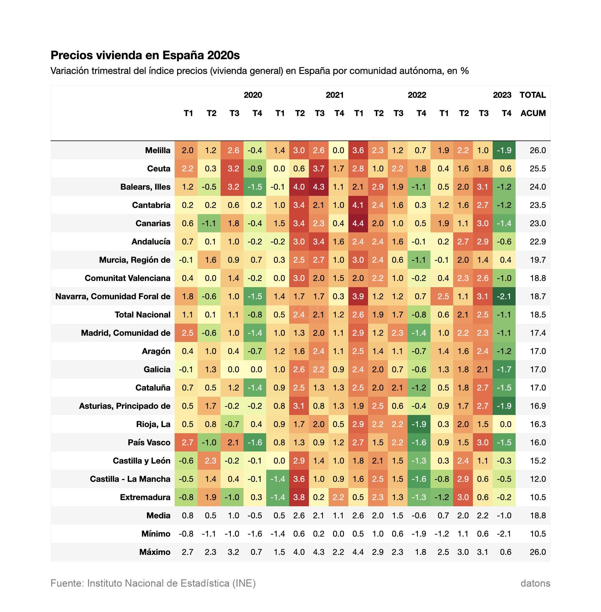
The data has been obtained from the National Institute of Statistics, with this indicator: https://www.ine.es/jaxiT3/Table.htm?t=25171&L=0 Green colors indicate falls in prices, while red colors indicate climbs. The darker it is, the greater the fall/rise. The table is sorted by running total (last column).
https://i.redd.it/lrupoqlwdvsc1.jpeg
Posted by datonsx