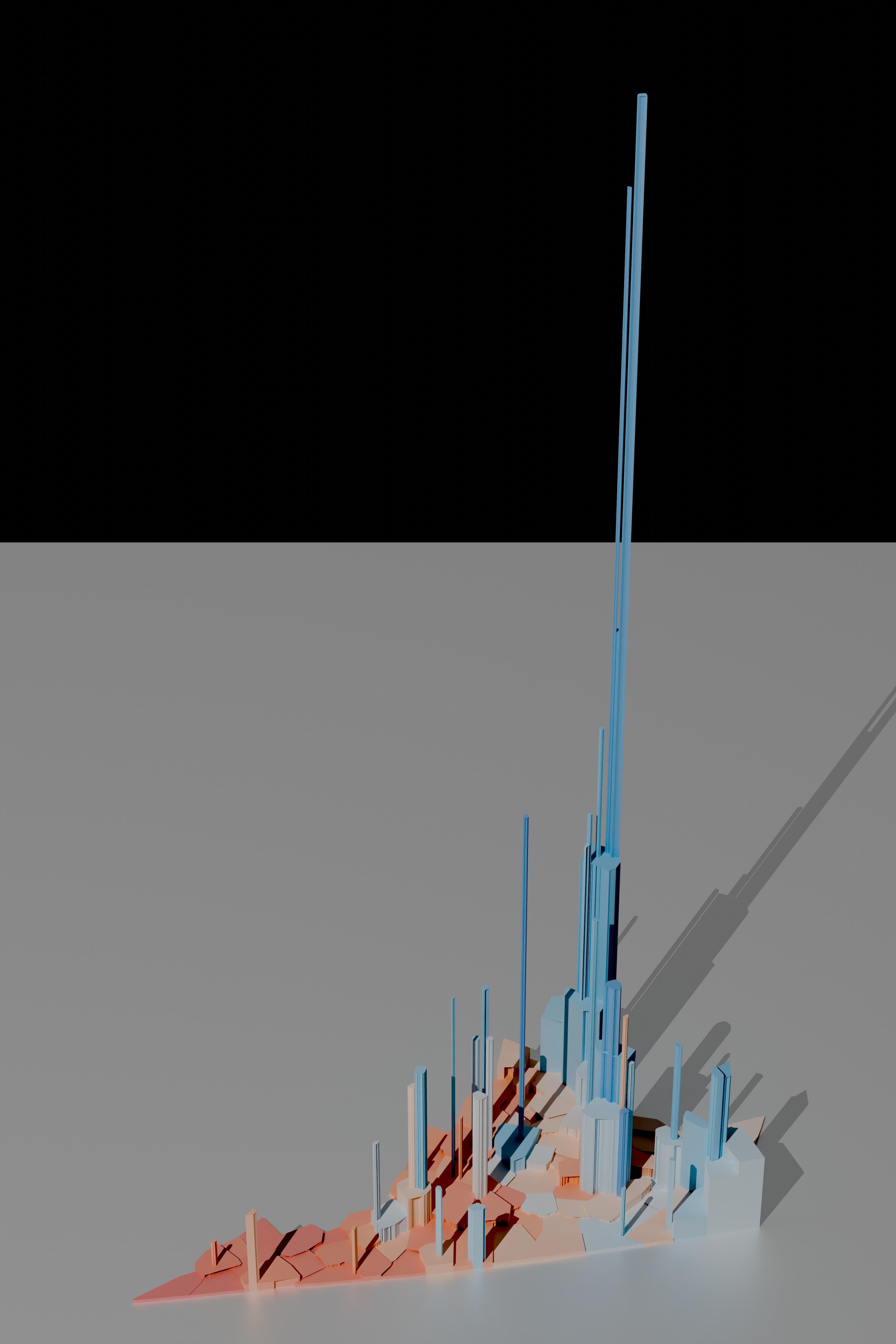
This is an attempt to correct several issues I’ve seen in election visualizations in American politics. By using volumetric representations of vote totals I maintain fidelity of both shape and position for each Virginia locality (Virginia cities are politically independent). Each locality is shaded to represent the margin of victory with a white mid-point; this prevents the eye’s bias towards red from taking over the map.
Rendering is in Blender. Anyone who wants to provide me with a materials and lighting tutorial suitable for a backend software engineer would be greatly appreciated.
cantonlautaro on
Soooo much red on the map…..some would say.
boofoodoo on
Pictured: why Republicans hate cities
KnotSupposed2BeHere on
The very tallest tower: is that Alexandria, Arlington, or something else?
Blrfl on
Nice work.
A similarly-interesting companion map would be one that shows tax dollars contributed to state coffers by each county and city. No idea where to get that data set, though.
drinkduffdry on
Can we(you) do this for the national maps?
notwalkinghere on
Rather than using shading to represent margin of victory, the height/volume should be absolute margin of victory (net vote count). That would provide an at-a-glance illustration of how the total count stacks up and where is contributing in each direction.
nabuhabu on
This is great. It conveys what you intend: volume of votes per county and affiliation of the voters. Much better than a flat map. There may be ways to tweak it but I don’t know that the small adjustments suggested would materially improve the basic read here. Ty OP.
phasmantistes on
Of course, because this image isn’t *actually* 3D, we’re still subject to the difficulties of projection. The color painted on the surface of each prism of course scales with the surface area of that prism, not its volume. You’d hope our brains could correct for that, but I’m not sure they can: the pillar above Charlottesville is very tall, but we can only see approximately half of its surface area; meanwhile we can see 90+% of the surface area of the low-lying prisms in the west. So this map *still* looks more red than it really should.
bb_218 on
I know there are critiques, but after reading a bit of description, I really like your visualization method here.
a-potato-named-rin on
What’s the tallest point? I can tell it’s NOVA but which area or city?
chefianf on
God bless those Eastern Shore folks… They get less respect then the MD Eastern shore do… At least we get added to a map of our state..
wheatley227 on
I think the combination of volume and shade is unreadable. I can’t tell what the different shades actually mean. This makes it look like the democratic candidate won by 60-70% when they actually won by about 10% I believe.
gimmickypuppet on
Not beautiful. This is just a population map that has no legend and does not clearly convey whatever it wants to convey. That there’s a lot of people outside DC? That there aren’t a lot of people in the red? If I need a multi-paragraph explanation = it’s not r/dataisbeautiful
Spongman on
cool. why does it look like there are overhangs? might be nice to add a boarder around each boundary.
VestOfHolding on
It’s interesting, but not really much of a full visualization. It’s fairly undecorated 3D render with a partial gray plane and zero other context. No title, no legend, or any other information. The idea is there, but the follow through to make it a full visualization needs work. Decent start though.

![[OC] Volumetric visualization of the Virginia 2025 Governor's race (Blender + Python)](https://www.byteseu.com/wp-content/uploads/2025/11/s1fxukbn911g1-1024x1536.jpeg "[OC] Volumetric visualization of the Virginia 2025 Governor’s race (Blender + Python)")
16 Comments
This is an attempt to correct several issues I’ve seen in election visualizations in American politics. By using volumetric representations of vote totals I maintain fidelity of both shape and position for each Virginia locality (Virginia cities are politically independent). Each locality is shaded to represent the margin of victory with a white mid-point; this prevents the eye’s bias towards red from taking over the map.
Rendering is in Blender. Anyone who wants to provide me with a materials and lighting tutorial suitable for a backend software engineer would be greatly appreciated.
Soooo much red on the map…..some would say.
Pictured: why Republicans hate cities
The very tallest tower: is that Alexandria, Arlington, or something else?
Nice work.
A similarly-interesting companion map would be one that shows tax dollars contributed to state coffers by each county and city. No idea where to get that data set, though.
Can we(you) do this for the national maps?
Rather than using shading to represent margin of victory, the height/volume should be absolute margin of victory (net vote count). That would provide an at-a-glance illustration of how the total count stacks up and where is contributing in each direction.
This is great. It conveys what you intend: volume of votes per county and affiliation of the voters. Much better than a flat map. There may be ways to tweak it but I don’t know that the small adjustments suggested would materially improve the basic read here. Ty OP.
Of course, because this image isn’t *actually* 3D, we’re still subject to the difficulties of projection. The color painted on the surface of each prism of course scales with the surface area of that prism, not its volume. You’d hope our brains could correct for that, but I’m not sure they can: the pillar above Charlottesville is very tall, but we can only see approximately half of its surface area; meanwhile we can see 90+% of the surface area of the low-lying prisms in the west. So this map *still* looks more red than it really should.
I know there are critiques, but after reading a bit of description, I really like your visualization method here.
What’s the tallest point? I can tell it’s NOVA but which area or city?
God bless those Eastern Shore folks… They get less respect then the MD Eastern shore do… At least we get added to a map of our state..
I think the combination of volume and shade is unreadable. I can’t tell what the different shades actually mean. This makes it look like the democratic candidate won by 60-70% when they actually won by about 10% I believe.
Not beautiful. This is just a population map that has no legend and does not clearly convey whatever it wants to convey. That there’s a lot of people outside DC? That there aren’t a lot of people in the red? If I need a multi-paragraph explanation = it’s not r/dataisbeautiful
cool. why does it look like there are overhangs? might be nice to add a boarder around each boundary.
It’s interesting, but not really much of a full visualization. It’s fairly undecorated 3D render with a partial gray plane and zero other context. No title, no legend, or any other information. The idea is there, but the follow through to make it a full visualization needs work. Decent start though.