
![S&P 500 P/E Ratio: Today’s AI Boom vs. the Dot-Com Bubble [oc]](https://www.byteseu.com/wp-content/uploads/2025/11/jpkof7mlla1g1-1536x768.png "S&P 500 P/E Ratio: Today’s AI Boom vs. the Dot-Com Bubble [oc]")
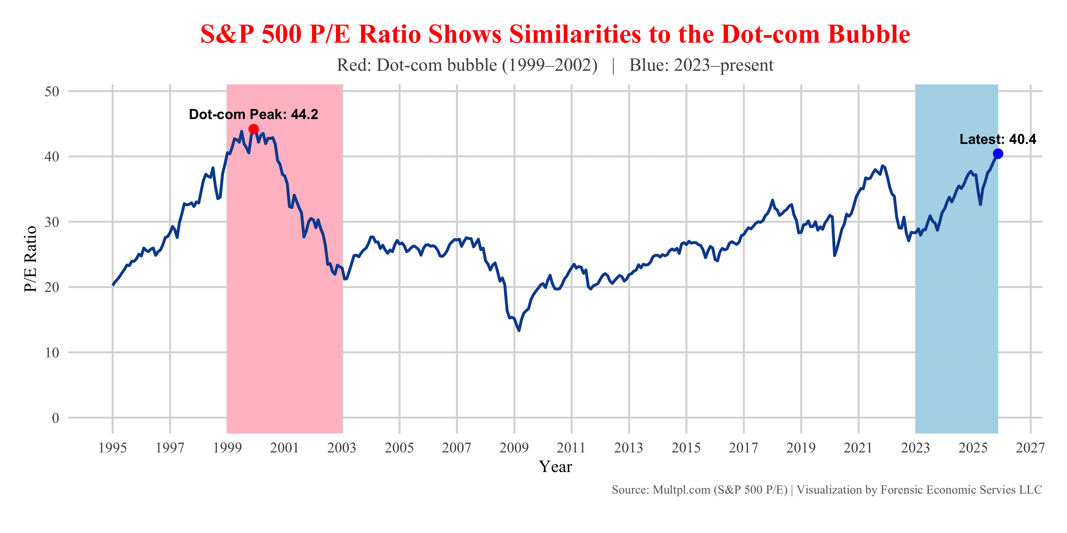
using GGPLOT2 in R and data from Yahoo Finance, this chart compares the S&P 500’s price-to-earnings ratio from 1995 to today. What stands out is how closely the current AI-driven run-up resembles the late-1990s tech boom.
- The dot-com peak hit 44.2 right before the crash.
- Today, the P/E is back above 40, one of the highest readings in modern history.
Posted by forensiceconomics
13 Comments
What does this mean for my INTC holdings?
Good chart, but I’ll point out that the 90s tech boom burst because many of the companies that carried inflated P/Es were vaporware. Perhaps one of the most famous examples was Pets.com. It had a revenue of $619,000 and a market capitalization of $290M. Now, I’m not saying some of the valuations aren’t obscene (like NVIDIA’s $4.5T market cap), but they had 55% sales growth Q/Q while generating $165B in sales with a forward P/E of 28. Similarly, Meta’s forward P/E is 20.49. These aren’t shrinking/stagnant companies.
What does this mean for my $DEEZ holdings?
It’s honestly kind of crazy to me that we haven’t surpassed it yet. I was too young to be aware of that sort of thing at the time, but man, that Dot-Com Bubble really was huge!
Hmmm… what data did you use exactly? I thought we were closer to 30 currently. Getting there, but not there yet…
[https://www.macrotrends.net/2577/sp-500-pe-ratio-price-to-earnings-chart](https://www.macrotrends.net/2577/sp-500-pe-ratio-price-to-earnings-chart)
Only if you choose the Cape ratio and not a rational measurement. But then again it seems the goal is to engineer a crash because popular opinion feels one is needed.
Interest rates were higher, tax rates were higher and buybacks were lower. Worrisome correlation and history tends to rhyme but times are different too.
I’m fairly certain it’s closer to 30, not 40.
There is so much more capital in the market from abroad though. Having stocks back then, especially as a foreigner, was so complicated. Now everyone has an app and there’s money flowing into the US500 from all across the world.
This data is just plain wrong.
The most expensive measure of sp500 valuations is ~30x trailing 12 month earnings.
We are NO WHERE near the 40+ of the 90s tech bubble.
100 redditors vs using their criticial thinking skills
Data is line on white background with blue and red rectangles
C’mon, Jerome. I just need another 10% to meet my number and then I’m out. <scratching neck>