

I was at an Outcome Research Conference today and one of the presenters was speaking about data visualization, which lead to a discussion about Florence Nightingale, the first woman elected to the Royal Statistical Society in 1858.
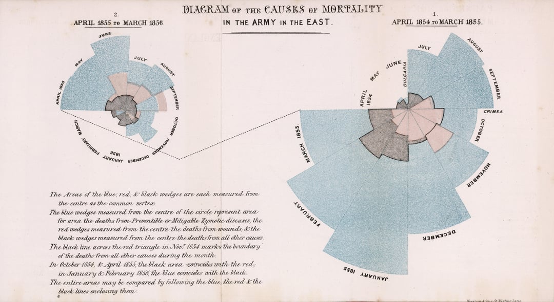
The above diagram was designed by Nightengale to illustrate that the high mortality rates of soliders on the battlefield of the Crimean War was largely due to infection and disease, which helped advocate for hospital sanitation reforms. Image source: https://commons.wikimedia.org/wiki/File:Nightingale-mortality.jpg
Also, I may have discovered my new favorite quote:
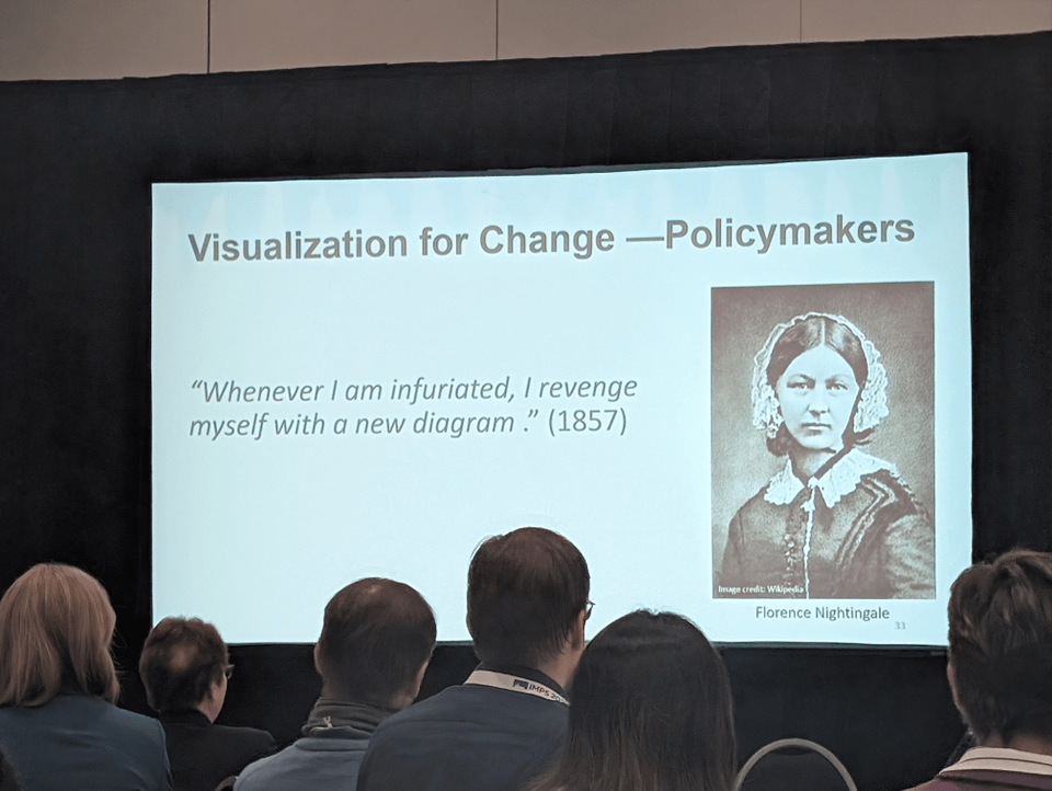
"Whenever I am infuriated, I revenge myself with a new diagram". – Florence Nightingale
Posted by ABFan86
8 Comments
I have mad respect for anyone who made nice graphs before computers even existed
Better quality than most things I try to do with tableau…
I never would have guessed. Everything I’ve picked up about her through pop history has been “Lady with a Lamp” mythos. She’s been shortchanged by our cultural memory ignoring the hard scientific work she did.
[Here’s a link with more information on her and Harriet Martineau.](https://www.sciencemuseum.org.uk/objects-and-stories/florence-nightingale-pioneer-statistician)
[W.E.B Dubois was noted for his data visualization too](https://www.smithsonianmag.com/history/first-time-together-and-color-book-displays-web-du-bois-visionary-infographics-180970826/) (a generation or two later).
This is the first I’ve heard about Nightengale’s talents in this respect. Thanks for sharing!
I’m a massive geek for data viz, and last year for something at school our kid dressed up as Florence nightingale – full nurse costume, a lamp and everything – and I drew a copy of that radar graph for them to take too to show everyone what else she did!
Something tells me Ms. Nightingale was a *very* intelligent woman.
Mad respect to her work in DataViz (even though as a Certified Pie Chart Hater I cannot condone her work in that respect (this is a joke, y’all nerds)).
Holy shit an actual r/dataisinteresting post that actually demonstrates some actual interesting beautiful data. Feels like it’s been a while