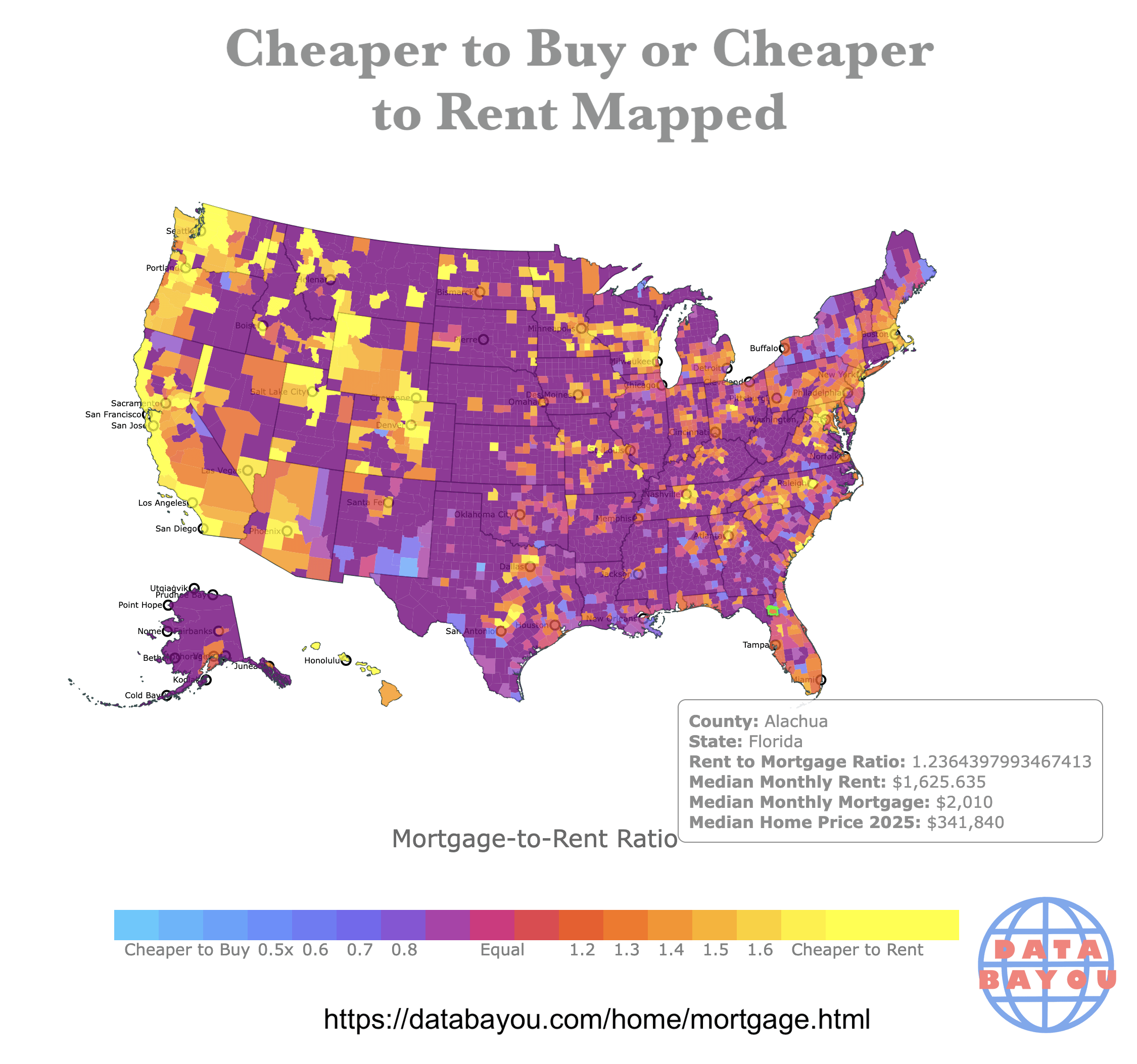
Map of mortgage-to-Rent Ratio in every U.S. County. The interactive map also has the median monthly mortgage and rent value. Made with D3.js. Data from Zillow and NAR. Link here https://databayou.com/home/mortgage.html
Posted by No_Statement_3317

![[OC] Cheaper to Buy or Rent?](https://www.byteseu.com/wp-content/uploads/2025/11/9cy67lum303g1-1536x1438.png "[OC] Cheaper to Buy or Rent?")
Map of mortgage-to-Rent Ratio in every U.S. County. The interactive map also has the median monthly mortgage and rent value. Made with D3.js. Data from Zillow and NAR. Link here https://databayou.com/home/mortgage.html
Posted by No_Statement_3317
18 Comments
I didn’t see anything that mentioned this, but for the aspect of ownership on this does it account for taxes and insurance?
If this is just the nominal monthly rent versus nominal monthly mortgage payment, then it does tell you what is more affordable, but not whether it is “worth” renting or buying as rent includes maintenance and sometimes utilities, and the mortgage payment includes principal.
Does this take into account that after 30 years you own the place, and can sell it? Or is it just comparing to a monthly payment?
Ownership is important for many, as it can be used as an investment for your retirement.
Looks like cities are being bought up. Either by outside investors or people worried they are going to be priced out.
Whoever put this page together could so easily create a vlookup equivalent interface for users to pick any city they want to look at from his database…and see the actual numbers. They have the data and give us the map and high level conclusions and the links to the raw data but the compiled data could be made accessible in more useful ways so easily.
Interesting. From a comparison standpoint, I might be more interested if the metric were $/SF to rent or own. Based on this map, where I live, it would seem renting is cheaper. But that logically makes sense, since most apartments around here are maybe 1000 square feet but houses are 1500-2500.
Nice map, but Washoe County is a good example of how it is limited. Reno may be a location where renting is much much cheaper than buying (yellow), but that city is just a pin-prick at the southern end of a large county that stretches up to the Oregon border. For the whole county to be shown yellow is misleading due to the limited granularity from using counties.
I’m shown in a cheaper to rent area, however over last 5-8 years rent in the area has increased 50% but mortgage is about the same.
This is actually what you would expect, whee the median is equality, more or less.
If it was cheaper to buy landlords and renters would come into market and drive up prices and/or drop. The only places where it’s far cheaper to rent are the bigger urban areas.
And for those wondering this type of comparison is normally done assuming all in costs and equity and price and rent increases.
As a former landlord that had 10 places I can say markets are elastic. I had several places in a college town that overbuilt and prices on rents cam down and the sales prices followed about 12 months later.
Here comes the rent defense force, to defend all of the unaffordable areas.
Are tax deductions, real estate taxes, RE appreciation/depreciation as expected, personal property insurance for apartments and other RE fees included in the computation? How about the size? Does it compare a 4 bedroom hose with a 4 bedroom apartment in same/similar neighborhood?
The chart looks kind of meaningless to me.
great work! an idea i always had in such cases was to color areas where mortgage/rent = 1 as green. this way you can contrast it better?
Does this included taxes and insurance in the mortgage payment?
In many states that will make a huge difference in actual mortgage price. In Texas my taxes and insurance combined are $1,000 a month.
A lot of times you see mortgages discussed it’s always just P&I not escrow included
Yaaaaawn* nope.
People who take this kind of advice just like to be lied too.
This, I’m sorry to say, is mostly useless.
All of the purple is NaN/no data. Kinda worthless.
From the description, it appears to ignore the beneficial effect of the mortgage interest being tax deductible. I would GUESS that this reduces the overall average effective mortgage payment by around 10%, but maybe others have better insight.
WTF is this shit with your decimal places and dollar signs?
Your ‘Rent to Mortgage Ratio’ goes out to 15 sig figures…that’s just lazy copy/paste.
Your Median Monthly Rent has 3 decimal places when it’s a CURRENCY. You’re telling us tenths of a penny?
Meanwhile, Median Monthly Mortgage and Median Home Price are both rounded to the dollar.
…this is so inconsistent I question whether this was made by a human. It’s shamefully sloppy.
Of course median house payment will be higher. Who’s rental unit is worth $340k???
Deciding which would be cheaper would need to be comparing like units, not the average rental to the average home since the home prices will be a higher range.