
![[OC] I pulled anonymized usage data from a gentle alarm clock iOS app and mapped where people are using it across the US](https://www.byteseu.com/wp-content/uploads/2025/11/flta919odk3g1-1024x597.png "[OC] I pulled anonymized usage data from a gentle alarm clock iOS app and mapped where people are using it across the US")
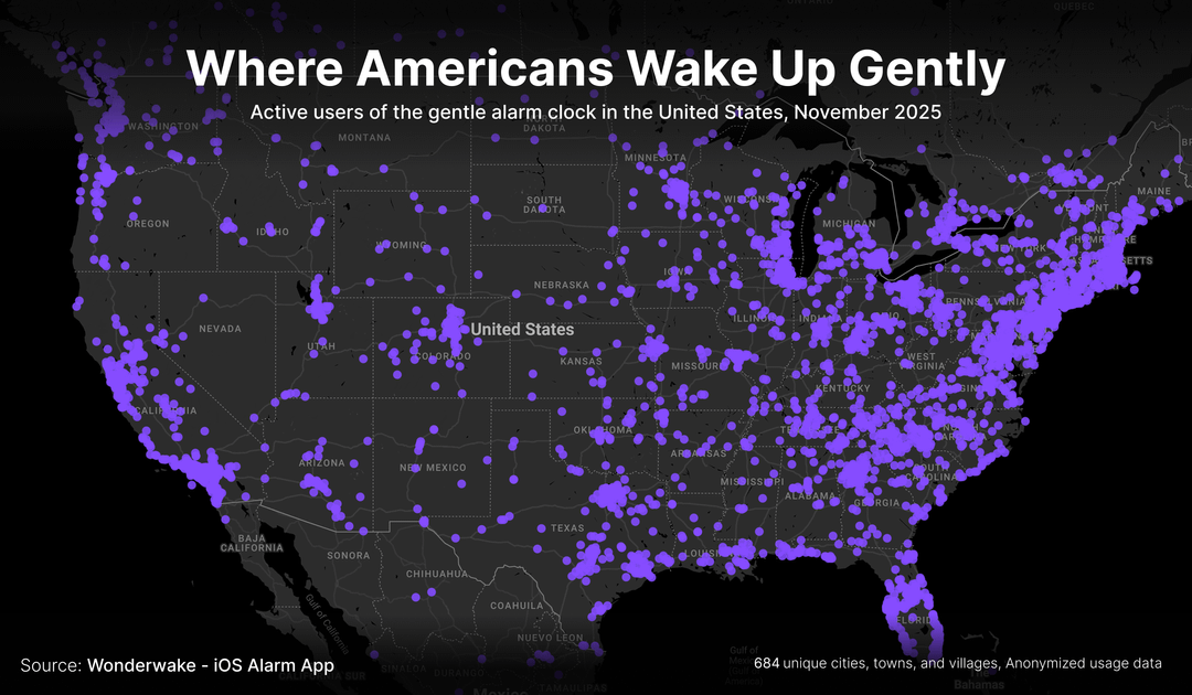
Each purple dot is a city, town, or village where at least one person used the app in November 2025. I thought the patterns were interesting enough to share here:
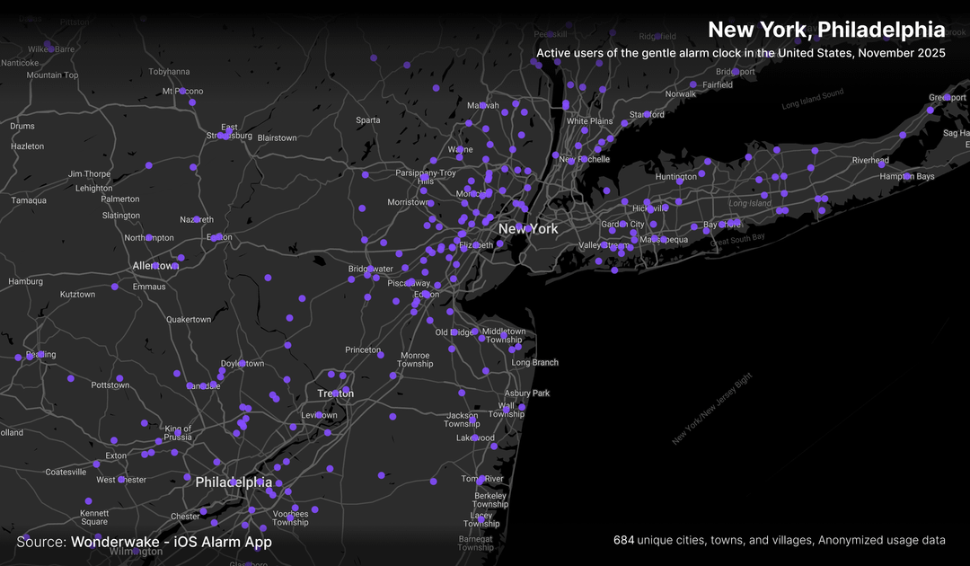
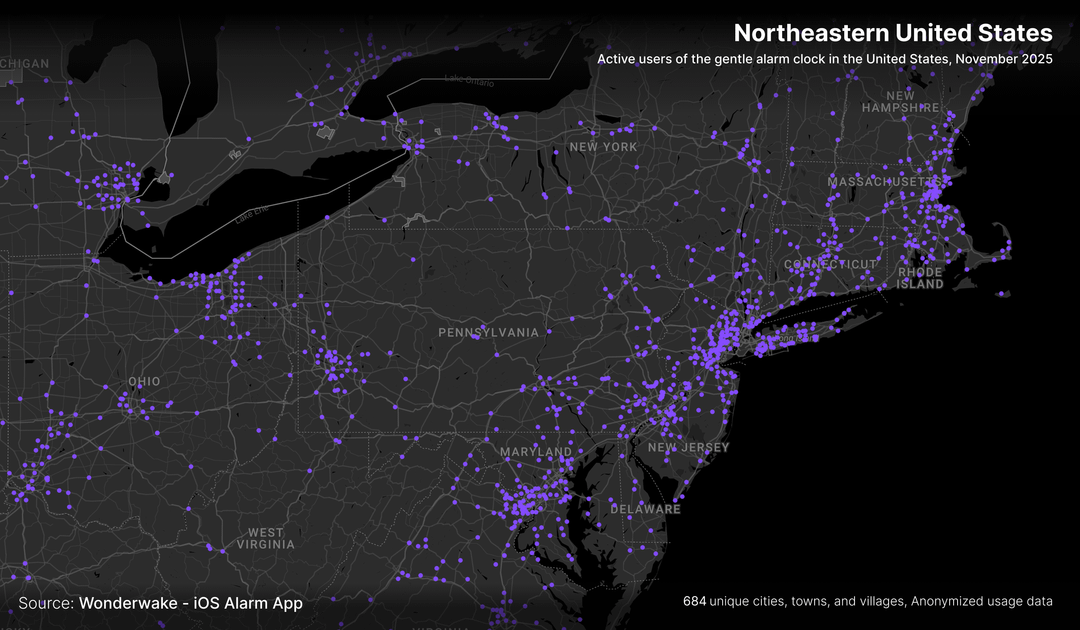
\- The East Coast really lights up, especially the Northeast corridor (Boston → NYC → Philly → D.C.).
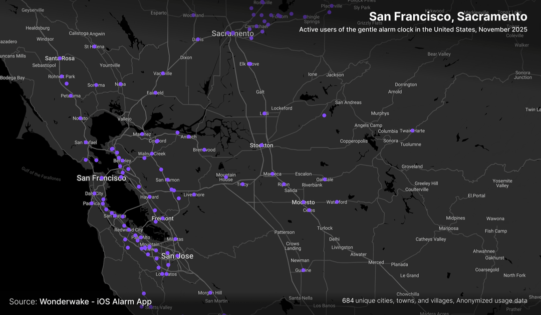
\- California has several dense clusters, with the Bay Area and LA as the brightest spots.
\- There’s a surprising amount of usage in rural areas, especially across the Midwest and the South, though it’s much more spread out there.
\- In the Mountain West and desert Southwest, most of the map is dark, but places like the Denver area, Salt Lake City, and Albuquerque show sparse yet distinct clusters.
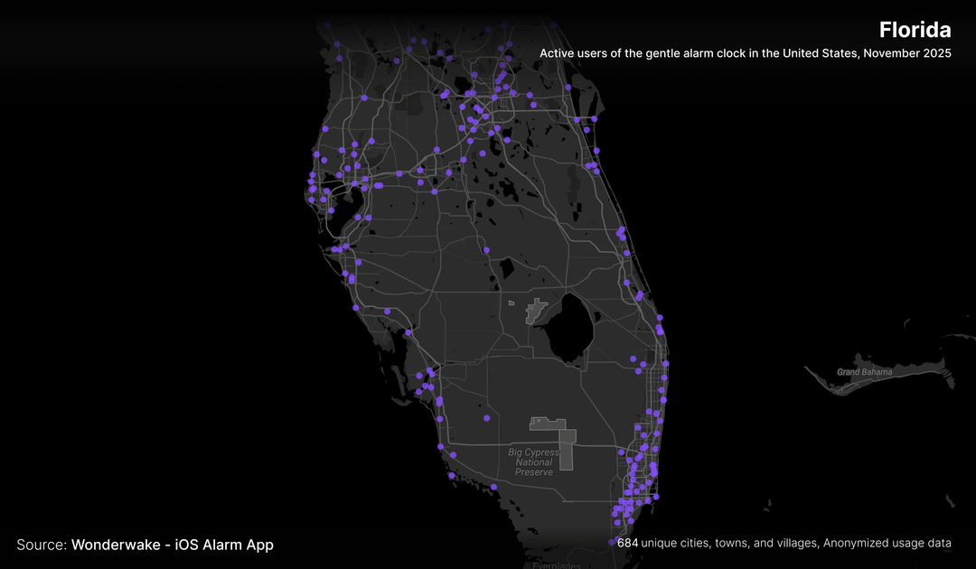
\- Florida is bright along both coasts, especially around Miami and the Tampa Bay area.
And yes, at a high level this does look a lot like a standard US population density map, which totally makes sense. Still, it’s fun to see that familiar pattern emerge specifically from where people live and wake up using a gentle alarm instead of the default one.
Source: [Wonderwake: Gentle Alarm Clock](https://apps.apple.com/app/apple-store/id6475820849?pt=118982322&ct=cmp1&mt=8)
Posted by BlueHawtDog
8 Comments
this is just an ad for your app
does this actually show where people wake up gently, or just where people own iPhones and bother installing niche alarm apps? Like, if we overlay this with income data / urban density, I bet the correlation would be wild
What do you mean you “pulled” data from the app? Did you hack the app and stole user information, or does this app somehow exposes user data?
This is just a population map.
This is not interesting at all. Its mostly a population map and an ad for your app.
[ Removed by Reddit ]
Would be interesting to see Europe 🙂
If you go to bed early enough, you don’t need an alarm.
Is it just me, or does the map look a lot like the map of population?