
![U.S. GDP vs Energy Use vs CO₂ Emissions per Capita (1990–2024) [OC]](https://www.byteseu.com/wp-content/uploads/2025/11/hj7h6dpt934g1-1536x864.png "U.S. GDP vs Energy Use vs CO₂ Emissions per Capita (1990–2024) [OC]")
Data Source: Our World in Data (https://ourworldindata.org/grapher/energy-use-per-capita, https://ourworldindata.org/grapher/co2-emissions-per-capita, [https://ourworldindata.org/grapher/gdp-pc-ppp]()) | Tools: R, tidyverse, ggplot2 [OC]
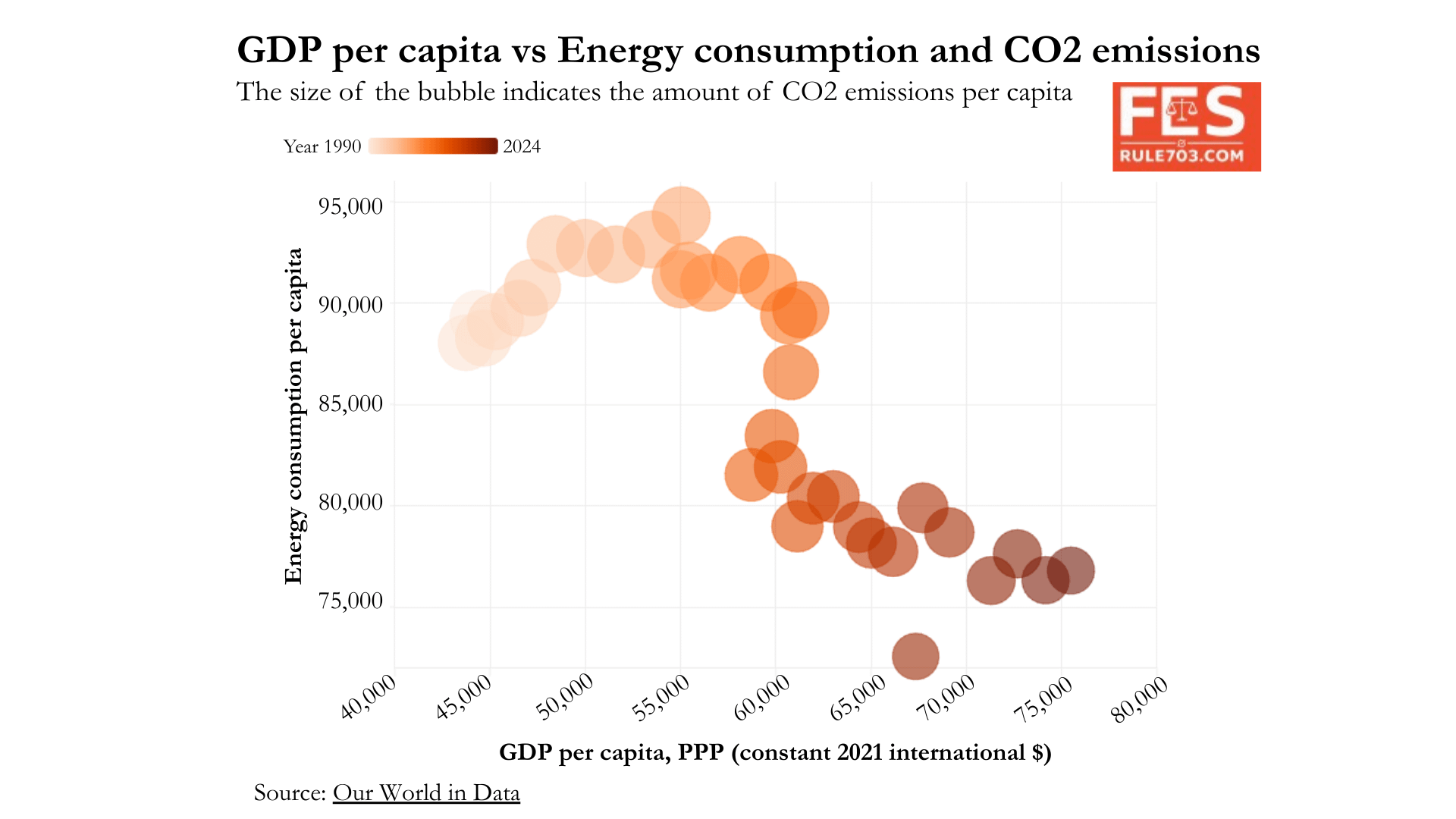
This bubble chart compares GDP per capita, energy consumption per capita, and CO₂ emissions per capita for the United States from 1990 to 2024.
- The horizontal axis shows GDP per capita (PPP).
- The vertical axis shows energy consumption per capita.
- The bubble size represents CO₂ emissions per capita.
- The color gradient runs from 1990 (lighter) to 2024 (darker).
A few patterns stand out:
- GDP per capita rises steadily over the 34-year period.
- Energy consumption per capita increases until the mid-2000s but then declines.
- CO₂ emissions per capita shrink significantly despite economic growth, partly due to cleaner energy mix, improved efficiency, and changes in industrial composition.
- The result is a decoupling: higher GDP with lower emissions and lower per-capita energy use.
Visualization created in R using ggplot2 with data pulled from the Our World in Data API.
Posted by forensiceconomics
18 Comments
aaand every bubble is the same size
[deleted]
An interesting visualisation, but it is generally rather difficult to correctly judge the relative surface areas of circles intuitively.
The GDP vs energy comparison isn’t a good way to argue we’re producing more with less energy because GDP measures money, not the physical work the economy actually performs. GDP itself is a poor indicator of production because it captures monetary valuation rather than the real material output of society. Price changes are usually the main factor in increased GDP without reducing the economy’s underlying dependence on energy, so the metric gives a misleading impression of “decoupling.”
Source: The Physics of Capitalism by Erald Kolasi
Who ever would think that when you print money consistently for 35 years that on a graph GDP goes up consistently
Don’t worry. You’ll see a jump soon.
This is fundamentally broken if it doesn’t count external CO2.
Move a cement plant overseas and you may have made the problem worse, but the CO2 per capita appears to improve.
not having a 0 axis makes the reduction look way better than it is.
this is broken. There’s a mistake in here. The title says the bubble size corresponds to CO2 emissions per capita but A) there’s no scale and B) all the bubbles are the same size. I think somebody just forgot to plug the variable into ggplot2
This is a hard to interpret graph. The bubbles all look the same size and don’t have an ability to actually see what those sizes are supposed to represent.
The year is the color. That is the worst. Draw a line and label key years. Others are pointing out the bubble size issue. Do you think this visualization says anything correct or useful?
I like the visualization aesthetically, but I feel like the information would be more easily accessible if you just plotted indexed lines over time for GDP p.c., energy consumption, and CO2 emissions.
Moreover, I agree with others here saying that these findings need to be interpreted with caution.
Multiple comments are complaining about how all the bubbles are the same size when they’re not, but I juts don’t really see the need for them to be bubbles when the y axis is conveying the same information, no?
This is one of the strangest data visualizations I’ve ever seen.
I don’t think I’ve ever seen a color gradient used to represent years…and I am genuinely unable to interpret this.
It should have been separate lines for year vs. emissions and year vs GDP, something like that
Think that only happens when manufacturing is outsourced. . .
*The tail of hell takes crawl…*
The graphic itself doesn’t apparently say US(A) anywhere.
The axes are backwards compared to the title. Graph titles should always be Y-axis vs. X-axis