Data tools used: www.plotset.com
Original source https://www.nationwide.co.uk/media/hpi/
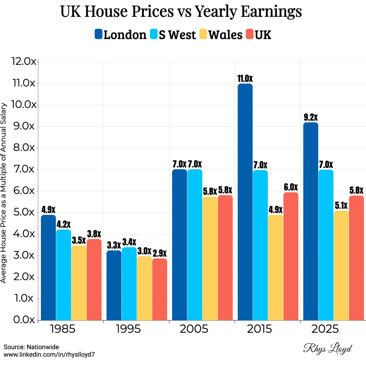
Description: Average UK house price to annual earnings
Posted by rhyslloyd7

![[OC] UK House Prices vs Yearly Earnings](https://www.byteseu.com/wp-content/uploads/2025/12/34nrj3d76s4g1-1024x1024.png "[OC] UK House Prices vs Yearly Earnings")
Data tools used: www.plotset.com
Original source https://www.nationwide.co.uk/media/hpi/
Description: Average UK house price to annual earnings
Posted by rhyslloyd7
6 Comments
Nice graph, even though the data is not beautiful.
Why did you decide for a bar graph and not a line graph?
I’ll be honest, I expected more of an upward trend than that
Calling Wales regional is bold
I’d like to know which average is being used… median would be best..
At this rate people will stay with their partents into their mid 40s
The problem is, those ratios never take into account interest rates. That is the REAL issue with affordability. A ratio of 5x can be way more affordable than 4x if interest rates are lower.