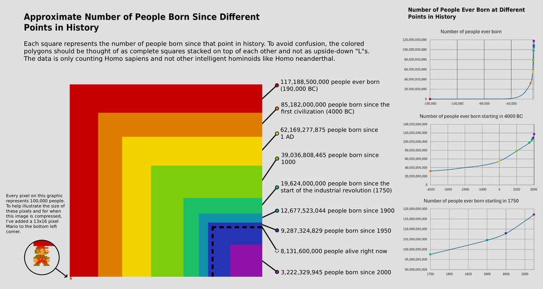
Sources are the PBR article “How Many People Have Ever Lived on Earth?” and the United Nations report “World Fertility 2024.” The graphic was made mostly in Photopea, and line graphs were made in Excel.
DataSittingAlone on
Here’s a link to a HD version if your interested ([https://imgur.com/a/K5RcKuy](https://imgur.com/a/K5RcKuy))
OtisDriftwood1978 on
Almost every person that’s ever lived is dead so in a sense it’s more natural to be dead than alive. I just hope there’s a benevolent afterlife to make up for the fact that very few people have had truly good lives.
Stummi on
so, 7.8 percent of all people ever born are alive today? A pretty interesting funfact IMHO
Nikkian42 on
How are we defining people, going back to 190000BC
Embarrassed_Jerk on
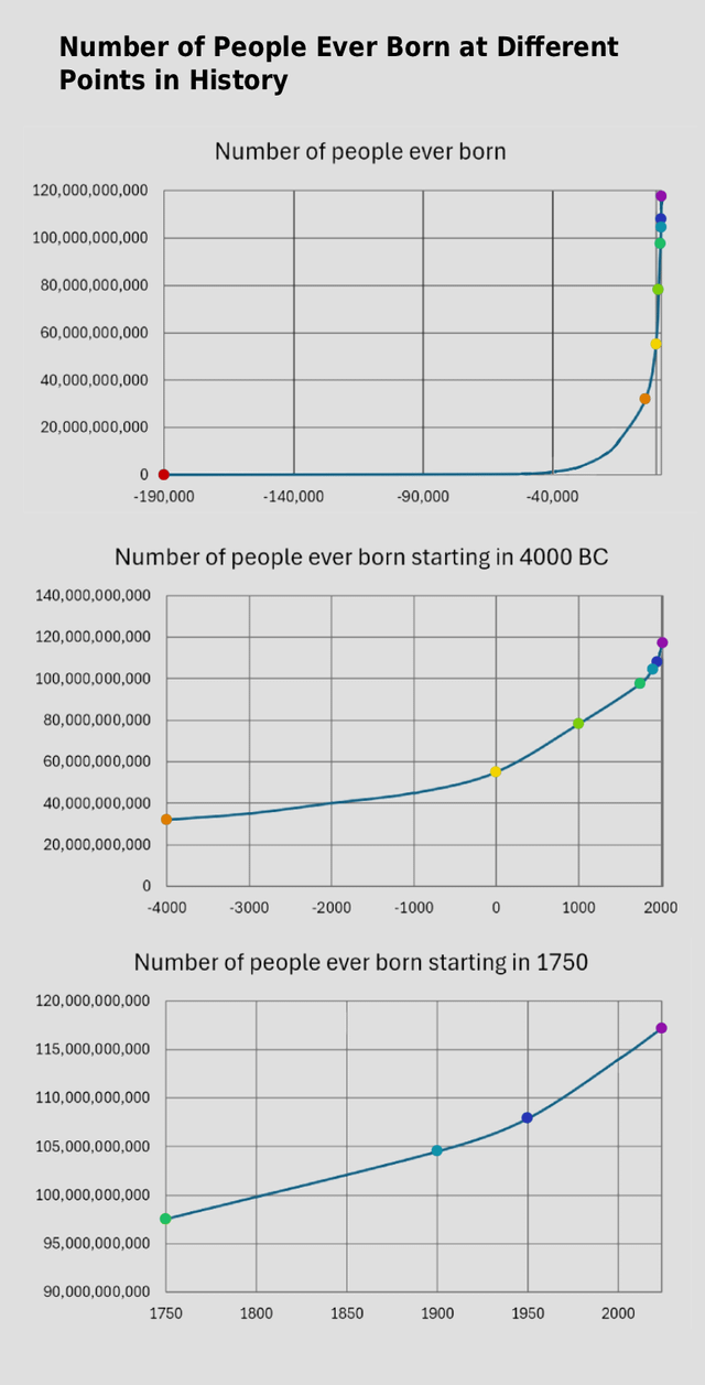
The time scale on the first graph needs to be linear to be more intuitive
Gedankensortieren on
I would replace one of the graphs on the right side with a logarithmic scale or even double logarithmic scale.
GOST_5284-84 on
i think this representation is really cool, and I don’t think anything is wrong with the timescale, but it does make it hard to appreciate how spread out over time the other sections really are
crelt7 on
Remember 23% of those who could have lived were aborted — you’re seeing the surviving 77%
jamexfot on
People born in the 2000 are about to be majority
Forgodddit on
omg, not related to the content, but I loved the Super Mario sprite for scale.
barclay_o on
I’m really confused why an infographic has a textual description of of how to interpret the visual; why not just draw it as a pyramid in orthographic perspective?
Nasyboy221 on
Unrelated but the graphic looks like the cover of the album Tasmania by Pond
InfidelZombie on
I don’t like the square visualization–it’s not intuitive to compare the areas of each of the colors. But otherwise, cool!
ajbiehl on
Opposite of beautiful. But the data is interesting.
February30th on
Half of them are in shoeboxes and coconuts
Gardener_Of_Eden on
Looks like a bubble. How to short this?
Weazelfish on
“Made that graph for you boss, real gay like you asked”
Interesting_Road_380 on
Nearly all of the people born since 1950 are still alive

![Approximate Number of People Born Since Different Points in History and People Ever Born at Different Points in History [OC]](https://www.byteseu.com/wp-content/uploads/2025/12/877wpcmp0g5g1-1024x545.png "Approximate Number of People Born Since Different Points in History and People Ever Born at Different Points in History [OC]")

20 Comments
Sources are the PBR article “How Many People Have Ever Lived on Earth?” and the United Nations report “World Fertility 2024.” The graphic was made mostly in Photopea, and line graphs were made in Excel.
Here’s a link to a HD version if your interested ([https://imgur.com/a/K5RcKuy](https://imgur.com/a/K5RcKuy))
Almost every person that’s ever lived is dead so in a sense it’s more natural to be dead than alive. I just hope there’s a benevolent afterlife to make up for the fact that very few people have had truly good lives.
so, 7.8 percent of all people ever born are alive today? A pretty interesting funfact IMHO
How are we defining people, going back to 190000BC
The time scale on the first graph needs to be linear to be more intuitive
I would replace one of the graphs on the right side with a logarithmic scale or even double logarithmic scale.
i think this representation is really cool, and I don’t think anything is wrong with the timescale, but it does make it hard to appreciate how spread out over time the other sections really are
Remember 23% of those who could have lived were aborted — you’re seeing the surviving 77%
People born in the 2000 are about to be majority
omg, not related to the content, but I loved the Super Mario sprite for scale.
I’m really confused why an infographic has a textual description of of how to interpret the visual; why not just draw it as a pyramid in orthographic perspective?
Unrelated but the graphic looks like the cover of the album Tasmania by Pond
I don’t like the square visualization–it’s not intuitive to compare the areas of each of the colors. But otherwise, cool!
Opposite of beautiful. But the data is interesting.
Half of them are in shoeboxes and coconuts
Looks like a bubble. How to short this?
“Made that graph for you boss, real gay like you asked”
Nearly all of the people born since 1950 are still alive
But why is the chart geh?
/s