
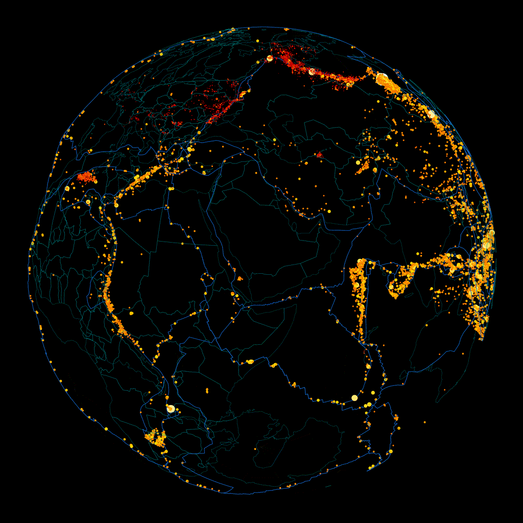
Interactive version: earthquakes.peterhunt.uk (works better on PC than mobile)
Source: earthquake.usgs.gov
I was inspired by a museum in Miyazaki – it had a glass cube showing the 3D origin of major earthquakes underneath Japan, and you could clearly see where the edges of the tectonic plates were. I'm not a web developer, so I built this using Gemini to do most of the hard work while I gave it artistic direction.
The earthquake magnitude affects the colour and size of each point, ranging from tiny and red to huge and white. The depth of each point is exaggerated by 2.5x so it's slightly easier to see from the global scale, and the blue lines on the globe are the tectonic plate boundaries.
Edit: I uploaded a 4K version of the above gif in both dark and light modes.
Posted by Peter3571
25 Comments
Man, the Pacific plate is ***HUGE***….
It’s almost unnerving.
Ring of fire indeed. Any reason why so many red ones in the center of the US?
Which way is it rotating tho
And Republicans deny Climate Chaos…
This is one of those images that could be circling either direction depending how you focus. Honeslty I watched it for 4 rotations and still can’t find the US. It’s too hard to see the landmass for visualization. I did find Africa and tried to extrapolate locations from there but honeslty this is very hard to visualize.
The cool thing about this gif is if you turn it upside down, the optical illusion makes it spin the other direction when you turn it again.
Very cool! Would love to see a transparent underlay that flashes in and out showing the land/water. Awesome visual as is
great work!. Loved the fact that it also includes the depth.
What about the software stack?
The Earth’s core is spinning backwards. I wonder if this is having an effect on amount and magnitude of earthquakes.
Main fun with these kind of illustrations: Make it rotate in both directions in your head.
This is awesome. So cool to be able to see these deep faults
The wrath of the fatterner personafied
Wow, some of those look nearly a thousand miles deep or so if the depth is to scale and not exaggerated for effect.
Love this! Very cool. Posts like this are what this sub was made for
This reminds me of Call of Duty BO2’s zombie menu screen
Why in the hell did you generate it rotating backwards/mirrored?
Weird that the god only creates earthquakes on fault lines…its almost like plate tectonic movement is the cause and not imaginary entitles.
This thing is AMAZING
It’s a bit difficult to tell if youre looking at the front or the back of the sphere as you move it…country lines might be recognizable but the other information confuses the senses a bit.
Just. Freaking. Incredible though.
Thanks for sharing your work!
What a terrible visualization.
How do you get a 4k version of the gif?
“I told you the earth isn’t round!” /s
This is crazy cool, I love it, well done!
It would be neat to have one on a government webpage that stays up to date and can be rotated in any direction at will and zoom in and out rather than static rotating. Ahhhh pipe dreams of an american
This would be so much easier to read with backface culling
I can see it spinning both ways