
![[OC] Quarter-century of growth: Who crushed it and who stalled? (GDP PPP, 2000–2025)](https://www.byteseu.com/wp-content/uploads/2025/12/72sfpvfkjm6g1-1024x864.png "[OC] Quarter-century of growth: Who crushed it and who stalled? (GDP PPP, 2000–2025)")
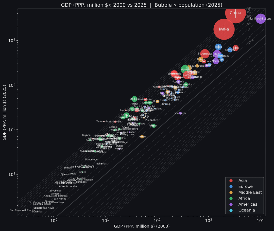
GDP in purchasing power parity (PPP) for ~200 countries, comparing 2000 (x-axis) vs 2025 (y-axis) on a log–log scale. Each point is a country; circle area is proportional to its 2025 population, colors show region (Asia, Europe, Middle East, Africa, Americas, Oceania).
The diagonal lines indicate how many times richer an economy became: the solid line is “no change” (same GDP in 2000 and 2025), dashed lines are 1.5×, 2×, …, 16× higher 2025 GDP. Countries above the main diagonal grew faster than the world average; those below it lagged behind.
Data source: IMF Data Mapper export (GDP, PPP) and IMF population data, years 2000 and 2025.
Posted by ollowain86
5 Comments
Imo I don’t think this should be a scatter plot because the inherent relationship between x and y is just subtraction. A bar chart can convey the difference between the two in a cleaner format
Maybe 5 of these data points are even a bit legible… This data is not beautiful.
This just isn’t legible.
The title is “who crushed it”. So “who crushed it” should be represented on either the vertical or horizontal axis, not like it is here on an almost arbitrary diagonal axis. It should be immediately obvious, and in this graph, it just isn’t. Intuitively, either the countries at the top, or the ones on the right, should be the ones that “crushed it”. Instead, they’re all squished together on a diagonal line, which makes it *very* difficult to see what this is trying to show you.
Even just rotating this 45° clockwise and using a different scale would help.
I cannot read anything. This is NOT beautiful!
I think a plot with (X = GDP per capita in 2000) and (Y = annual compound growth rate of GDP per capita between 2000 and 2025) would be more informative? At least it would show you whether there is convergence (poorer economies are growing faster, catching up) or not, accounting for population growth as well.
In your chart, if a country’s population grows by 20% but GDP per capita stagnates, they would still be “crushing it”, which I don’t think is an accurate statement.