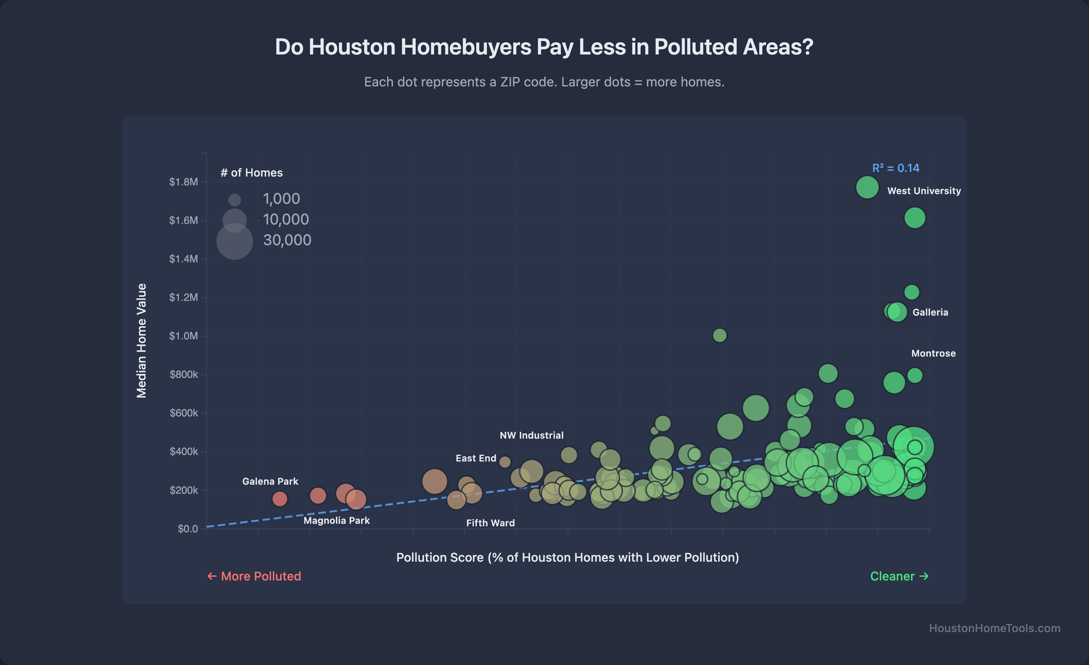
Flimsy-Beat3012 on December 13, 2025 6:52 am Data: Harris County Appraisal District, EPA environmental data Tool: Custom visualization Interactive version: [https://houstonhometools.com/insights/pollution-property-values/](https://houstonhometools.com/insights/pollution-property-values/)
CrimsonRaider2357 on December 13, 2025 11:13 am Is the x axis mislabeled? It’s labeled “% of Houston Homes with Lower Pollution,” but “Cleaner” points to the right. If “% of Houston Homes with Lower Pollution” is high, that implies a more polluted location, not less polluted.

![[OC] Pollution levels vs. Home Values across 150+ Houston ZIP codes](https://www.byteseu.com/wp-content/uploads/2025/12/sdyu3ta63x6g1-1536x937.png "[OC] Pollution levels vs. Home Values across 150+ Houston ZIP codes")
3 Comments
Data: Harris County Appraisal District, EPA environmental data
Tool: Custom visualization
Interactive version: [https://houstonhometools.com/insights/pollution-property-values/](https://houstonhometools.com/insights/pollution-property-values/)
Seems somewhat flat if you remove the outliers?
Is the x axis mislabeled? It’s labeled “% of Houston Homes with Lower Pollution,” but “Cleaner” points to the right. If “% of Houston Homes with Lower Pollution” is high, that implies a more polluted location, not less polluted.