
![[OC] How Netflix Turned $11.1B in Revenue into $3.1B Profit in Q2 FY25](https://www.byteseu.com/wp-content/uploads/2025/12/uh6yt8cbzc7g1-1536x960.png "[OC] How Netflix Turned $11.1B in Revenue into $3.1B Profit in Q2 FY25")
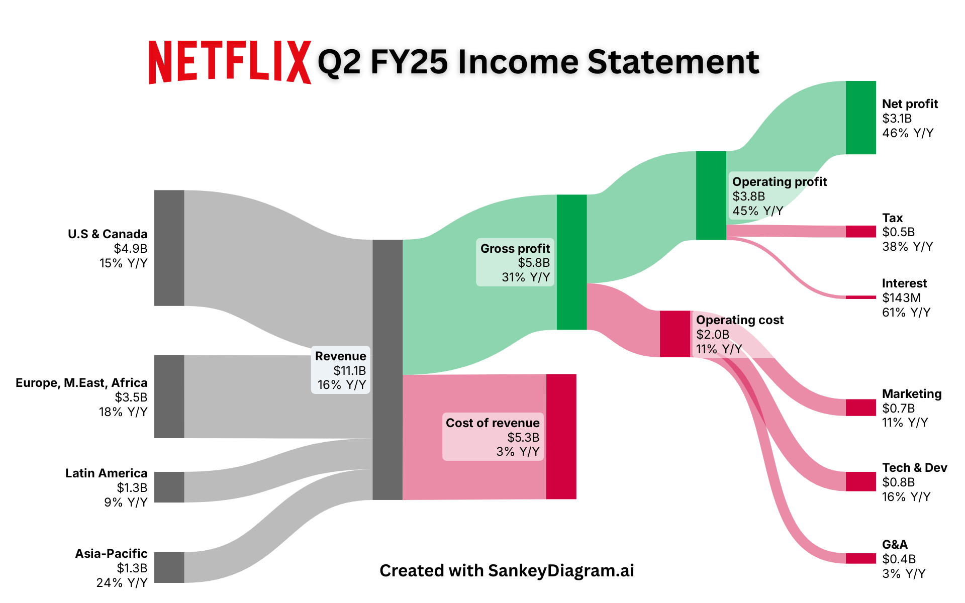
This Sankey diagram depicts Netflix's Q2 FY25's financial statement which shows the way $11.1B in revenues across different regions is channeled through cost and operating expenses, in order to generate $3.1B of net profits (+46% YoY).
Produced using: SankeyDiagram + Illustrator
source: Netflix Q2 FY25 earnings report (Investor Relations)
Posted by FrostingTall9171
5 Comments
I wish I had a 16% tax rate..
How is the tax that little? Owners are always bitching about how the government takes half and that’s like one eighth
There’s nothing beautiful or interesting about a sankey diagram in 2025 – it represents the absolute minimum effort version of an r/dataisbeautiful post.
And they still increase up the subscription cost like crazy.
Thats actually fantastic graph to show why in EU we need high digital tax on American corporations. Its fucking crazy how much money is sucked from market without reinvesting in European economy. They have high margin and money is actually exported straight to US.