
![[OC] Age, Term Length, and Lifespan of US Presidents](https://www.byteseu.com/wp-content/uploads/2025/12/pgtgx41f8k8g1-1536x1046.png "[OC] Age, Term Length, and Lifespan of US Presidents")
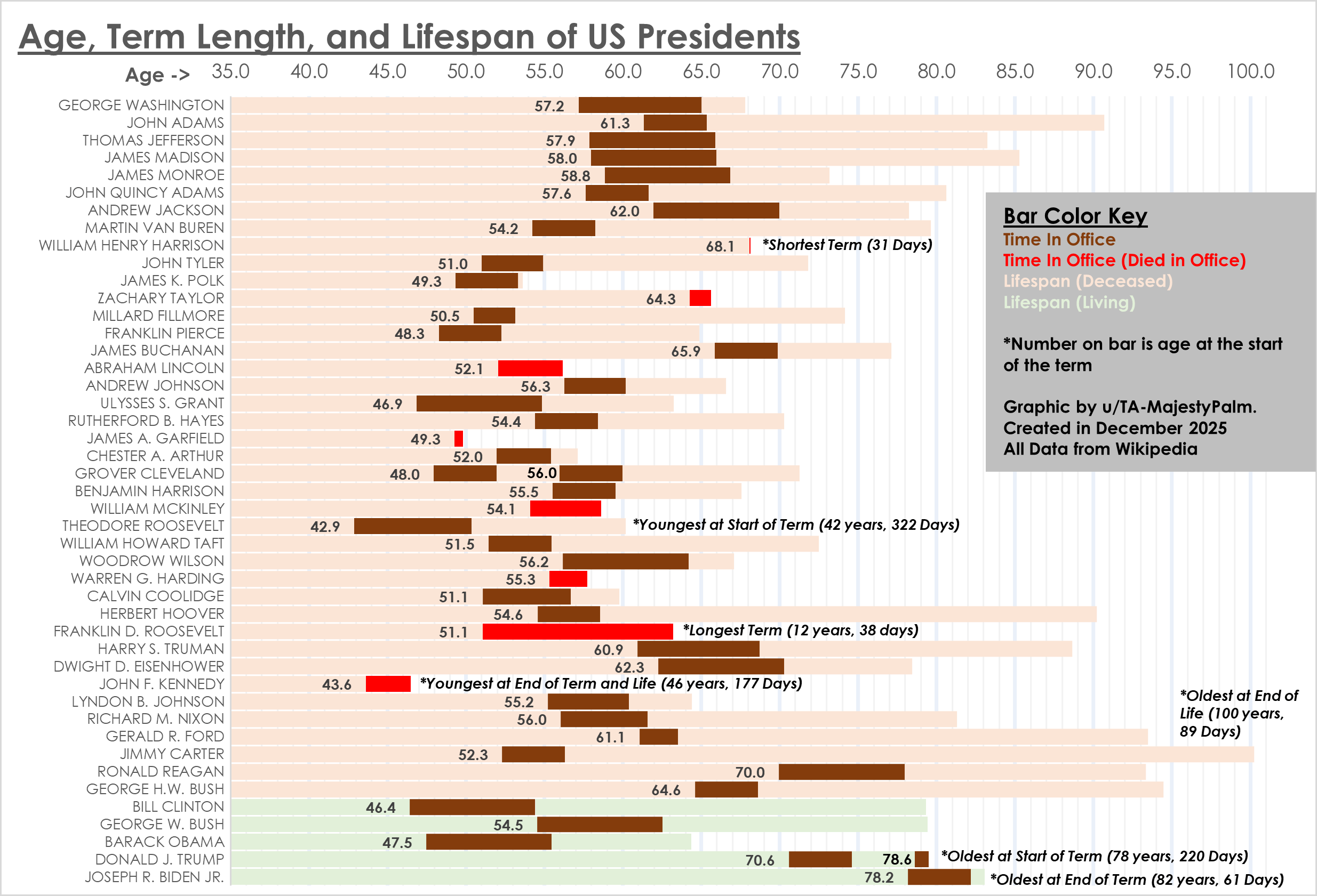
Graphic by me, created using Excel. All data from Wikipedia here: https://en.wikipedia.org/wiki/List_of_presidents_of_the_United_States_by_time_in_office and here: https://en.wikipedia.org/wiki/List_of_presidents_of_the_United_States_by_age
Posted by TA-MajestyPalm
7 Comments
All in a nice colour of shit.
I like this one. Simple and illustrative with a design that reads nicely top-to-bottom. It tries to say nothing more and nothing less than what the data do.
If I had to give a *possible* note for possible improvement to design, it’s that there is maybe a lot of empty space in the bars that could be utilized for a second version. An interesting use would be a color-coded indication of when and in what capacity the various people started their political/executive career; so one color for military officer, another for state office, another for multinational executive, etc. It may end up being too distracting from the basic concept though, or add a tiny bit of subjectivity.
And even though the data is widely available, I would still strongly recommend putting date of creation and data source(s) on the graphic itself. Overall, good job.
Interesting plot. now make it beautiful. Start with a color pallet.labelling looks sloppy overall. You dont have to show who died in office with a new color. Our eyes can see when the bold bar hits the end of their life….That’s a start. Have a go at it.
I really like this. A ton of information
This is actually a good visualization unlike other ones usually posted here. Thanks for sharing!
It is quite interesting to see how many presidents of the past didn’t even live to the age where Biden or Trump got into the office.
Kennedy didn’t reach end of term. Should be terminated by death, period. Stating end of term and life is incorrect.