^ lmk if you’re interested in adding other countries to the graph I think that could be cool
Every-Cup-4216 on
Wow, so the most prominent dip appears to have surfaced during WW2, meaning that ex-military likely drove the increased income mobility.
Loki-L on
The graph is a lot flatter than I would have expected.
Normally in those sort of economic diagrams you can tell exactly when the two World Wars, the great depression and the Reagan presidency happened without needing to look at the x-axis.
This is all just very smooth and steady.
Maybe that is because of the scale. (0.15 to 0.35 may have been better)
Or maybe the data really is that smooth and steady.

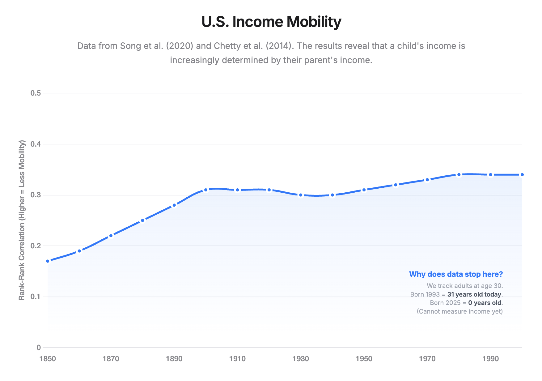
![[OC] How Much Does Your Parents Income Determine Yours?](https://www.byteseu.com/wp-content/uploads/2025/12/mnzxvei0dp8g1-1536x1079.png "[OC] How Much Does Your Parents Income Determine Yours?")
3 Comments
**Data Source**
Historical Data (1850–1970): Song et al. (2020), “Long-Term Decline in Intergenerational Mobility in the United States since 1850”
Modern Data (1980–1993): Chetty et al. (2014), “Where is the Land of Opportunity?”
**Tools**
Chart.js, HTML/CSS
**Methodology**
This chart tracks the Rank-Rank Correlation of income.
* 0.0 = Perfect Mobility (Parent rank doesn’t predict child rank).
* 1.0 = Perfect Immobility (Child rank is determined entirely by parent rank).
The data shows a rise from 0.17 in the 1850s to ~0.34 today, indicating that class mobility has significantly decreased over time.
**Code**
[https://github.com/theaustinhatfield/IncomeMobility](https://organic-waffle-pjwxg7jp44q9h777r.github.dev/)
^ lmk if you’re interested in adding other countries to the graph I think that could be cool
Wow, so the most prominent dip appears to have surfaced during WW2, meaning that ex-military likely drove the increased income mobility.
The graph is a lot flatter than I would have expected.
Normally in those sort of economic diagrams you can tell exactly when the two World Wars, the great depression and the Reagan presidency happened without needing to look at the x-axis.
This is all just very smooth and steady.
Maybe that is because of the scale. (0.15 to 0.35 may have been better)
Or maybe the data really is that smooth and steady.