
![[OC] I built an interactive playground to compare the true sizes of countries](https://www.byteseu.com/wp-content/uploads/2025/12/lwe2ohiiiu8g1-1536x952.png "[OC] I built an interactive playground to compare the true sizes of countries")
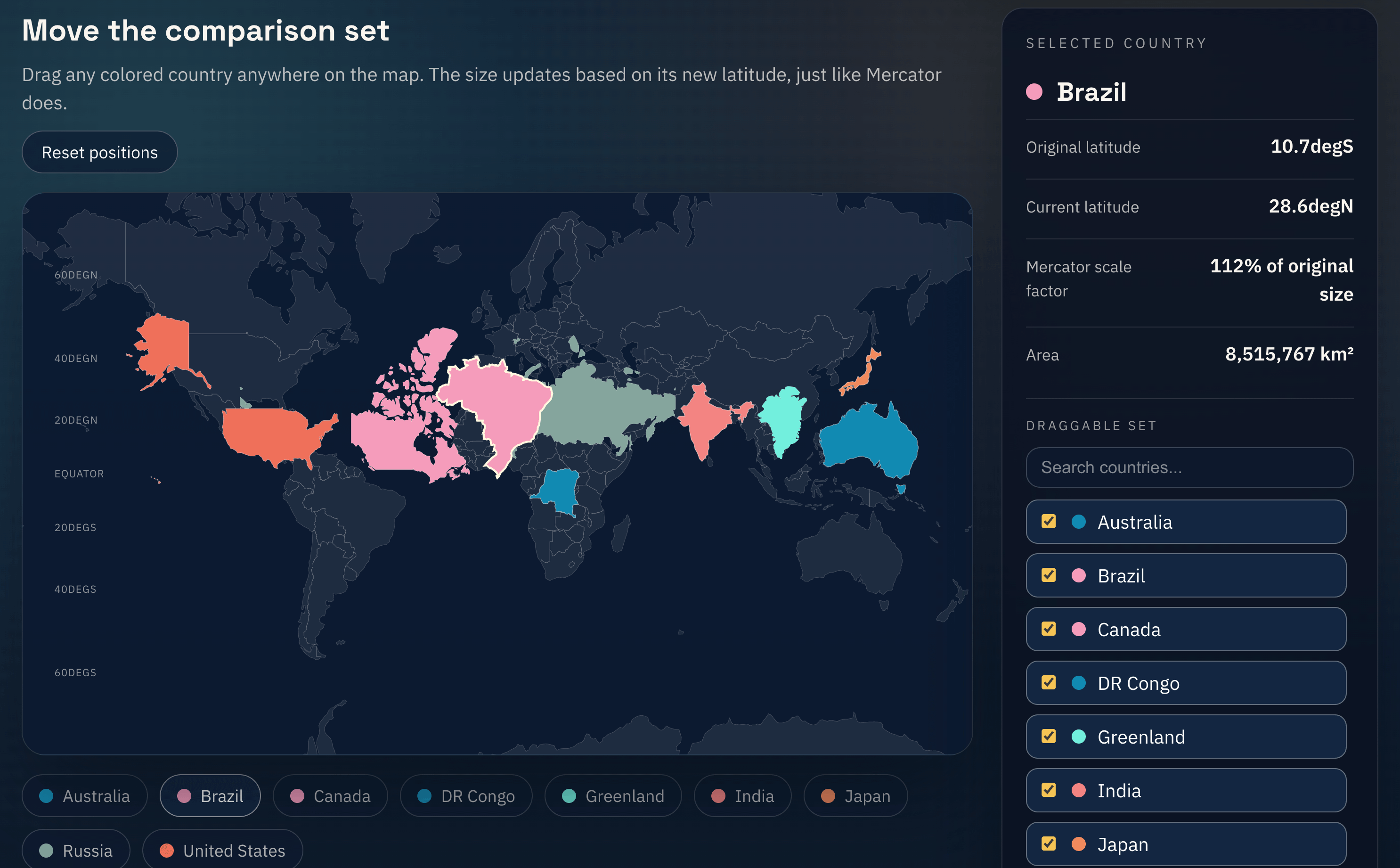
Pick any country and drag it around to compare its real area with others. It’s a neat way to see how the Mercator projection warps map sizes. Built with the World Atlas GeoJSON + country shapes (feel free to replace the data with your own).
- Github Repo which you can replace the geojson data with yours.
- Online playground for you to have a try
- Source of geojson data used
Posted by Sudden_Beginning_597
11 Comments
I liked how Canada, Greenland, and Russia changed sizes as you drag them to the equator.
The Mercator projection really does distort the sizes.
I used your playground site.
thanks, i never knew svalbard is like 1/5th the size of mainland norway, and just how small the country is in general
https://preview.redd.it/wghazw1zmu8g1.png?width=680&format=png&auto=webp&s=a716c45c7f67863afa20b56245eddc7d9746cf48
This already [exists](https://thetruesize.com/)
Wait, Alaska alone is like 1/3 of the contiguous USA? God Damn. I did not know that.
I knew it was huge, but still.
Fun and fascinating. Thank you!
Love that AI frontend slop
Why does the US include Hawaii but not Alaska?
your Antarctica model is bad, its kind of circular, not a rectangle.
Now I am curious how Pangea looked like because moving these masses around doesn’t seem to fit.
Great lil app, nice work. Fun idea, cohesive, intuitive, and aesthetically pleasing interface.
Since this is a Mercator projection, it maintains north-south lines as vertical. Alaska’s border with Canada is true north-south (following 141°W). So when you move Alaska, it should expand and contract horizontally and vertically, but shouldn’t its eastern edge remain vertical when you drag it into the southern hemisphere?