

I turned the nuclide chart into a piece of 3D printed wall art.
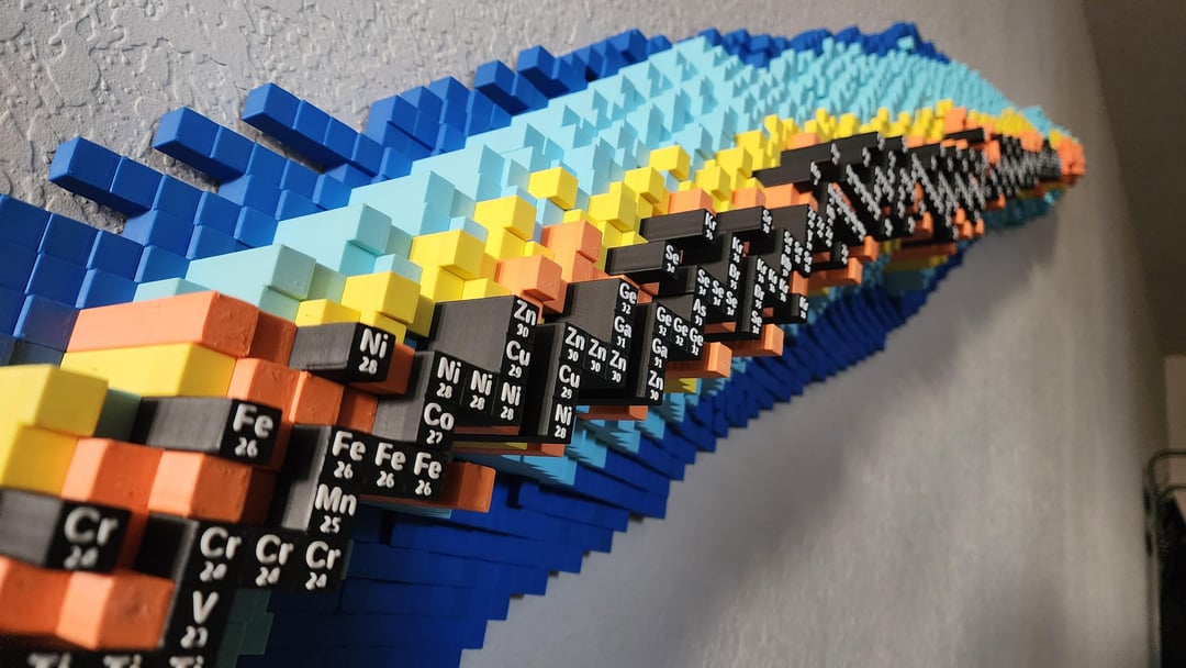
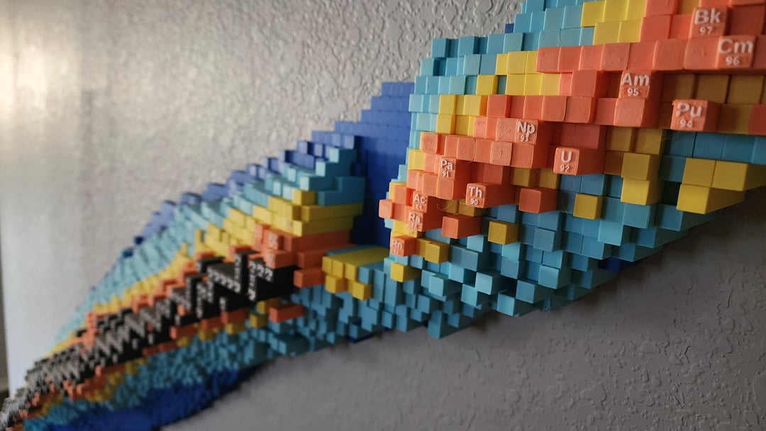
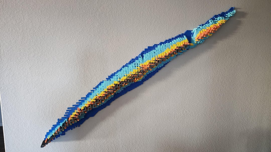
This chart shows the half life of each isotope from the periodic table. On the vertical axis is the number of protons and on the horizontal is the number of neutrons. The height of each column corresponds to the half life. The height is not on a linear or logarithmic scale but rather a custom scaling to give a more interesting shape. The different color sections correspond to the length of the half life. The half lives are: dark blue – less than a second, light blue – less than a minute, yellow – less than a day, orange – more than a day, black – stable. This is about 8ft long from end to end. It took about a month to print.
If anyone is interested in getting a custom one, I am selling them on Etsy. https://www.etsy.com/listing/4397642068/customizeable-3d-nuclide-chart
Posted by wingsandstache
7 Comments
The link you provided is your internal shop link, so that’s not gonna work. I did search on Etsy and found your $1500 listing. little pricy my friend. Albeit cool work.
Someone likes Bobby Broccoli. I approve
Very cool.
Anyone know the explanation for that giant blue gap after the last stable (Pb / lead). Seems like it bucks the pattern so there is probably something interesting there.
No just print the island of stability and I’ll be REALLY impressed!
Really cool! I appreciate the effort to make art out of science. You may want to reach out to some university physics/radiochemistry departments as they may be interested! If they ever had funding or money to spend that is
Why are you putting the number of protons instead of the atomic weight? That’s redundant with the element name. And it makes it hard to tell which isotope it is.
Wow, that’s really slick. I’m a high school chemistry teacher and would love that on my classroom wall… but I don’t think the public school budget extends that far. Still, it’s beautiful.