
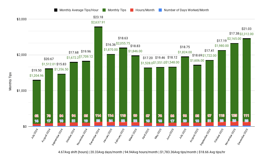
Picked up a part time job as a delivery driver after being laid off, been there for 18 months. Kept track of each day worked, hour worked and tips earned in a spreadsheet, and aggregated the data in this chart. All averages at the bottom (average shift length, days worked per month, average hours worked per month, average tips per month, total average tips per hour worked)
This is for a local restaurant chain, not DoorDash. Tips tracked only, I get an hourly wage as well.
Posted by urban_mystic_hippie
8 Comments
Source: Data compiled by me in a google sheet, chart made with google sheets function
Bro… 4 different types of data in one plot..
What about total comp including hourly wage?
What is your hourly wage (pre-tip)?
Visualizing hours and dollars in a single bar is just… no comment.
Ok, I see the comments – how would a professional chart the different data values? I wanted to see different types of related values (days vs hours vs tiips)
Completely open to suggestions and advice.
Curious, what is the net amount per month after subtracting monthly operating costs..
Hate to add another data point into this busy chart, but would recommend adding a secondary axis and line chart for this net figure
The y achis doesn’t fit the monthly tip amount.