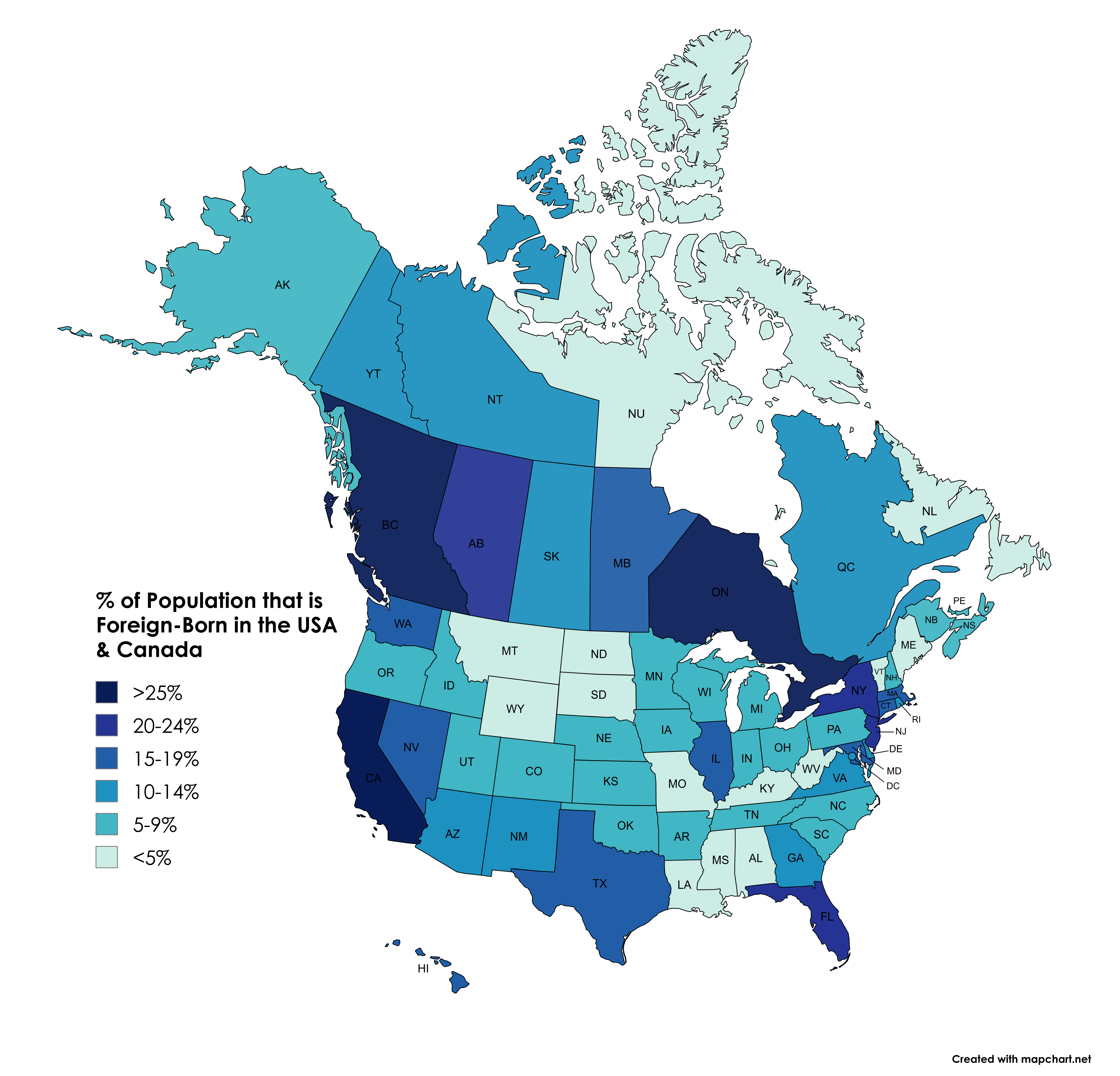
1. California (27.3%)
2. New Jersey (24.2%)
3. New York (23.1%)
4. Florida (22.1%)
5. Nevada (19.2%)
**States with Lowest % of Foreign-Born:**
1. West Virginia (1.8%)
2. Montana (2.2%)
3. Mississippi (2.6%)
4. Wyoming (3.6%)
5. Maine (3.8%)
**Provinces/Territories with Highest % of Foreign-Born:**
1. Ontario (30%)
2. British Columbia (29%)
3. Alberta (23.2%)
4. Manitoba (19.7%)
5. Quebec (14.6%)
**Provinces/Territories with Lowest % of Foreign-Born:**
1. Newfoundland & Labrador (2.8%)
2. Nunavut (3.2%)
3. New Brunswick (5.8%)
4. Nova Scotia (7.5%)
5. Prince Edward Island (7.8%)
calcifer219 on
As a Chicagoan doing work in Toronto. Wow is that true. I was completely blind to the Indian and weirdly Jamaican population in Toronto.
This map is showing providences for Canada, but I’m going to assume most of it is located in populated areas.
I’m sure there is more, but a weird surprise when I visited.
Pesto57 on
If you go by cities – Toronto and Miami have the largest percentage of people born in another country.
idk_what_to_put_lmao on
I know that some areas (more notably, Canada) are facing certain issues due to high levels of immigration but I honestly think it’s kind of a nice thing that we have so many foreign-borns if you think about what it means for our countries as a whole. I’m not purporting that anything is perfect or anything, but that means that we live in countries where other people feel welcomed and are able to live happy lives that may not be accepted or possible in their own or other countries.
eric5014 on
In Australia, 2021 census:
Western Australia 38%
Victoria 35%
New South Wales 34.6%
Australian Capital Territory 32.5%
Northern Territory 30.5%
Queensland 28.6%
South Australia 28.5%
Tasmania 20.9%
Total 33%
Beren__ on
It’s crazy how y’all just ignore Mexico
Mid_Atlantic_Lad on
Another “where the biggest cities are” map.
oddslane_ on
Always interesting how Canada sits higher overall, but some US metros quietly rival it once you zoom in. The regional patterns tell a lot of the story, especially around big cities versus rural areas. It also helps to remember that “foreign-born” includes people who have been citizens for decades, which can change how it reads. I wonder how different this would look if it showed change over time instead of a single snapshot. Still, really clean way to visualize a topic that usually gets oversimplified.

![Percentage of Population that is Foreign-Born in the USA & Canada [OC]](https://www.byteseu.com/wp-content/uploads/2026/01/eicc20raf2bg1-1536x1476.png "Percentage of Population that is Foreign-Born in the USA & Canada [OC]")
8 Comments
[https://en.wikipedia.org/wiki/List_of_U.S._states_and_territories_by_immigrant_population](https://en.wikipedia.org/wiki/List_of_U.S._states_and_territories_by_immigrant_population) – 15% of US population
[https://www12.statcan.gc.ca/census-recensement/2021/](https://www12.statcan.gc.ca/census-recensement/2021/) – 23% of Canadian population
**States with Highest % of Foreign-Born:**
1. California (27.3%)
2. New Jersey (24.2%)
3. New York (23.1%)
4. Florida (22.1%)
5. Nevada (19.2%)
**States with Lowest % of Foreign-Born:**
1. West Virginia (1.8%)
2. Montana (2.2%)
3. Mississippi (2.6%)
4. Wyoming (3.6%)
5. Maine (3.8%)
**Provinces/Territories with Highest % of Foreign-Born:**
1. Ontario (30%)
2. British Columbia (29%)
3. Alberta (23.2%)
4. Manitoba (19.7%)
5. Quebec (14.6%)
**Provinces/Territories with Lowest % of Foreign-Born:**
1. Newfoundland & Labrador (2.8%)
2. Nunavut (3.2%)
3. New Brunswick (5.8%)
4. Nova Scotia (7.5%)
5. Prince Edward Island (7.8%)
As a Chicagoan doing work in Toronto. Wow is that true. I was completely blind to the Indian and weirdly Jamaican population in Toronto.
This map is showing providences for Canada, but I’m going to assume most of it is located in populated areas.
I’m sure there is more, but a weird surprise when I visited.
If you go by cities – Toronto and Miami have the largest percentage of people born in another country.
I know that some areas (more notably, Canada) are facing certain issues due to high levels of immigration but I honestly think it’s kind of a nice thing that we have so many foreign-borns if you think about what it means for our countries as a whole. I’m not purporting that anything is perfect or anything, but that means that we live in countries where other people feel welcomed and are able to live happy lives that may not be accepted or possible in their own or other countries.
In Australia, 2021 census:
Western Australia 38%
Victoria 35%
New South Wales 34.6%
Australian Capital Territory 32.5%
Northern Territory 30.5%
Queensland 28.6%
South Australia 28.5%
Tasmania 20.9%
Total 33%
It’s crazy how y’all just ignore Mexico
Another “where the biggest cities are” map.
Always interesting how Canada sits higher overall, but some US metros quietly rival it once you zoom in. The regional patterns tell a lot of the story, especially around big cities versus rural areas. It also helps to remember that “foreign-born” includes people who have been citizens for decades, which can change how it reads. I wonder how different this would look if it showed change over time instead of a single snapshot. Still, really clean way to visualize a topic that usually gets oversimplified.