
![[OC] Emigration numbers visualized for India (1 Flag ~ 100k people)](https://www.byteseu.com/wp-content/uploads/2026/01/7x5cam4ui0bg1-1024x769.png "[OC] Emigration numbers visualized for India (1 Flag ~ 100k people)")
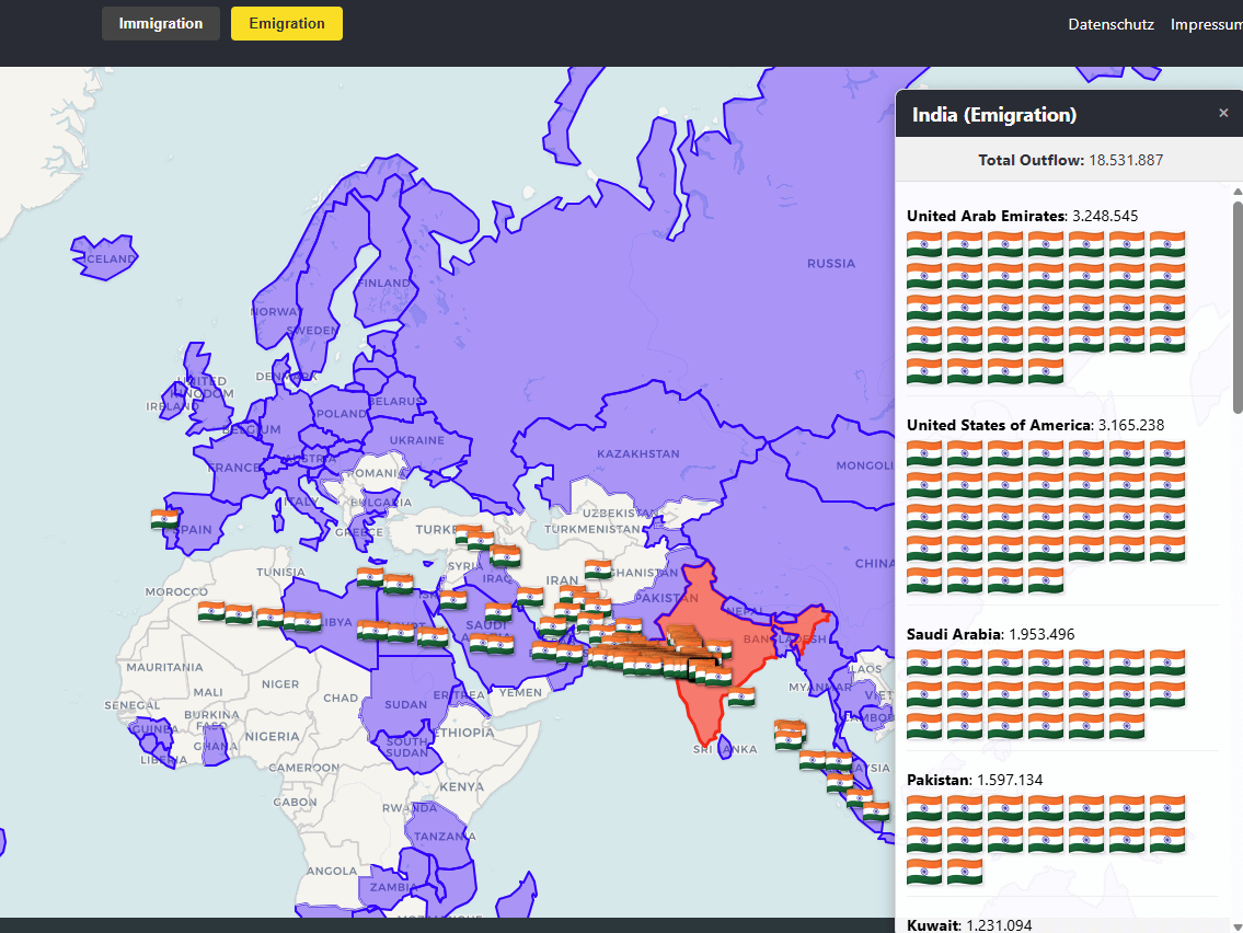
Screenshot is mid animation. Flags are moving from India to the destination countrys.
Data Source used:
https://www.un.org/development/desa/pd/content/international-migrant-stock
Tools used:
- Leaflet & React-Leaflet
- React-Leaflet-Drift-Marker
- D3.js
- GeoJSON
Interactive Version for the whole world: migrantsontheglobe.com
Posted by Competitive_Law6952
6 Comments
How are so many Indians emigrating to… India?
Bad screenshot. It’s a screenshot while the animation is still ongoing so it’s useless to visualize.
What do the countries in purple represent? And what about the countries without that color? Don’t they have at least 100,000 Indian immigrants?
Misses out on much of the world?
Not beautiful data.
Something wrong with this data. For instance, where is Canada? Indian immigration to Canada is averaging over 100k per year and cumulatively would be higher than Kuwait for example.
Interesting to see it list nearly 800k Pakistanis flowing into India. Surely that cannot be right.
EDIT: And an even bigger number flowing from India > Pakistan. This goes against everything I know about the two countries.