
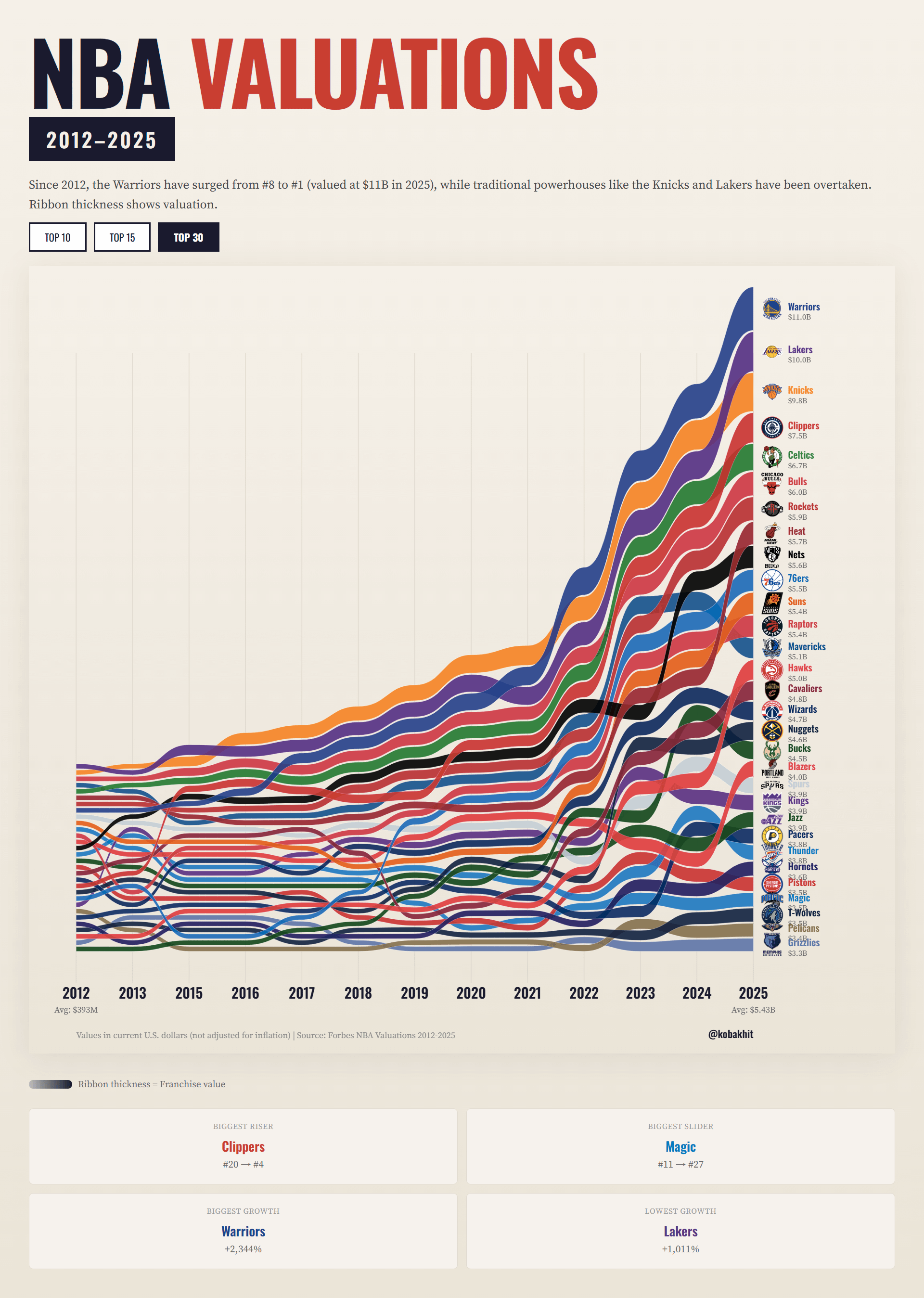
![[OC] NBA Team Valuations 2012 - 2025](https://www.byteseu.com/wp-content/uploads/2026/01/41e3eex17hbg1-1093x1536.png "[OC] NBA Team Valuations 2012 – 2025")
Data Source: Forbes NBA Valuations List
Tools: HTML/CSS/Javascript and Claude Sonnet 4.5
Inspired by https://www.reddit.com/r/Infographics/comments/1q1k4xh/how_global_economic_power_shifted_19802025/#lightbox
Interactive version: https://kobakhit.com/data-visuals/nba-team-valuations/nba-team-valuations.html
Posted by dostre
4 Comments
Data Source: [Forbes NBA Valuations List](https://www.forbes.com/sites/justinteitelbaum/2025/10/23/the-most-valuable-nba-teams-2025/)
Tools: HTML/CSS/Javascript and Claude Sonnet 4.5
Inspired by [https://www.reddit.com/r/Infographics/comments/1q1k4xh/how_global_economic_power_shifted_19802025/#lightbox](https://www.reddit.com/r/Infographics/comments/1q1k4xh/how_global_economic_power_shifted_19802025/#lightbox)
Interactive version: [https://kobakhit.com/data-visuals/nba-team-valuations/nba-team-valuations.html](https://kobakhit.com/data-visuals/nba-team-valuations/nba-team-valuations.html)
how on Earth were the Kings ever valued higher than the Blazers
Why did you choose not to normalise the data OP? I’m sure you made the right choice for what you wanted to show but did you consider readability – my suggestion would be if you want to show relative value growth across teams then normalise against the overall increase. If you want to demonstrate the overall growth and what fuelled it I’m not sure stacked ribbons is the best way.
Thunder is surprisingly low to me. Is that purely because of its location?