

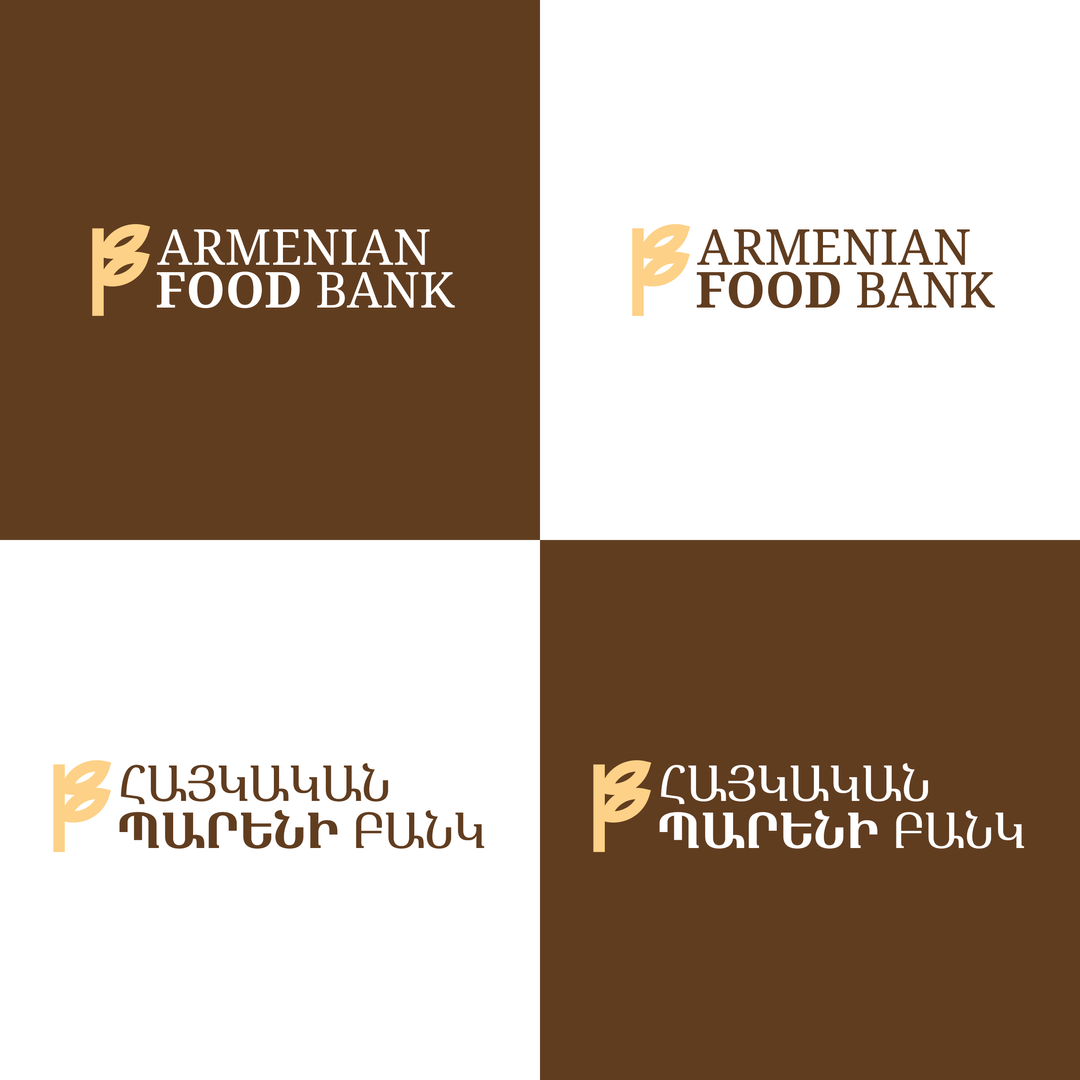

I recently developed a complete visual identity proposal for Armenian Food Bank, driven by the belief that charities deserve branding that is as thoughtful and dignified as their mission.
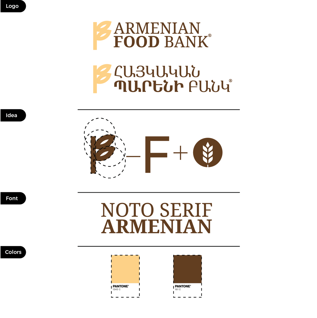
The core symbol is constructed from geometric forms to create a stylised wheat, universally associated with nourishment and sustenance, while simultaneously echoing the letter “F” — a quiet, intentional reference to Food.
For the logotype, I chose Noto Serif, deliberately avoiding an industrial or corporate tone often conveyed by sans-serif fonts, and instead opting for something warmer, more humane, and timeless.
The color palette is based on Pantone standards to ensure consistency, reliability, and professional scalability across all media.
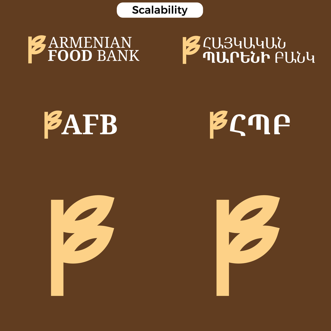
The system itself is designed to be highly adaptable, functioning seamlessly in three configurations:
• Full logo
• Symbol + AFB acronym
• Standalone symbol
This makes the identity practical for everything from social media and packaging to signage and print.
I created this project independently and would be genuinely glad to offer this identity to Armenian Food Bank free of charge, should it resonate with their values and vision. If this concept feels aligned with their mission, I’d be happy to share the full package and discuss how it can be implemented free of charge.
https://www.reddit.com/gallery/1q6ls5i
Posted by sxydoctor
2 Comments
Looks really nice. Congratulations, hopefully they’ll pick it up.
Is there an Armenian Food Bank? Where does it operate?