
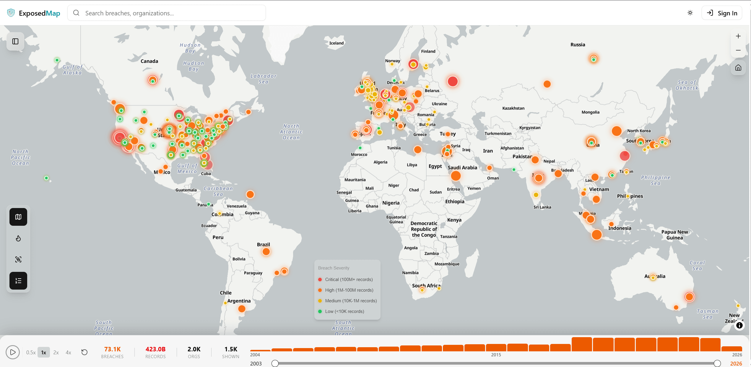
![[OC] I built a globe that visualizes known data breach — 3,300+ in 2025 alone, a new record](https://www.byteseu.com/wp-content/uploads/2026/02/kar9h3okeoig1-1536x750.png "[OC] I built a globe that visualizes known data breach — 3,300+ in 2025 alone, a new record")
Sources: Data is aggregated from public breach disclosures, Have I Been Pwned database, regulatory filings, and news reports. Updated continuously.
Tools: Next.js, OpenMaps, WebGL
https://www.exposedmap.com/map
Been tracking global data breach data as a side project for a while now. Finally got around to visualizing it properly on an interactive globe.
Each point represents a reported breach, color-coded by severity. You can filter by industry, root cause, country, and time period. Some patterns are immediately obvious once you see it all laid out — the US and EU light up like christmas trees, finance gets hammered more than any other sector, and there's a noticeable spike every January. Select map marker for breach details.
There's also a free email checker if you're curious where your info showed up in any of these.
Posted by chasindr3am
4 Comments
This is a great visualization, nice work. Curious how you define and dedupe a “known data breach”, and what sources you used for coverage across regions. Also, do you have a way to tag records that include credentials versus general PII dumps?
I’m confused, what is the location in reference to? The company head quarter? Database location? Location of the victim?
Come on Norway – you’re better than this!
Very nice (and useful!!!) work indeed. The downside that I see currently is that some dots appear exactly at the same spot, and I am unable to select or switch between those dots. For example in the center of France.
Man do companies suck at keeping our private information. They should pay us, or pay a huge fine to their competitors. Or simply shouldn’t collect anything if they don’t know how to handle it.