
![CORRECTED - Most common runway numbers by Brazilian state [OC]](https://www.byteseu.com/wp-content/uploads/2026/02/tl7stm7072kg1-724x1024.png "CORRECTED – Most common runway numbers by Brazilian state [OC]")
Correction is due to a bad miscalculation I made in the underlying data. This has been fixed, so I apologize to anyone that saw this twice… the first, incorrect one, has been deleted now.
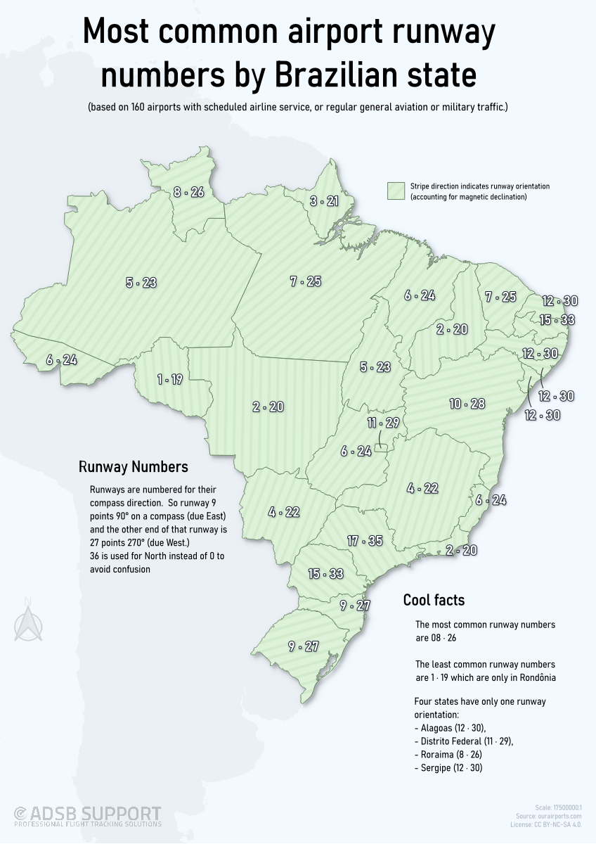
This is the second visualization of this type I've done, that this time looks at all the major airport runways in Brazil, and shows the most common orientation in each state.
I learned from my first post and have hopefully included all the great feedback there into this one. In addition, I decided to change the land colour to green to better reflect the Brazilian national colours, and to give more contrast to the background. I also included a shadow of the continent to help with context.
I'm not completely happy with the text placement, but this was the least worst.
As with last time, your constructive feedback is encouraged!
I used runway data from ourairports.com, manipulated it in LibreOffice Calc, and mapped it in QGIS 3.44
Posted by ADSBSGM
2 Comments
I used runway data from [ourairports.com](http://ourairports.com/), manipulated it (correctly this time) in LibreOffice Calc, and mapped it in QGIS 3.44
Muito legal!
This is a great follow-up to your US map. It sounds like you might do a whole series. It would be amazing to eventually see a worldwide map, each country in a subtly different color based on their flag.
I don’t have much feedback. Maybe an observation that the stripes are hard to see with small states, but that’s nitpicky.
It might be interesting to add the prevailing local wind direction somehow. I suspect that would clutter the map, so it would have to be an optional overlay.