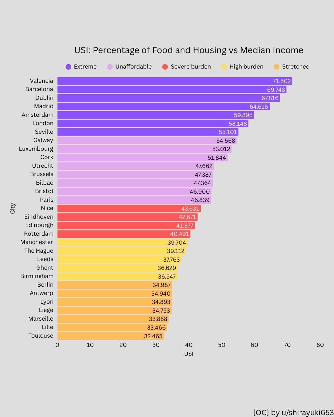
This is Part 3 of the USI series and covers the first half of European cities.
Data sources:
• Numbeo (1-bedroom rent & food price anchor)
• National statistical agencies (UK, IE, FR, ES, LU)
• Glassdoor (BE, NL) for salary estimates where official city-level data was limited
Index definition: USI = Housing burden + Essential food share (as % of gross income); Housing burden = 1BR rent / median income and food share = simplified essential consumption proxy
Both components are shown separately for transparency. The index is designed to reflect structural urban cost pressure rather than full household budgets.
Tools: Python (pandas) for data processing, Canvas for visualisation.
Note: This covers UK, IE, FR, ES, LU, BE, NL. DACH, CZ, PL and Scandinavia are in Part 4 of the series
Zifnab_palmesano on
While I do not dosagree with the numbers, I think other Spanish cities such as Palma de Mallorca and Ibiza/Eivissa are missing, because they suffer largely as other cities
Maybe the plot is made not with all data at hand but to show the range of situations?
SoupyAT on
I don’t think 35% is “stretched”, honestly, that would be great
elcanariooo on
So, knowing you can’t really rent or get loans above 33%-ish of your income in France (I’m simplifying a bit), the figures just…. make no sense?
I mean…. “numbeo” lol
Winterspawn1 on
Is the median income for the country or the city? Income from a job is typically higher in and near big cities.
Niklear on
The fact that this starts at stretched is mind blowing. Sadly feels like the whole world is in very much the same situation.
BlimundaSeteLuas on
This list is not exhaustive. What was your selection process?
zdzislav_kozibroda on
Good idea but not a single city east of Berlin. Why make a chart with only half of continent’s data?
monkehh on
What do the numbers represent? Your figure for rent would be over double the annual rent on the average 1-bed in Dublin and more than the rent on a 3-bed.
Testosteron123 on
Where is munich, i know we make more money here but at least in the Rental Cost it should pop up, since the lowest is 21%
Error_404_403 on
Limited to Germany, Spain, France, UK, Netherlands and Belgium. Not all Europe.
Would be nice to have info on at least capital / major cities of other countries.
nfrances on
Add Croatia, and see numbers here, and cry….
The_39th_Step on
I’m from London and the surrounding area but have lived in Manchester for over a decade. I have a decent job here and life is workable, even if it has got more expensive
BonsaiBobby on
Very unclear. I don’t understand these data. What is the number inside the bar? How come these absolute numbers are ranked exactly like the percentages?
In Amsterdam we don’t spend 4000 euro per month on rent. The number for Amsterdam is approximately the median income (48k) but in the food stats it’s 14k. We don’t spend over 1000 euro per month on food. Also strange that food prices are more or less equal across the country, so why is Amsterdam more expensive than other Dutch cities. You should also know that 40% of houses in Amsterdam have rent regulation and cannot exceed 900 euro.
The_Emu_Army on
The split between Berlin and Dublin is surprising. They’re both prosperous nations (for different reasons) and you would expect the nouveau riche to move to the capital.
Maybe Berlin has some unused capacity from back when there was an East Berlin?
1. are all of the figures at an individual level, household level, or a mix? Assuming income data is individual, how have you managed to get individual-level data for housing? The average person doesn’t live on their own.
2. How have you set the thresholds for survivability? Housing and food are both major expenses everywhere, but in the US you then also need to cover a number of things that are either free or subsidised in Europe. Did you use the same thresholds for Europe and the US?
3. Does housing cost just use the median cost across all types/sizes of housing, or does it hold something constant? Specifically, cities like Paris and Amsterdam are noted for very high density housing and small apartments, significantly smaller than all the Spanish cities.
gatosaurio on
Valencia used to be so nice… now we’re Barcelona 2: shitty bogaloo
_crazyboyhere_ on
Can I get one for American and Canadian cities?
zezinandoreinando on
Portugal: those are rookie numbers
TheRadishBros on
Food is quite affordable in UK, which shows just how insane the housing costs are for London to be near top of the list.
Same with Dublin, to an even greater extent.
Cobbdouglas55 on
Does food include restaurants and bars? We Spaniards spend quite a few hours drinking.
sogdianus on
Forgot Lisbon which would be right at the top
ma_tendresse on
I find this analysis very insightful, and I understand the decision to split the regions in different charts to be able to include more cities while keeping the data readable. Thanks for that!
That said, I do agree as others have commented that eventually having a chart that includes only the most populous cities for each country and includes all of Europe would be very interesting to see.
sadlittlecrow1919 on
Really goes to show that the UK housing crisis is mostly just a London housing crisis. Leeds and Manchester saw their populations grow by 8.1% and 9.7% respectively between 2011 and 2021 – higher than London which saw its population grow by 7.7% – but both cities are still a long, long way from being even remotely close to London levels of unaffordable.
Then you read articles about how new housing construction in London has plummeted to almost nothing while the likes of Leeds and Manchester have built loads of new housing over the past decade, and you start to understand why.
panversie on
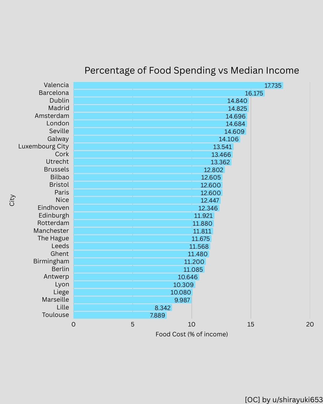
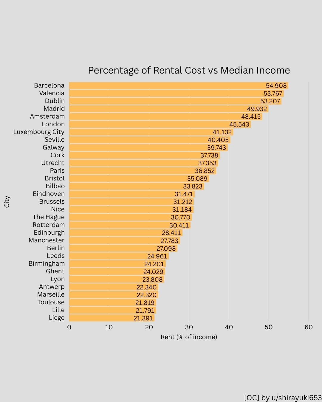
Would be nice to see food and housing split up. I can imagine Spanish people spending more on food in general than Dutch people for example.
teknoraver on
Milan is so cheap that it’s not even in the list!
indiode on
Data representation is awful. 3 significant digits for % values.

![[OC] These European Cities Spend Over 50% of Income on Housing + Food](https://www.byteseu.com/wp-content/uploads/2026/02/lr0p5zjeotkg1-819x1024.jpg "[OC] These European Cities Spend Over 50% of Income on Housing + Food")
28 Comments
This is Part 3 of the USI series and covers the first half of European cities.
Data sources:
• Numbeo (1-bedroom rent & food price anchor)
• National statistical agencies (UK, IE, FR, ES, LU)
• Glassdoor (BE, NL) for salary estimates where official city-level data was limited
Index definition: USI = Housing burden + Essential food share (as % of gross income); Housing burden = 1BR rent / median income and food share = simplified essential consumption proxy
Both components are shown separately for transparency. The index is designed to reflect structural urban cost pressure rather than full household budgets.
Tools: Python (pandas) for data processing, Canvas for visualisation.
Note: This covers UK, IE, FR, ES, LU, BE, NL. DACH, CZ, PL and Scandinavia are in Part 4 of the series
While I do not dosagree with the numbers, I think other Spanish cities such as Palma de Mallorca and Ibiza/Eivissa are missing, because they suffer largely as other cities
Maybe the plot is made not with all data at hand but to show the range of situations?
I don’t think 35% is “stretched”, honestly, that would be great
So, knowing you can’t really rent or get loans above 33%-ish of your income in France (I’m simplifying a bit), the figures just…. make no sense?
I mean…. “numbeo” lol
Is the median income for the country or the city? Income from a job is typically higher in and near big cities.
The fact that this starts at stretched is mind blowing. Sadly feels like the whole world is in very much the same situation.
This list is not exhaustive. What was your selection process?
Good idea but not a single city east of Berlin. Why make a chart with only half of continent’s data?
What do the numbers represent? Your figure for rent would be over double the annual rent on the average 1-bed in Dublin and more than the rent on a 3-bed.
Where is munich, i know we make more money here but at least in the Rental Cost it should pop up, since the lowest is 21%
Limited to Germany, Spain, France, UK, Netherlands and Belgium. Not all Europe.
Would be nice to have info on at least capital / major cities of other countries.
Add Croatia, and see numbers here, and cry….
I’m from London and the surrounding area but have lived in Manchester for over a decade. I have a decent job here and life is workable, even if it has got more expensive
Very unclear. I don’t understand these data. What is the number inside the bar? How come these absolute numbers are ranked exactly like the percentages?
In Amsterdam we don’t spend 4000 euro per month on rent. The number for Amsterdam is approximately the median income (48k) but in the food stats it’s 14k. We don’t spend over 1000 euro per month on food. Also strange that food prices are more or less equal across the country, so why is Amsterdam more expensive than other Dutch cities. You should also know that 40% of houses in Amsterdam have rent regulation and cannot exceed 900 euro.
The split between Berlin and Dublin is surprising. They’re both prosperous nations (for different reasons) and you would expect the nouveau riche to move to the capital.
Maybe Berlin has some unused capacity from back when there was an East Berlin?
In my opinion this data is a bit misleading. It looks like the extreme cases were rare, while there are whole countries where housing in cities is a luxury. For example, in Poland we have a median income of 5340zł after taxes, while an average price of rent in warsaw is 3750zł([source](https://businessinsider.com.pl/nieruchomosci/koszty-najmu-mieszkan-w-polsce-rosna-najwyzsze-stawki-w-warszawie/2pcrv1v)) which means just housing equals to over 70% of median income.
A few questions and points:
1. are all of the figures at an individual level, household level, or a mix? Assuming income data is individual, how have you managed to get individual-level data for housing? The average person doesn’t live on their own.
2. How have you set the thresholds for survivability? Housing and food are both major expenses everywhere, but in the US you then also need to cover a number of things that are either free or subsidised in Europe. Did you use the same thresholds for Europe and the US?
3. Does housing cost just use the median cost across all types/sizes of housing, or does it hold something constant? Specifically, cities like Paris and Amsterdam are noted for very high density housing and small apartments, significantly smaller than all the Spanish cities.
Valencia used to be so nice… now we’re Barcelona 2: shitty bogaloo
Can I get one for American and Canadian cities?
Portugal: those are rookie numbers
Food is quite affordable in UK, which shows just how insane the housing costs are for London to be near top of the list.
Same with Dublin, to an even greater extent.
Does food include restaurants and bars? We Spaniards spend quite a few hours drinking.
Forgot Lisbon which would be right at the top
I find this analysis very insightful, and I understand the decision to split the regions in different charts to be able to include more cities while keeping the data readable. Thanks for that!
That said, I do agree as others have commented that eventually having a chart that includes only the most populous cities for each country and includes all of Europe would be very interesting to see.
Really goes to show that the UK housing crisis is mostly just a London housing crisis. Leeds and Manchester saw their populations grow by 8.1% and 9.7% respectively between 2011 and 2021 – higher than London which saw its population grow by 7.7% – but both cities are still a long, long way from being even remotely close to London levels of unaffordable.
Then you read articles about how new housing construction in London has plummeted to almost nothing while the likes of Leeds and Manchester have built loads of new housing over the past decade, and you start to understand why.
Would be nice to see food and housing split up. I can imagine Spanish people spending more on food in general than Dutch people for example.
Milan is so cheap that it’s not even in the list!
Data representation is awful. 3 significant digits for % values.