
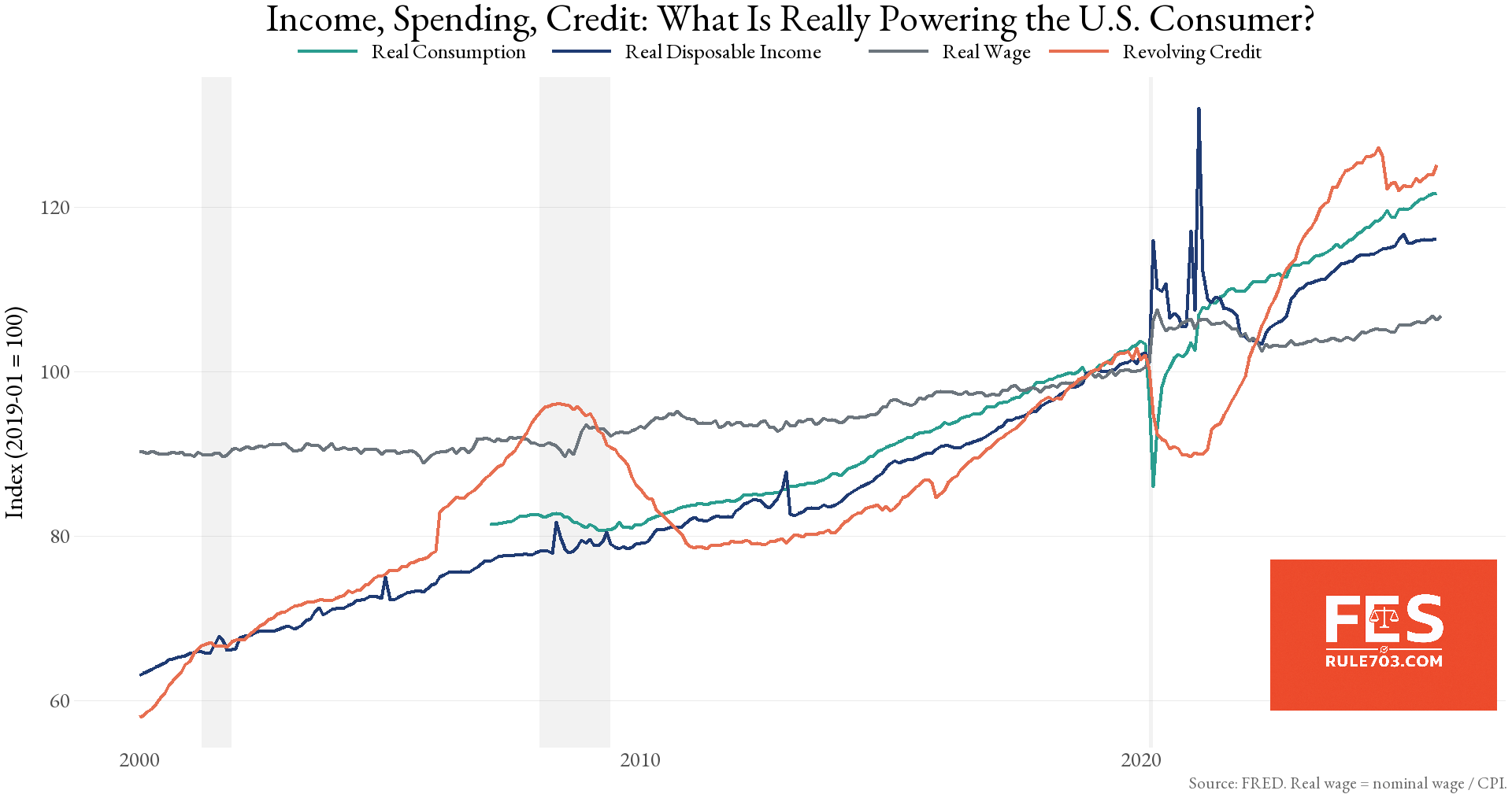
![[OC] Income vs. Spending vs. Credit — What’s really powering the U.S. consumer? (2000–2025)](https://www.byteseu.com/wp-content/uploads/2026/02/aaple0hcrhlg1-1536x807.png "[OC] Income vs. Spending vs. Credit — What’s really powering the U.S. consumer? (2000–2025)")
Data Sources and Tools:
- FRED (Federal Reserve Economic Data)
- Real wage calculated as nominal average hourly earnings divided by CPI
- Monthly data
- GGplot in R
we wanted to look at what’s actually driving U.S. consumer strength over the last two decades.
This chart indexes four series to January 2019 = 100:
- Real Disposable Income
- Real Consumption (Spending)
- Real Wages (Nominal wages adjusted by CPI)
- Revolving Credit (credit card balances)
Shaded areas represent NBER recessions.
What stands out:
• Consumption has outpaced real wage growth since 2020
• Revolving credit exploded post-pandemic, especially 2022–2024
• Real wages recovered from the 2022 inflation shock — but not nearly as sharply as spending
• Disposable income spiked during stimulus, then normalized
The interesting question:
Is the consumer being powered by income growth…
or by credit expansion?
The post-2021 divergence between credit and wages is especially striking.
Posted by forensiceconomics
5 Comments
debt is how rich get rich so
profoundly misleading to make all these within series indices.
the increase in credit availability will make an uninformed reader think that the average american has debts larger than their wages.
was it *intended* to be misleading, or just a mistake?
terrible choice of colors
Some critiques:
I think you made a mistake by using PCEC96 as your real consumption figure: [Real Personal Consumption Expenditures (PCEC96) | FRED | St. Louis Fed](https://fred.stlouisfed.org/series/PCEC96)
Look at the original axis on the left. This is a cumulative figure. The number you should be using is the per capita series (A794RX0Q048SBEA).
And you shouldn’t be using “real wages” since wages are only 1 form of income. Why are you not looking at median income? [Real Disposable Personal Income (DSPIC96) | FRED | St. Louis Fed](https://fred.stlouisfed.org/series/DSPIC96#)
If you index things to 2019 Jan 1 as 100, plot the two together, and it is almost identically lined up: [https://imgur.com/a/FFtyvzm](https://imgur.com/a/FFtyvzm)
That’s… not how you should represent that.
Representing the amount of revolving credit outstanding over total consumption would give a better view of how are people paying for shit…
Growth of disposable income isn’t really a factor in answering the question “how are they paying”.
It’s either cash or credit…