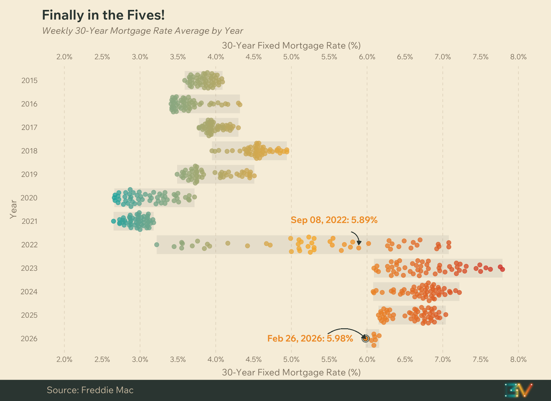
What do the colors of the dots denote? Is it the date progression through the year of the data point?
dcolomer10 on
r/usdefaultism. Why do you guys never say it’s for the US only? It would so strange for me to make a post “mortgage rates under 2% for first time since X” without specifying it’s for Spain
BadAdvice__Bot on
This looks fine and all but I can’t help thinking it would be a lot better as just a line chart. It would provide how the trend occurred through the pandemic and how fast it has been declining recently.
IMovedYourCheese on
Why flip the axes for no reason? Date should be on X, variable being plotted should be on Y.
The simplest charts are usually the best: see [https://fred.stlouisfed.org/series/MORTGAGE30US](https://fred.stlouisfed.org/series/MORTGAGE30US). All your fancy design is taking *away* useful information.
Looks like it’ll still be a cold day in hell before they can come close to my 2.875%. Might be stuck in this house for the next 20 years it seems.
shicken684 on
Will be interesting to see if lower rates starts pushing home prices up again. I know a lot of people are simply locked out at current prices and not sure 1 or 2% lower interest is going to make the difference to open up the market again.
Ok-disaster2022 on
Here’s the thing: all loans in the US are set with the primary rate as the minimum. The Ded raised the prime a few years ago and won’t lower it (justifiably).
metal079 on
I feel sad I’m in my 6.5 percent interest house 😭
doubleflusher on
*Hugs my 2.65 mortgage rate*
phdoofus on
When you decide to focus on mortgage rates instead of housing prices and income……
Solid_Owl on
WTF is up with this chart swapping the axes?
CletusDSpuckler on
Which puts mortgage rates STILL below their long running median.
Mrchristopherrr on
Bought a house in September, so I imagine the market is due to crash any day now. You’re welcome.
paranoid_70 on
The chart should go back to the late 70s if you want to see some REALLY high interest rates.
salter77 on
Meanwhile, here in Mexico we have rates from 10 to 13%.
And they were higher some years ago too.
Trelyrien on
And here I am mad I refi’d at 3.5 when I could’ve gotten 3!

![[OC] Mortgage Rates Under 6% For First Time Since September 2022](https://www.byteseu.com/wp-content/uploads/2026/02/vde1qww5y1mg1-1536x1117.png "[OC] Mortgage Rates Under 6% For First Time Since September 2022")
19 Comments
Source: Freddie Mac
Tools Used: R
Chart Type: Beeswarm
What do the colors of the dots denote? Is it the date progression through the year of the data point?
r/usdefaultism. Why do you guys never say it’s for the US only? It would so strange for me to make a post “mortgage rates under 2% for first time since X” without specifying it’s for Spain
This looks fine and all but I can’t help thinking it would be a lot better as just a line chart. It would provide how the trend occurred through the pandemic and how fast it has been declining recently.
Why flip the axes for no reason? Date should be on X, variable being plotted should be on Y.
The simplest charts are usually the best: see [https://fred.stlouisfed.org/series/MORTGAGE30US](https://fred.stlouisfed.org/series/MORTGAGE30US). All your fancy design is taking *away* useful information.
https://preview.redd.it/dwkaptg232mg1.png?width=2678&format=png&auto=webp&s=c4b8087d206f1453461596abaab89cd9ff74bebe
Looks like it’ll still be a cold day in hell before they can come close to my 2.875%. Might be stuck in this house for the next 20 years it seems.
Will be interesting to see if lower rates starts pushing home prices up again. I know a lot of people are simply locked out at current prices and not sure 1 or 2% lower interest is going to make the difference to open up the market again.
Here’s the thing: all loans in the US are set with the primary rate as the minimum. The Ded raised the prime a few years ago and won’t lower it (justifiably).
I feel sad I’m in my 6.5 percent interest house 😭
*Hugs my 2.65 mortgage rate*
When you decide to focus on mortgage rates instead of housing prices and income……
WTF is up with this chart swapping the axes?
Which puts mortgage rates STILL below their long running median.
Bought a house in September, so I imagine the market is due to crash any day now. You’re welcome.
The chart should go back to the late 70s if you want to see some REALLY high interest rates.
Meanwhile, here in Mexico we have rates from 10 to 13%.
And they were higher some years ago too.
And here I am mad I refi’d at 3.5 when I could’ve gotten 3!
God damn the Mortgages are high in the US eh?
I got 5 percent three months ago