
![[OC] I analyzed the latest US flight delays data to see which airports are the biggest gambles](https://www.byteseu.com/wp-content/uploads/2026/03/s3en72fgtnmg1-1536x1160.png "[OC] I analyzed the latest US flight delays data to see which airports are the biggest gambles")
I'm the developer behind gate2gate.app – a tool that helps travelers check risky layover itineraries before they book tickets. This app houses actual on-time arrival performance data as part of the risk algorithm. I wanted to share the latest analysis of this aggregated data and the most interesting findings (some are not so surprising).
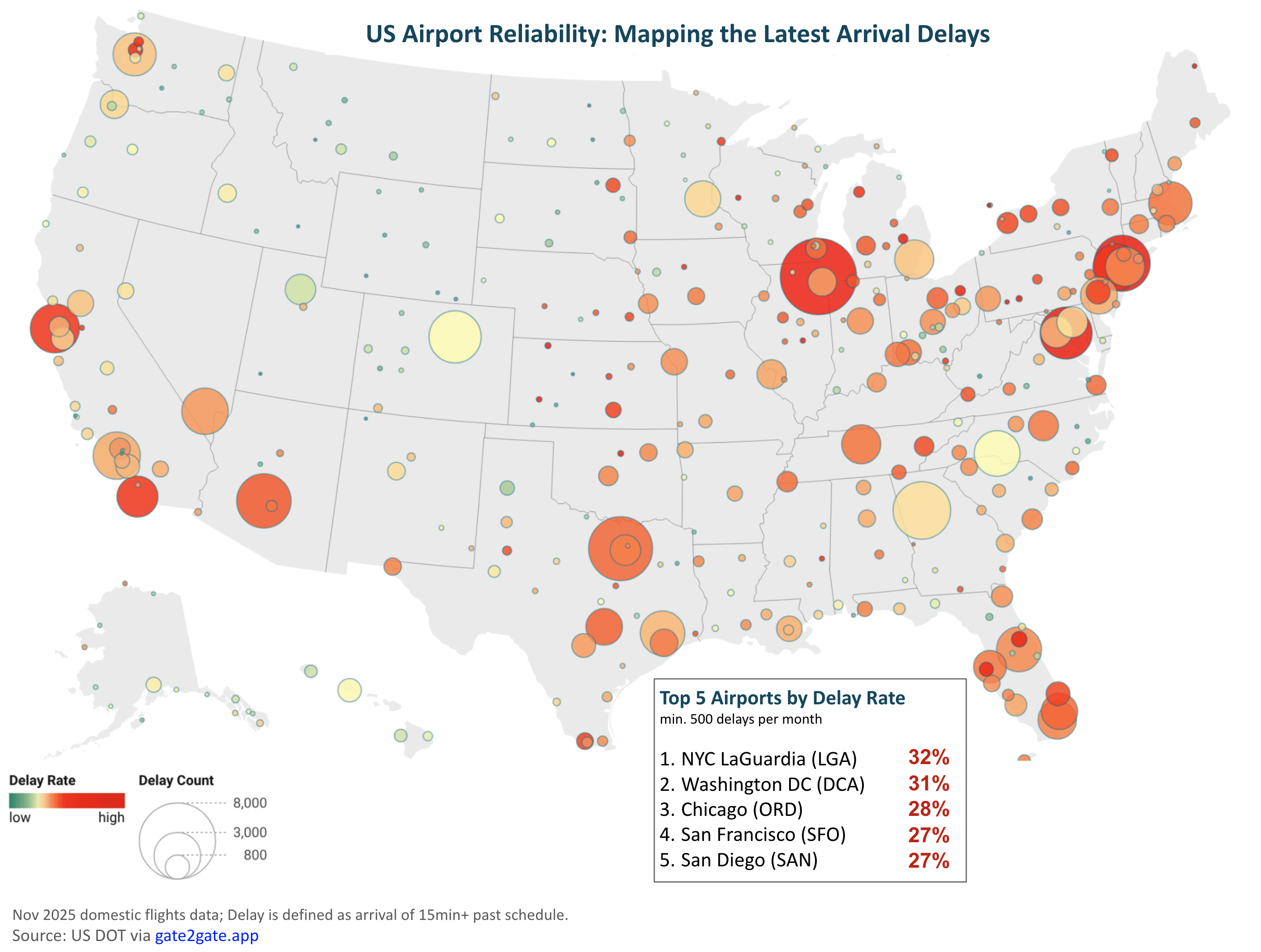
- The "Triangle of Pain" is Real: If you are flying into the Northeast, the odds are stacked against you. LGA (32%), DCA (31%), and EWR (27%) are effectively a Bermuda Triangle for on-time arrivals. Roughly 1 in 3 flights failed to arrive on schedule.
- The "Midwest Hub" Disparity: Despite sharing similar geography and winter weather risks, Chicago (ORD) had a 28% delay rate, while Detroit (DTW) and Minneapolis (MSP) sat at 18% and 17%. If you have a choice of layover hubs in the north, avoid Chicago.
- The Best Major Hub isn't where you think: While huge hubs often get a bad rap, Salt Lake City (SLC) is arguably the most reliable major connection point in the US right now, with only a 13% delay rate. Even Atlanta (ATL), the busiest airport in the world, maintained an impressive 16% delay rate, outperforming much smaller airports.
- The "Budget Airport" Trap: Orlando Sanford (SFB), often used by budget travelers to avoid the main MCO airport, actually had one of the highest delay rate in the entire dataset at 34%. You might save money on the ticket, but you pay for it in time.
- California Dreaming vs. Reality: There is a massive reliability gap between San Francisco (SFO) at 27% and Los Angeles (LAX) at 19%. If you are connecting on the West Coast, going south avoids the "marine layer" delays common at SFO.
Bonus fact: Despite large hubs often criticized for delays, Atlanta (ATL) and Charlotte (CLT) were surprisingly neck-and-neck (16% vs 15%). They both outperformed smaller, less complex airports like Nashville (BNA) and Raleigh-Durham (RDU), proving that the biggest hubs aren't always the biggest bottlenecks.
Posted by gimigriy
28 Comments
Did you factor how many flights go into each airport into this? My thought being if I’ve got a higher chance of delay going into ORD, but lots of flight options out of there, I might be better off than if I fly into a “safer” airport that gets better on-time numbers because it doesn’t have the same volume of flights.
Looks like many of the delay heavy hitters are AA hubs…
The over-use of bold in your post body is a legibility nightmare. You’re drawing eyes all over the body for zero gain in information processing and it makes it look like you had AI summarize your post with zero regard for the people who might actually consume the information.
appropriate use of font size, color scale, bubble size, and a relevant highlights box? you spoil us
That bonus fact seems backwards based on your map. Charlotte is a yellow-ish circle, Atlanta is orange-ish.
From a data viz perspective there is a lot to improve here.
The size of the dots is the most overwhelming detail and given it’s just a count it mostly tracks with the size of the airport.
With the exception of Salt Lake being green and O’Hare being red the color really tells me little due to the color map changing over such a narrow range and there being no % scale with it for reference. Not to mention it’s in the worst color scale for color blind folks. Yet that is the most important statistic you are trying to convey.
I went to the app and couldn’t easily find this map (seems like it should be front and center).
Cool concept but needs some tweaks for it to be a reasonable data visualization.
I don’t want to nitpick but plugging your own website isn’t a data source. Why don’t you reference the actual FAA dataset where the numbers are publicly available
SAN gets a pass for having only 1 runway and the demand being high. I can see why AS pulled out of SFO and starting to add more routes to SAN, WN is better competition in my opinion… It also doesn’t help that T1 is being expanded in the coming years, so more gates!!
I don’t agree:
Wouldn’t it be the case that delays in other places will necessarily influence on-time arrivals and departures at a major connecting airports in the first place? Seems like this would be the first potential bias in the data — and you have to consider time frame, which I believe would introduce another issue! Here’s an example: two major snowstorms hit the Chicago area this past November 2025, which is the month you used for the analysis. It was one of the snowiest Novembers the area has ever seen. All the small regional airports around that feed into O’Hare had problems for days moving planes properly. You can’t make generalized conclusions about airports from these data alone.
I live in the upper Midwest. I have 3 choices to connect: MSP, DTW, ORD. I try to avoid ORD like the plague. MSP, DTW are so much better.
How is EWR not top 5? Not saying the data is wrong or anything just very surprised it’s not top 5
The San Diego delays are 99%+ of the time in the morning due to fog, after like 10am it’s no problem at all
I’m absolutely shocked that DFW isn’t ranked 1. I don’t think I’ve ever gotten out on time and I’ve flown through there at least 15 times
Is this arrival delays for outgoing flights? Meaning, if you fly out of ORD, you have a high chance of not arriving to your next airport on time?
I’ve never had a flight delayed out of SLC. Mormons are punctual.
what airlines have the highest rates?
“Biggest gambles” is dramatic rhetoric.
I live in Alaska and people are often like “aren’t your flights delayed a lot due to weather?” and the answer is “not really”. It does happen, but way less often than at ORD
The O’Hare bubble looks larger than the LGA or DCA bubbles, but are 28, 32 and 32 %, respectively. Is something incorrect.
I loathe O’Hare!
Lmao love how you have SUO as an airport. There’s no scheduled air service there, it’s all medevac. Glad they’re meeting their filed departure times though
LGA continuing to do LGA things
I’m still mad Spirit outright canceled a return flight to DTW on me and my family and said they had no alternative options available, we had to drive the whole way back
SFB… yeah lol, one Allegiant plane getting delayed means 8 flights downstream for the next 3 days are also delayed now, if not outright cancelled. And this is on top of the daily summertime storms that shut down the airport for 30 minutes at a time. Have fun!
It looks to me that you’ve visualized on time performance per airline. MDW shows Southwest’s OTP, ATL shows Delta’s.
San Diego only having one run way…expected
Any time I see LaGuardia at the top of a “bad airports” metrics list, it just makes me think of Auntie Orphan Annie, and throw my hands up and say “de Blasio”.
I suspect airline-level decisions have a big impact on this data. Three of the airports you called out for their good performance are Delta hubs: ATL, DTW, and MSP. Common wisdom seems to be that Delta pads out its schedules pretty generously, making an “on-time” arrival easier to achieve.
As a personal anecdote, I was on a Delta flight last year that landed 30 minutes early… and then set on the tarmac for 30 minutes while we waited for the gate free up.
So while it’s good to be confident if you need to make a tight connection, don’t put too much stock in “on-time” arrivals when the airlines get to decide what counts as “on-time”
DCA is not surprising. Since the incident there, it seems like there are more delays (I’m assuming due to a bigger focus on safety).
Another population distribution map!