
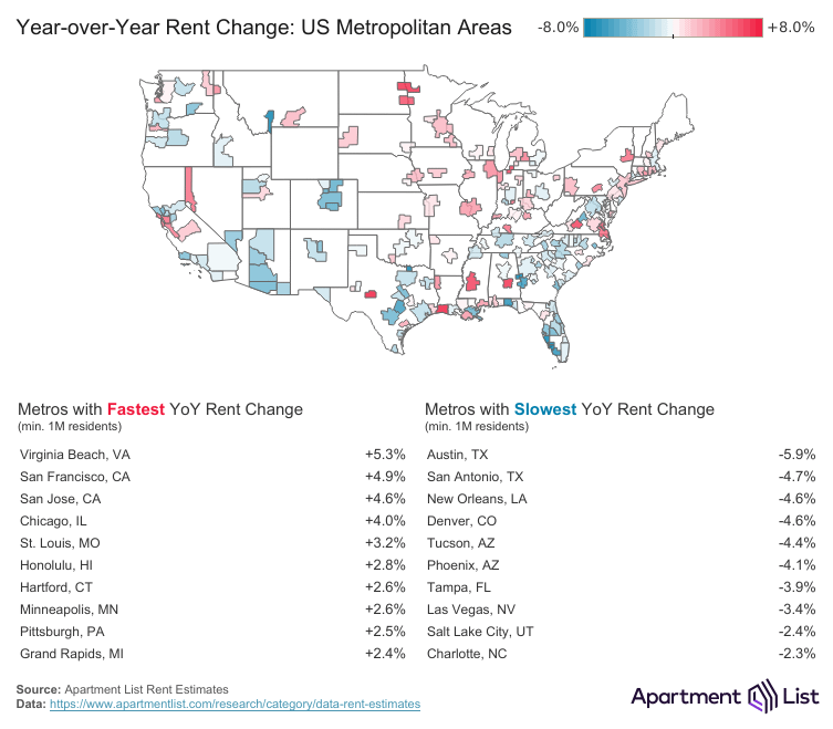
Year-over-year rent changes across U.S. metro areas, showing where prices are heating up and where they're cooling off (hence the red and blue)
Rent is down across much of the Sun Belt region, with Austin having the sharpest drop among large metros. Virginia Beach saw the fastest rent growth, with San Francisco coming in second.
Source + interactive map: https://www.apartmentlist.com/research/national-rent-data
\reposted to fix wording and add context*
Posted by Apartment_List
7 Comments
Would be interesting to see how this compares against “migration” or at least population of adults.
I think it would be better as highest and lowest, because otherwise going down 5% is technically just as fast as going up 5%.
I lived in Grand Rapids years ago. I can’t imagine what the rental market looks like there right now because it was pretty bad when I was there.
The Bay Area just continues to get more insane.
Just off the top of my head, Toledo, Ohio is included in this map and the MSA has far fewer than 1M residents. Cleveland and Buffalo are not included and they clearly meet the population criteria.
Probably increases correspond exactly to their property tax increases. Thank your “elected officials” for their tax and spend and tax and spend with no input from their constituents.
Lol and people were jumping into real estate deals in Texas banking on 20% rent growth. It was so obviously going to pop given all of the new supply. Likely still has further to fall.