
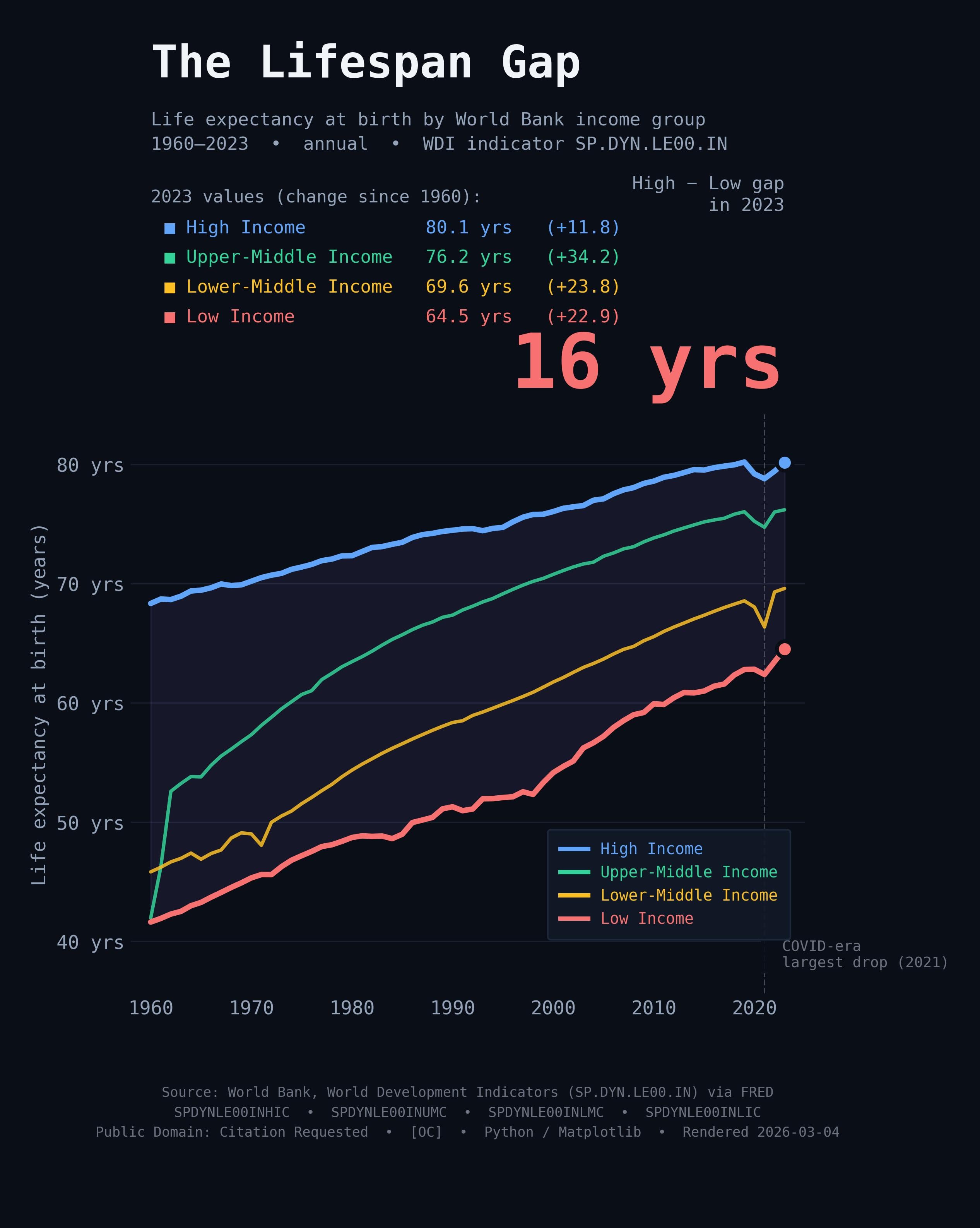
![[OC] Life expectancy gap between high and low income countries: 27 years in 1960, still 16 years in 2023. Low income nations gained +23 years. High income gained +12.](https://www.byteseu.com/wp-content/uploads/2026/03/c5xytpvyazmg1-1226x1536.jpeg "[OC] Life expectancy gap between high and low income countries: 27 years in 1960, still 16 years in 2023. Low income nations gained +23 years. High income gained +12.")
here's the methodology and sources so we're all on the same page:
Four World Bank income-group series (life expectancy at birth) pulled
live from FRED at render time. Zero hand-entered numbers.
Series (annual, 1960–2023, not seasonally adjusted):
• SPDYNLE00INHIC — High Income
• SPDYNLE00INUMC — Upper-Middle Income
• SPDYNLE00INLMC — Lower-Middle Income
• SPDYNLE00INLIC — Low Income
The shaded band is the gap between High and Low income groups.
The dashed line marks the largest single-year drop in the cross-group average (data-driven, not manually placed).
Caveats:
• These are World Bank income-group aggregates — countries move between
groups over time, so group composition is not static.
• Within-group variation is large (e.g. not all "Low Income" countries
are the same).
• Life expectancy at birth is a period measure; it reflects current
mortality rates, not a prediction of actual lifespan for anyone born today.
Sources (Public Domain — Citation Requested):
https://fred.stlouisfed.org/series/SPDYNLE00INHIC
https://fred.stlouisfed.org/series/SPDYNLE00INUMC
https://fred.stlouisfed.org/series/SPDYNLE00INLMC
https://fred.stlouisfed.org/series/SPDYNLE00INLIC
Posted by godot_lover
4 Comments
interesting. kinda feels like the “cheap wins” in public health already happened – vaccines, sanitation etc
Always good to see things are continuing to improve. Personally I’m glad even high-income expectancy is increasing, it means we haven’t hit a plateau yet.
Yes, well, the “low income” countries are the likes of Haiti, Niger, Sudan, Yemen, etc. It is surprising is that they managed to reach even these levels.
https://preview.redd.it/d5eg9x7tlzmg1.jpeg?width=1080&format=pjpg&auto=webp&s=1094591cac201988fed13d54f63356c26bed40ef
What happened in the 60s to cause a massive jump for upper middle income countries and only those countries?