
**The data**
All data comes from Jeff Sackmann's Tennis Abstract project:
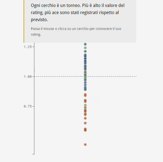
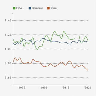
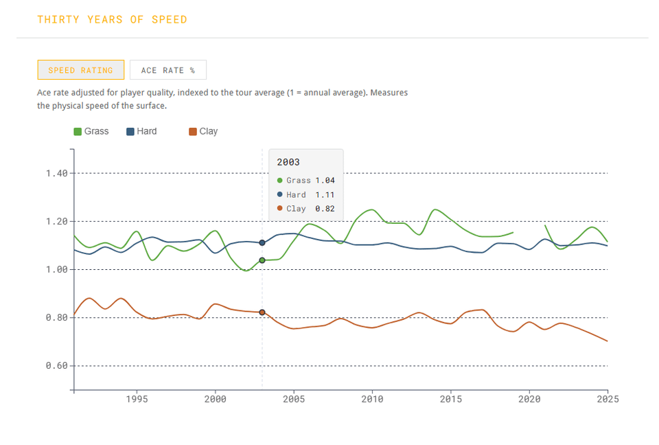
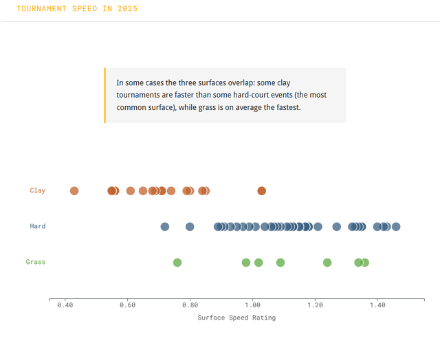
– **Surface Speed Ratings** (1991–2025): scraped year by year from tennisabstract.com. The metric uses ace rate adjusted for server/returner quality, indexed to each year's tour average. 1.0 = average surface, 1.25 = 25% more aces than expected.
– **Rally length** (1990–2024): aggregated from the Match Charting Project, a crowdsourced shot-by-shot dataset of ~9,700 professional matches. Rally length is computed as a weighted average across shot-length buckets per match, then aggregated by year and surface. Dot size = number of charted matches.
**The visuals**
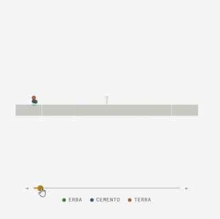
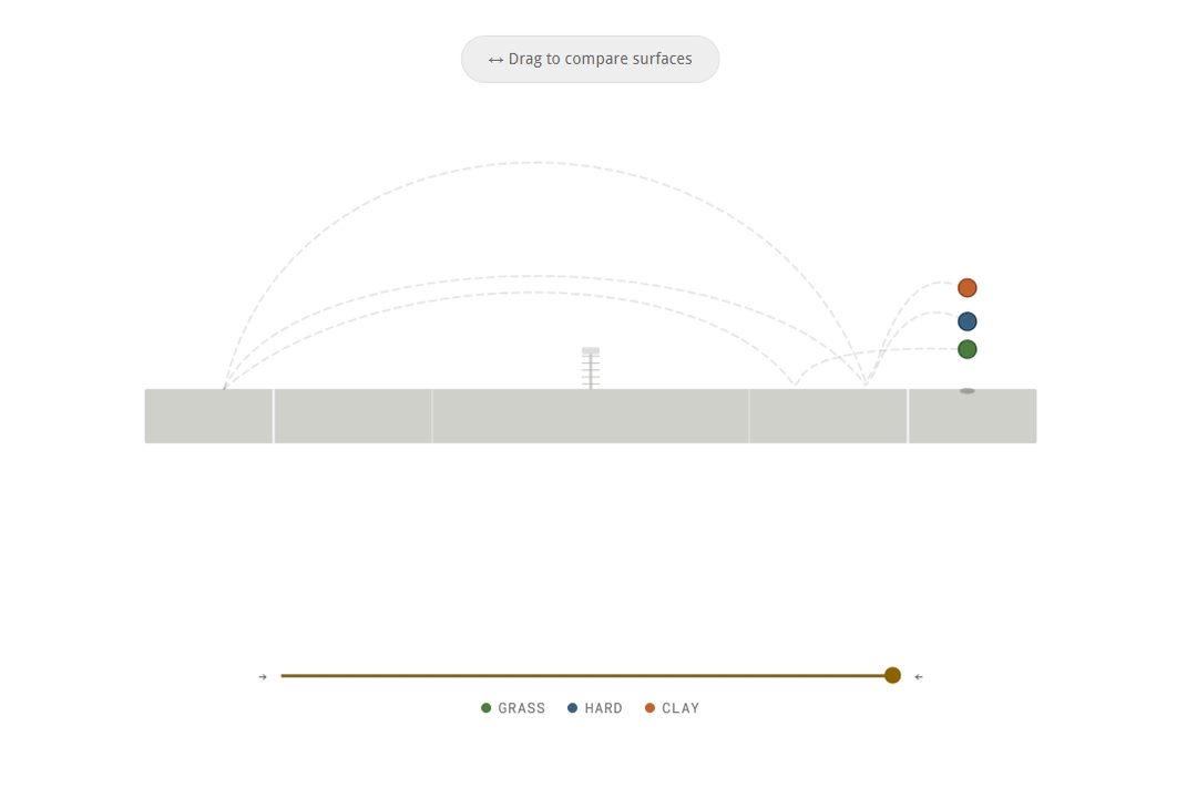
– Bounce animations: SVG with hand-tuned cubic Bézier curves, one per surface, scroll-driven
– Dot plot: D3, flat → categorized transition on scroll
– Line chart (speed rating): D3 with toggle between speed rating and raw ace rate
– Rally trend: D3 line chart with proportional dot sizing
**Stack**
SvelteKit + Svelte 5, D3.js, deployed on GitHub Pages.
**Links**
Article: https://daniloderosa.github.io/tennis_surface_speed/
Code: https://github.com/daniloderosa/tennis_surface_speed
Data source: https://www.tennisabstract.com and https://github.com/JeffSackmann/tennis_MatchChartingProject
Posted by DataNilo96