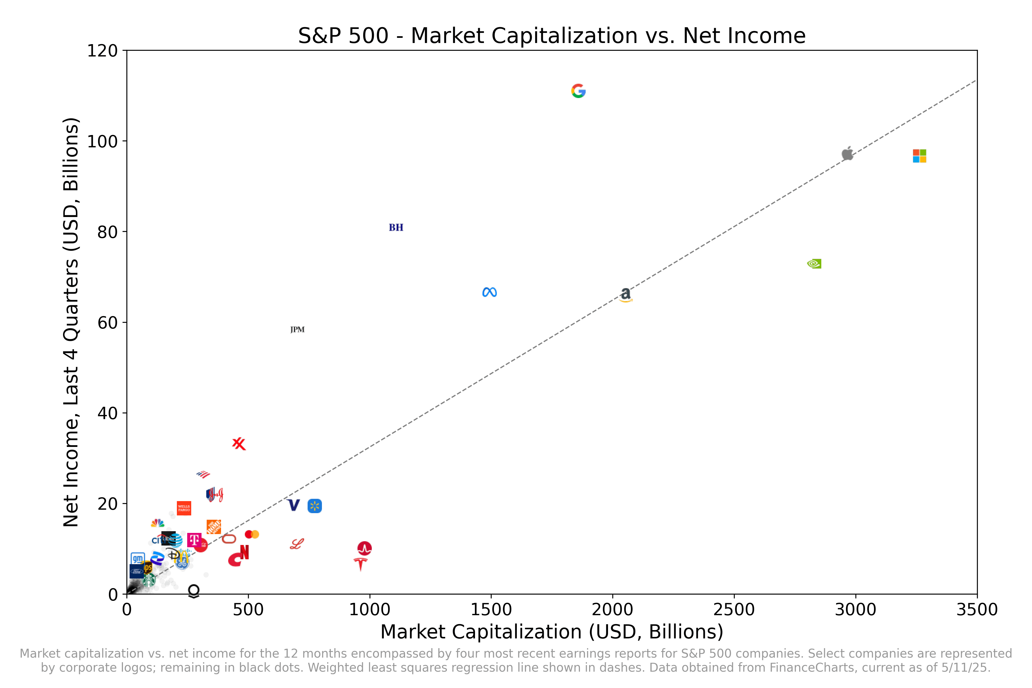
* Data from [FinanceCharts](https://www.financecharts.com/screener/sp-500).
* Each company is represented by a black dot, except for select companies represented by a corporate logo.
* Top 17 companies by market cap included, including all of the “Magnificent Seven”
* Additional companies include outliers in terms of extremely high PE, extremely low PE, or just represent iconic American companies whose logos would be easily recognizable
* I couldn’t include other companies on this plot because it got too cramped–they were too close to other companies which had logos of a similar color scheme.
* Note that companies that have yet to report this quarter include NVDA, AVGO, WMT, and COST. Their net income will likely look much more favorable if I were to update this in a month.
* Graphs generated using Python matplotlib
-Sliced- on
This means that the market is predicting more growth ahead to companies like Microsoft and Tesla vs Google for example.
Personally, I think that the market is wrong here, but we’ll see.
kavithatk on
I really don’t understand the unpopularity of Google. That P/E is insane.
yttropolis on
Two things:
1. This just seems like a more complicated way to present P/E ratio.
2. Log scale probably makes more sense for both axes, as stock prices are generally modeled as geometric BM and you’d want to preserve the linearity of static P/E values.
OttawaExpat on
If you flip the axes, the slope is P/E
turb0_encapsulator on
what’s next to Tesla? At first I thought it was Lululemon, but that can’t be right.
Cultural_Dust on
This also seems like a small lesson in branding and a quality logo too.

![[OC] S&P 500 - Market Capitalization vs. Net Income](https://www.byteseu.com/wp-content/uploads/2025/05/n5h43saog80f1-1536x1024.png "[OC] S&P 500 – Market Capitalization vs. Net Income")
7 Comments
* Data from [FinanceCharts](https://www.financecharts.com/screener/sp-500).
* Each company is represented by a black dot, except for select companies represented by a corporate logo.
* Top 17 companies by market cap included, including all of the “Magnificent Seven”
* Additional companies include outliers in terms of extremely high PE, extremely low PE, or just represent iconic American companies whose logos would be easily recognizable
* I couldn’t include other companies on this plot because it got too cramped–they were too close to other companies which had logos of a similar color scheme.
* Note that companies that have yet to report this quarter include NVDA, AVGO, WMT, and COST. Their net income will likely look much more favorable if I were to update this in a month.
* Graphs generated using Python matplotlib
This means that the market is predicting more growth ahead to companies like Microsoft and Tesla vs Google for example.
Personally, I think that the market is wrong here, but we’ll see.
I really don’t understand the unpopularity of Google. That P/E is insane.
Two things:
1. This just seems like a more complicated way to present P/E ratio.
2. Log scale probably makes more sense for both axes, as stock prices are generally modeled as geometric BM and you’d want to preserve the linearity of static P/E values.
If you flip the axes, the slope is P/E
what’s next to Tesla? At first I thought it was Lululemon, but that can’t be right.
This also seems like a small lesson in branding and a quality logo too.