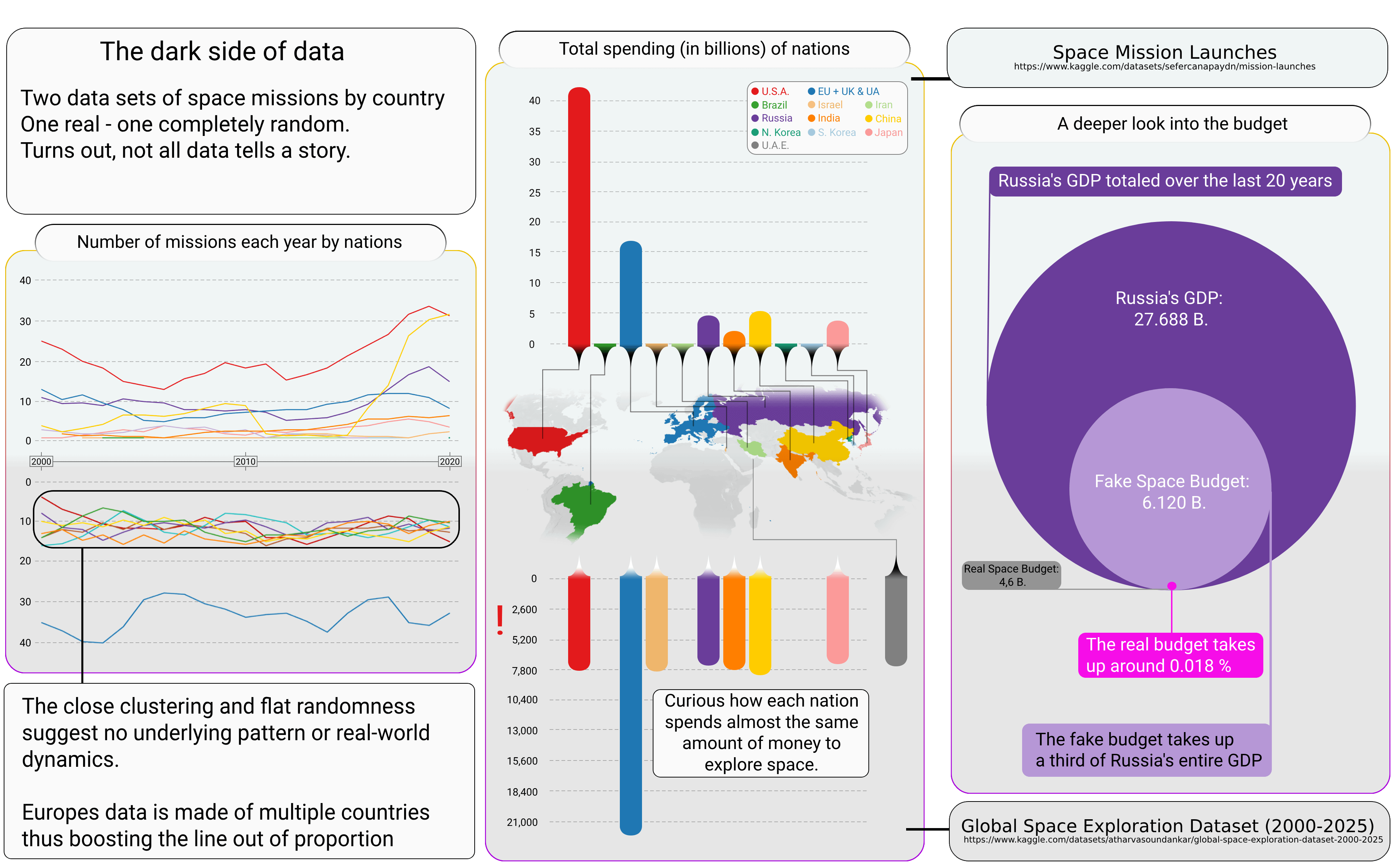
Share Facebook Twitter LinkedIn Pinterest Bluesky Threads [OC] Real vs Synthetic data for Space Missions Posted by Gloomy_Raccoon_Turd
dirtyword on May 13, 2025 4:34 pm This looks interesting but I feel like I’m missing some key context. Namely, what are you talking about?
Gloomy_Raccoon_Turd on May 13, 2025 4:36 pm The datasets both come from [Kaggle.com](http://Kaggle.com) Real: [https://www.kaggle.com/datasets/sefercanapaydn/mission-launches](https://www.kaggle.com/datasets/sefercanapaydn/mission-launches) Synthetic: [https://www.kaggle.com/datasets/atharvasoundankar/global-space-exploration-dataset-2000-2025/discussion?sort=hotness](https://www.kaggle.com/datasets/atharvasoundankar/global-space-exploration-dataset-2000-2025/discussion?sort=hotness) Tools used: Photopea, Tableau and Python
letmepoint on May 13, 2025 4:42 pm Where are your goddamn vertical axes labels? What is the difference between the graphs on the top and bottom in the left hand side?
jaden530 on May 13, 2025 9:38 pm I can’t tell which is the fake and which is the real. Also what is the spending? Is that $7,800? 7.8 billion? What am I looking at? What’s the reason for the fake data even?

![[OC] Real vs Synthetic data for Space Missions](https://www.byteseu.com/wp-content/uploads/2025/05/xdd3dog7sk0f1-1536x952.png "[OC] Real vs Synthetic data for Space Missions")
6 Comments
This looks interesting but I feel like I’m missing some key context. Namely, what are you talking about?
The datasets both come from [Kaggle.com](http://Kaggle.com)
Real:
[https://www.kaggle.com/datasets/sefercanapaydn/mission-launches](https://www.kaggle.com/datasets/sefercanapaydn/mission-launches)
Synthetic:
[https://www.kaggle.com/datasets/atharvasoundankar/global-space-exploration-dataset-2000-2025/discussion?sort=hotness](https://www.kaggle.com/datasets/atharvasoundankar/global-space-exploration-dataset-2000-2025/discussion?sort=hotness)
Tools used: Photopea, Tableau and Python
Where are your goddamn vertical axes labels? What is the difference between the graphs on the top and bottom in the left hand side?
I’m a bit confused, what do some of the axes mean?
Bro this is incomprehensible.
I can’t tell which is the fake and which is the real. Also what is the spending? Is that $7,800? 7.8 billion? What am I looking at?
What’s the reason for the fake data even?