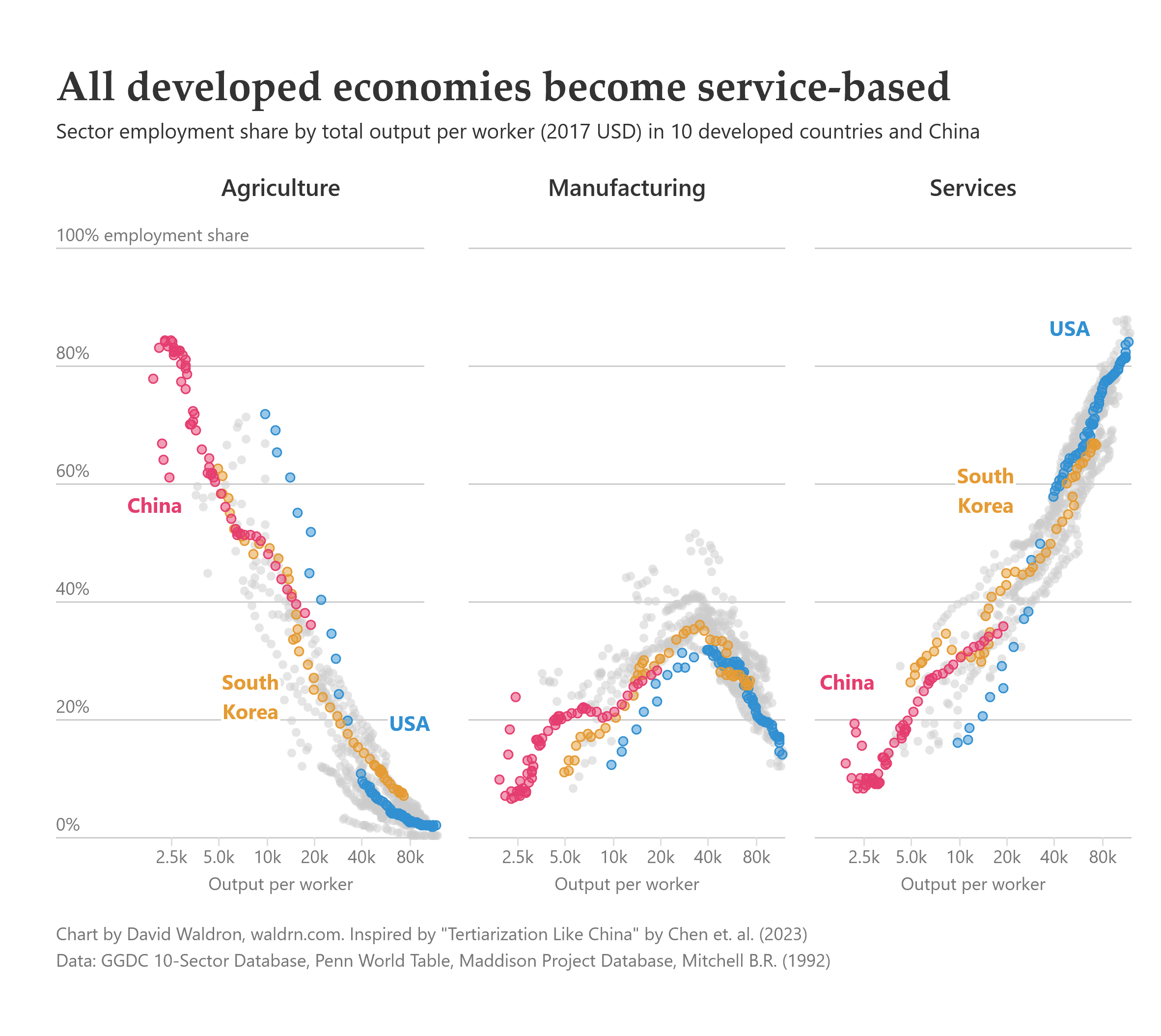
The chart is partly an adaptation and replication of Figure 1 in this article, [“Tertiarization Like China”](https://www.annualreviews.org/content/journals/10.1146/annurev-economics-071122-030026). It shows the common evolution of economic development in OECD countries and China, beginning as agricultural economies, industrializing, then ultimately becoming service-based (tertiarization).
The data is from a variety of sources, all of which are linked in the [R script](https://github.com/dawaldron/tertiarization) that reads and summarizes the data. Charts are made with d3.js.
Longjumping-Bake-557 on
Watch the US try and do a 180 for the next 4 years
khalamar on
I don’t get it. Those are not timelines, they just show that a majority of people working in agriculture produce low value (and by that I mean the price of what they sell, not that they slack or produce shit), while for services most people produce high value. That’s quite expected, there’s no indication of a shift between one sector to another.
K1lgoreTr0ut on
I’d love for someone to study what to do with people who aren’t intellectually suited for a service economy. Failure to answer this question causes political instability.
feldhammer on
Why does USA have multiple blue points per chart but it’s not a time series?

![Developed economies de-industrialize and become dominated by the services sector [OC]](https://www.byteseu.com/wp-content/uploads/2025/05/r0ixhmjp2x1f1-1536x1370.png "Developed economies de-industrialize and become dominated by the services sector [OC]")
6 Comments
[Complete blog post here](https://blog.waldrn.com/p/what-happened-to-american-manufacturing)
The chart is partly an adaptation and replication of Figure 1 in this article, [“Tertiarization Like China”](https://www.annualreviews.org/content/journals/10.1146/annurev-economics-071122-030026). It shows the common evolution of economic development in OECD countries and China, beginning as agricultural economies, industrializing, then ultimately becoming service-based (tertiarization).
The data is from a variety of sources, all of which are linked in the [R script](https://github.com/dawaldron/tertiarization) that reads and summarizes the data. Charts are made with d3.js.
Watch the US try and do a 180 for the next 4 years
I don’t get it. Those are not timelines, they just show that a majority of people working in agriculture produce low value (and by that I mean the price of what they sell, not that they slack or produce shit), while for services most people produce high value. That’s quite expected, there’s no indication of a shift between one sector to another.
I’d love for someone to study what to do with people who aren’t intellectually suited for a service economy. Failure to answer this question causes political instability.
Why does USA have multiple blue points per chart but it’s not a time series?
Finally a beautiful graph on r/dataisbeautiful