
![North Carolina: Newly Registered 18-44 Dems turned out 25 points Higher than Previously Registered [OC]](https://www.byteseu.com/wp-content/uploads/2025/06/wuftjik8s45f1-1024x819.jpg "North Carolina: Newly Registered 18-44 Dems turned out 25 points Higher than Previously Registered [OC]")
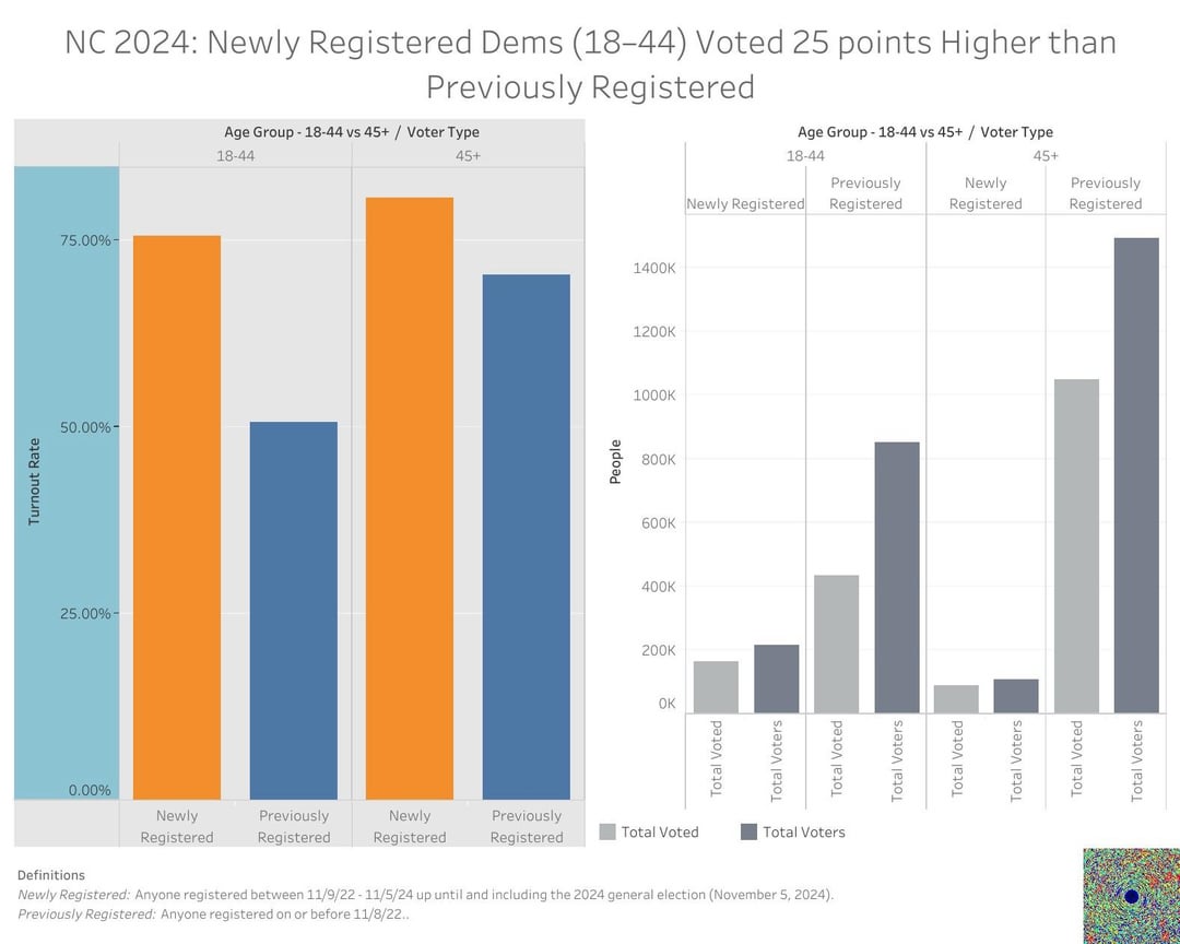
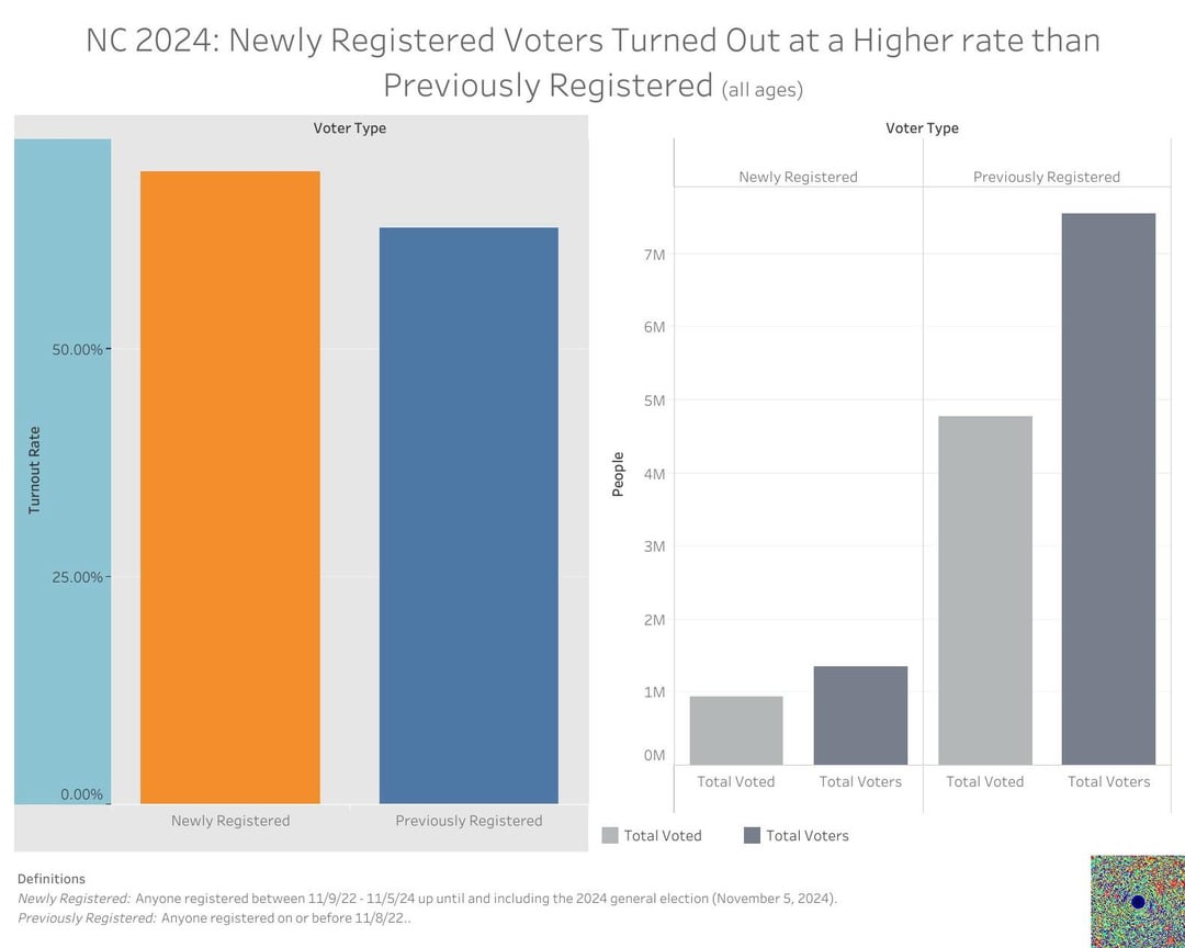
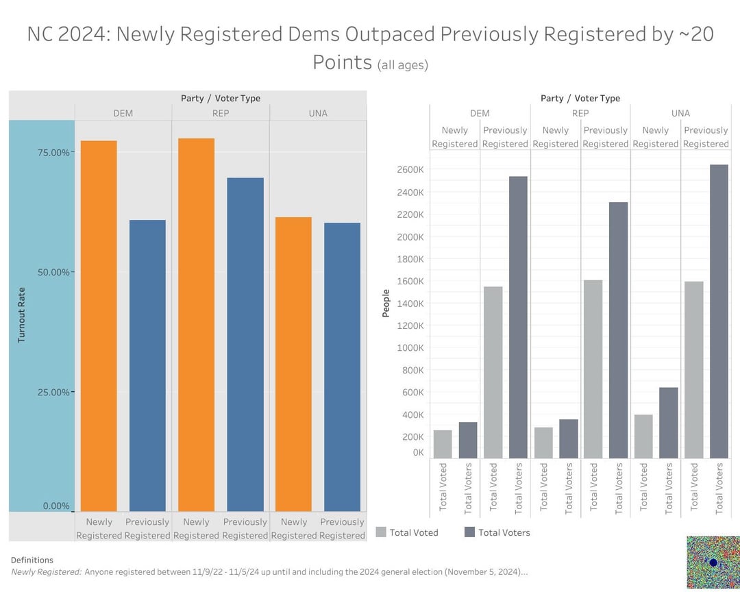
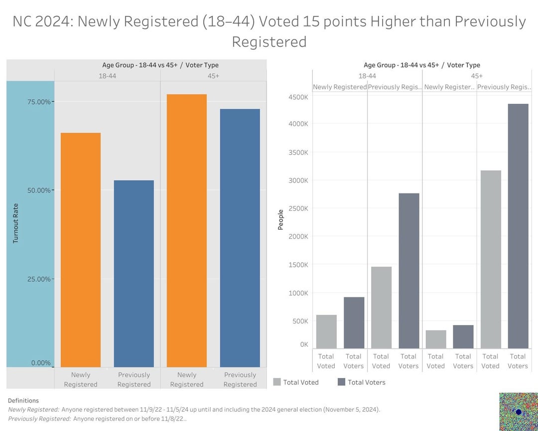
I built these charts to show how “new‐reg” North Carolina voters (anyone who registered between 11/9/22 and 11/5/24) turned out at significantly higher rates than voters who were already on the rolls. Key takeaways:
• All Ages (All Parties): Newly registered voters cast ballots at roughly 69 % vs. 63 % for previously registered—an overall lift of ~6 points.
• Democrats (18–44): New‐reg Dems (18–44) turned out at ~77 %, compared to 50 % for their previously registered peers—a 25 point jump. Even Dems 45+ saw a ~10 point lift.
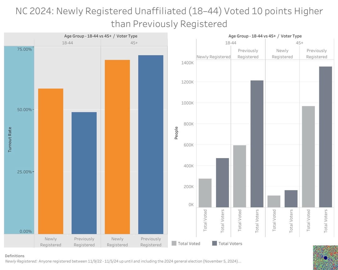
• Unaffiliated (18–44): Among Independents ages 18–44, new regs came in at 58 % vs. 48 %—a 10 point increase.
• Overall Party Comparison: New‐reg Democrats outvoted new‐reg Republicans and Unaffiliated across both age groups, suggesting a huge youth‐driven mobilization for the left.
My hope is that these visuals spark a conversation about why the Democrats refuse to spend a large amount of money of voter registration and rely on Extremely Poorly funded outside orgs for new voter registration.
Instead Democrats spend money on persuading a relatively slim number of voters rather than trying to register the 40,000,000 more unregistered Americans than undecideds.
In the coming days, I will be releasing more data about this topic and include other states.
———————
Data Source: North Carolina voter list take from NC Secretary of State
Big thanks to u/vintagegold and the rest of the team for cleaning n piping the data! Couldn’t have done this without yall!
Register to vote: https://vote.gov
——————
Contact your reps:
Senate: https://www.senate.gov/senators/senators-contact.htm?Class=1
House of Representatives: https://contactrepresentatives.org/
Posted by sillychillly
11 Comments
North Carolina: Newly Registered 18-44 Dems turned out 25 points Higher than Previously Registered [OC]
I built these charts to show how “new‐reg” North Carolina voters (anyone who registered between 11/9/22 and 11/5/24) turned out at significantly higher rates than voters who were already on the rolls. Key takeaways:
• All Ages (All Parties): Newly registered voters cast ballots at roughly 69 % vs. 63 % for previously registered—an overall lift of ~6 points.
• Democrats (18–44): New‐reg Dems (18–44) turned out at ~77 %, compared to 50 % for their previously registered peers—a 25 point jump. Even Dems 45+ saw a ~10 point lift.
• Unaffiliated (18–44): Among Independents ages 18–44, new regs came in at 58 % vs. 48 %—a 10 point increase.
• Overall Party Comparison: New‐reg Democrats outvoted new‐reg Republicans and Unaffiliated across both age groups, suggesting a huge youth‐driven mobilization for the left.
My hope is that these visuals spark a conversation about why the Democrats refuse to spend a large amount of money of voter registration and rely on Extremely Poorly funded outside orgs for new voter registration.
Instead Democrats spend money on persuading a relatively slim number of voters rather than trying to register the 40,000,000 more unregistered Americans than undecideds.
In the coming days, I will be releasing more data about this topic and include other states.
———————
Data Source: North Carolina voter list take from NC Secretary of State
Viz Tool: Tableau
Big thanks to u/vintagegold and the rest of the team for cleaning n piping the data! Couldn’t have done this without yall!
____________
Register to vote: https://vote.gov
——————
Contact your reps:
Senate: https://www.senate.gov/senators/senators-contact.htm?Class=1
House of Representatives: https://contactrepresentatives.org/
I’m not gonna lie these charts are not very intuitive and hard to navigate/decipher. Great to hear the result though.
These graphs are hideous. Why is the scale on the left graph thicker than the bars? And why would you graph a percentage and not have the top of the scale be 100%? For the right side, there has to be a better way to represent the data. Maybe stacking the bars or only graphing the Delta between registered and actual voters?
Wouldn’t this naturally be the case since someone who puts in the effort to get registered to vote is just very likely to vote in the next big election compared to someone who didn’t?
Is there the same data for the Republican voters? It would be interesting to compare
I do want to preface this by saying I think this is an interesting idea for data to analyze for a topic to discuss. However, I have questions about the approach being taken.
>My hope is that these visuals spark a conversation about why the Democrats refuse to spend a large amount of money of voter registration and rely on Extremely Poorly funded outside orgs for new voter registration.
I cannot caution strongly enough against drawing conclusions and making recommendations based on a single election cycle. N=1 is an anecdote.
And you seem to be *assuming* that new voters turned out at a higher rate than previously registered voters just because they were new. Is this data showing that newly registered voters are more likely to vote because they’re new, or is it showing that people who are highly motivated to vote are more likely to register? Or is it showing the consequences of some states making it harder to register and vote while other states lowered those barriers? Or is this too limited a dataset to tell?
How much does new voter registration correlate to improved performance on election day? Is there a difference between “never registered before” versus someone registering because they moved? Are moves within the state counted the same as moves from out of state? How are registrations counted if someone changes party registration or changes address within the same town/county?
How do these trend over time? Does every year show new registrants turn out at higher rates than previously registered, and how consistent is that increase? Does this effect hold up during years with no presidential election?
Add to that the charts are a bit confusing to read and feel very intended to “make a point” rather than visualize the data. Why are the scales bigger than the data? Why is the Y axis colored different from anything else, and only on one of the two charts per slide? Why are the titles inconsistent (“Newly registered voters turned out at a higher rate than…” vs “Newly registered dems outpaced… (never says the metric)”)?
Also, and this may be a matter of taste, why are your chart titles conclusions rather than, y’know, titles? Let the data speak for itself, and write your conclusions in the text. How can it be beautiful data if you’re unsure we’ll interpret it correctly without the conclusion as the title?
Edit: Fixed a few words and clarified some verbiage
“Unaffiliated” in North Carolina doesn’t mean independent.
People in NC register as Unaffiliated so that they can choose which party’s primary they want to vote in.
https://www.ncsbe.gov/registering/choosing-your-party-affiliation
> A voter may choose one political party or can decide not to register with a political party. If a voter does not register with a political party, the voter will be registered as unaffiliated.
>
>In a partisan primary, voters affiliated with a political party may only vote their party’s ballot and may not vote in another party’s primary. For example, a registered Republican may only vote in the Republican Party primary. This remains true even if the party you are affiliated with does not have a primary.
>
>Unaffiliated voters may choose any one political party’s ballot or a nonpartisan ballot (if available) in a primary election.
But Dems still lost by a larger margin in 2024?
Could you break this out by county?
Bar charts aren’t beautiful
These charts alone are interesting, but they’re only one part of the rest of your message. When it comes to where campaigns should deploy recourses or focus their message, the marginal utility of a dollar/volunteer hour spent on each method, the difference in efficacy of different methods, the specific groups targeted by different types of messages (do campaigns actually age to choose between targeting swing voters vs non voters?), and the overall message efficacy would also be relevant to see.
For example, a larger percentage of newly registered democrats voting in comparison to newly registered republicans could be used to argue that Harris having much better ground game than trump was useful even if she didn’t win the state. It certainly would be one extra data point in the ongoing conversation about whether Harris doing better on average in swing states is due to effective campaigning/ground game.