
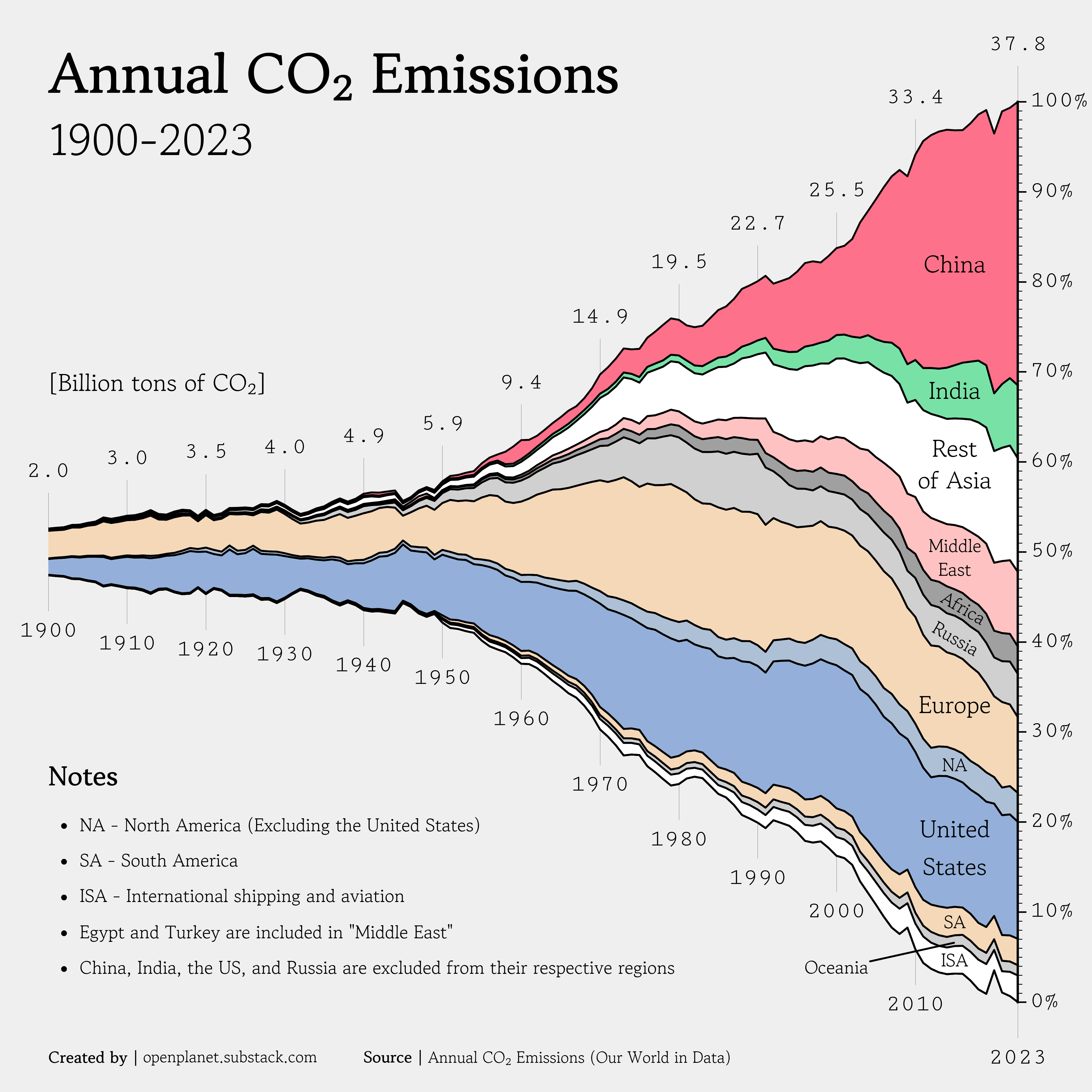
![[OC] Annual CO₂ emissions between 1900 and 2023](https://www.byteseu.com/wp-content/uploads/2025/06/lw5j3ok0tv5f1-1536x1536.png "[OC] Annual CO₂ emissions between 1900 and 2023")
Data source: Annual CO₂ emissions (Our World in Data)
Tools used: Matplotib
Yesterday, I got some fantastic feedback when I posted a simple chart showing coal production. One comment added a chart with the same style as the one above to show how I could better display the information. So, I decided to create a new chart, but with CO2 emissions instead.
It's always tricky to create good regions that avoid double-counting. In this chart I've separated the four largest emitters (China, India, the US, and Russia) from their respective regions.
I've also extracted the Middle Eastern countries as a separate regions and removed their values from "Rest of Asia", "Africa", and "Europe" for the relevant countries. The Middle East doesn't exist in the original data, only from a different source.
Appreciat all feedback I can get.
Posted by oscarleo0
8 Comments
Why is all the historical data centered around the 50% mark?
Not using per capita is extremely bias.
Her … yiyip dünyanın sorunuymuş gibi genelleme yayın yapıyorlar. Ulan … dünyanın başına bela sizsiniz.
Because it’s hard to tell in charts like this, US CO2 emissions have been declining since 2007.
Since 2007 US emissions have decreased ~21%. During those same 18 years the population increased over 13%.
So from a per capita basis we’ve decreased by closer to 30% in the last 18 years.
Please make a per-capita version
When the whole class behaves and improves but one person doesn’t and fucks the whole class
Is there any data on how much of Chinese emissions is for goods made for western countries?
That’s always what I think when I see these charts. It makes China look bad and western countries look good, eventhought part of Chinese transmissions is because of outsourced western manufacturing.
Nice chart nice colours. No notes.
We’re so used to seeing stacked numbers only go in one direct with zero at the bottom of the y-axis. I actually feel like this (your version) is more intuitive to look at because both sides of each country are expanded over time. Is there a name for this type of stacking?