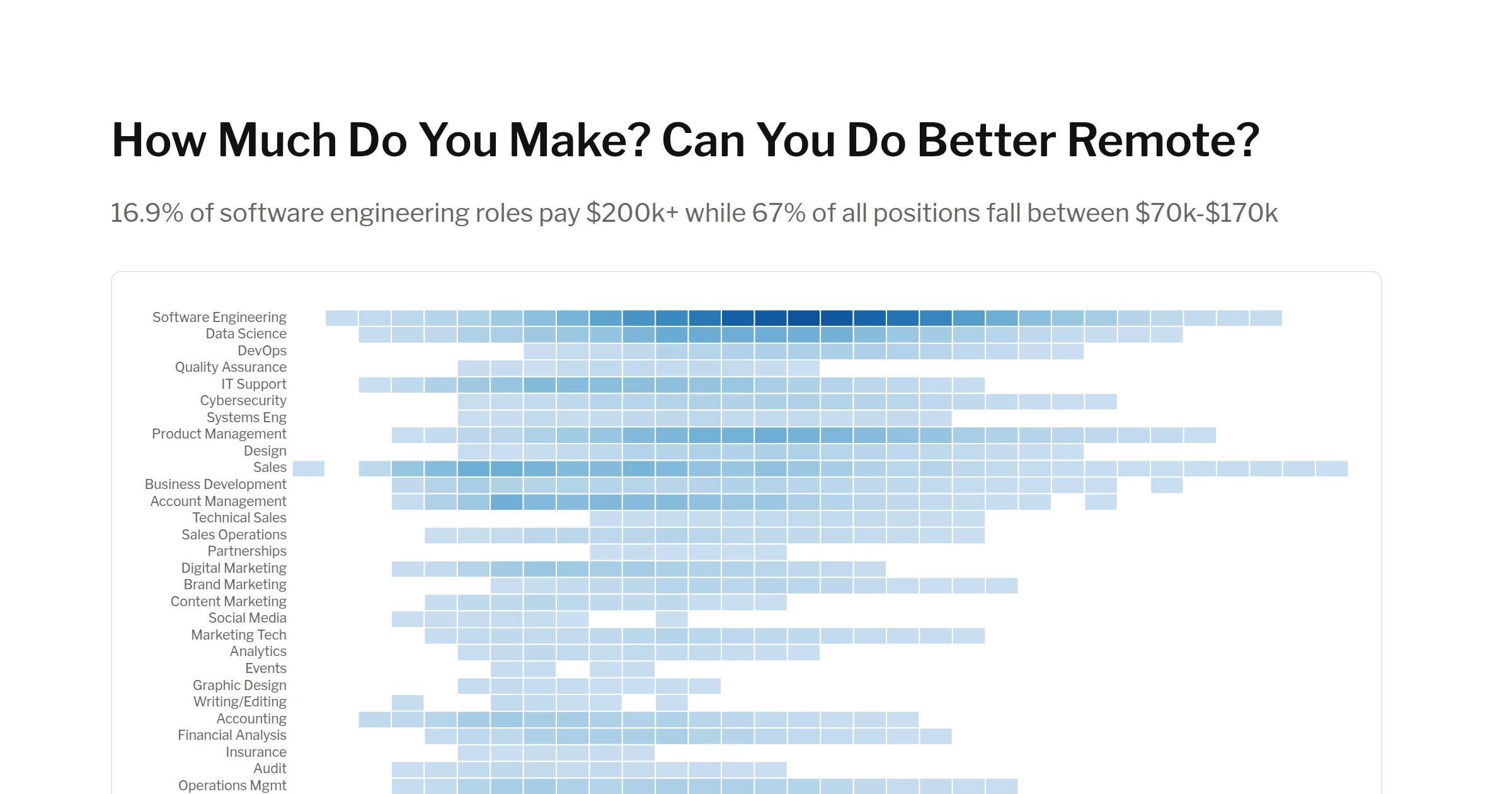
OC – I spidered the data from company web sites, filtered it with Bigquery, and made the visualizations with Vega. Please comment if an API for this data would be useful, and I will work on it over the summer.
ottawalanguages on
great work! what are the color intensities?
ricochet48 on
In my experience it’s the inverse, where 80% disclose and about 20% do not.
The issue is the range. I’ve seen some wild ones way outside skills / locations (like $100K-$250K)
IMovedYourCheese on
The obvious bias is that companies that pay a lot will be a lot more likely to disclose salaries in job postings. So by filtering out the rest you are only getting a picture of the very top of the market.
ColSanders5 on
Great work! I’d love to see a breakdown of the software engineering bucket
marigolds6 on
One piece of bias on the software engineering side is that, full remote is often used as a perk to recruit hard to find roles. So the roles that are full remote are often going to be high paying roles in the first place. That does not mean those roles pay more than they would in-office.
(Quite the opposite IMO, companies make a role full-remote when they know they cannot pay enough to afford the person they want if the role were in-office.
marigolds6 on
How was remote defined here?
I’ve have seen people differentiate between full-remote (anywhere in the world) and remote within a specific geographic area.
An example of the latter would be remote from anywhere in the US or remote from anywhere in North America. Europe gets even more complicated, where “remote” might be inside a specific country, inside the EU, EU+other counties (UK is common) or inside a certain other subset of countries. but almost never *all* of Europe.
SpaceToaster on
That chart is a far cry from beautiful. The footer shows grouped ranges *at an angle* when there would be plenty of space to hold it horizontally or stacked, and there should be vertical lines to show the group borders. The angled groups makes it almost impossible to read. And why the fuck are there groups anyway? And holy shit the groups don’t even include all salaries? WTF this is getting worse and worse the more I try and actually read it. This is not beautiful.

![[OC] I analyzed 52,401 remote jobs: Only 22% disclose salaries. Here's what they pay](https://www.byteseu.com/wp-content/uploads/2025/06/su-ljIMawXGN6GwRJC7lUthVWB0X73AGhNO8xftPTk-1536x806.jpg "[OC] I analyzed 52,401 remote jobs: Only 22% disclose salaries. Here’s what they pay")
8 Comments
OC – I spidered the data from company web sites, filtered it with Bigquery, and made the visualizations with Vega. Please comment if an API for this data would be useful, and I will work on it over the summer.
great work! what are the color intensities?
In my experience it’s the inverse, where 80% disclose and about 20% do not.
The issue is the range. I’ve seen some wild ones way outside skills / locations (like $100K-$250K)
The obvious bias is that companies that pay a lot will be a lot more likely to disclose salaries in job postings. So by filtering out the rest you are only getting a picture of the very top of the market.
Great work! I’d love to see a breakdown of the software engineering bucket
One piece of bias on the software engineering side is that, full remote is often used as a perk to recruit hard to find roles. So the roles that are full remote are often going to be high paying roles in the first place. That does not mean those roles pay more than they would in-office.
(Quite the opposite IMO, companies make a role full-remote when they know they cannot pay enough to afford the person they want if the role were in-office.
How was remote defined here?
I’ve have seen people differentiate between full-remote (anywhere in the world) and remote within a specific geographic area.
An example of the latter would be remote from anywhere in the US or remote from anywhere in North America. Europe gets even more complicated, where “remote” might be inside a specific country, inside the EU, EU+other counties (UK is common) or inside a certain other subset of countries. but almost never *all* of Europe.
That chart is a far cry from beautiful. The footer shows grouped ranges *at an angle* when there would be plenty of space to hold it horizontally or stacked, and there should be vertical lines to show the group borders. The angled groups makes it almost impossible to read. And why the fuck are there groups anyway? And holy shit the groups don’t even include all salaries? WTF this is getting worse and worse the more I try and actually read it. This is not beautiful.