
![[OC] Annual CO₂ emissions between 1900 and 2023 - Remake x2 based on feedback](https://www.byteseu.com/wp-content/uploads/2025/06/iihlc1wxf46f1-819x1024.png "[OC] Annual CO₂ emissions between 1900 and 2023 – Remake x2 based on feedback")
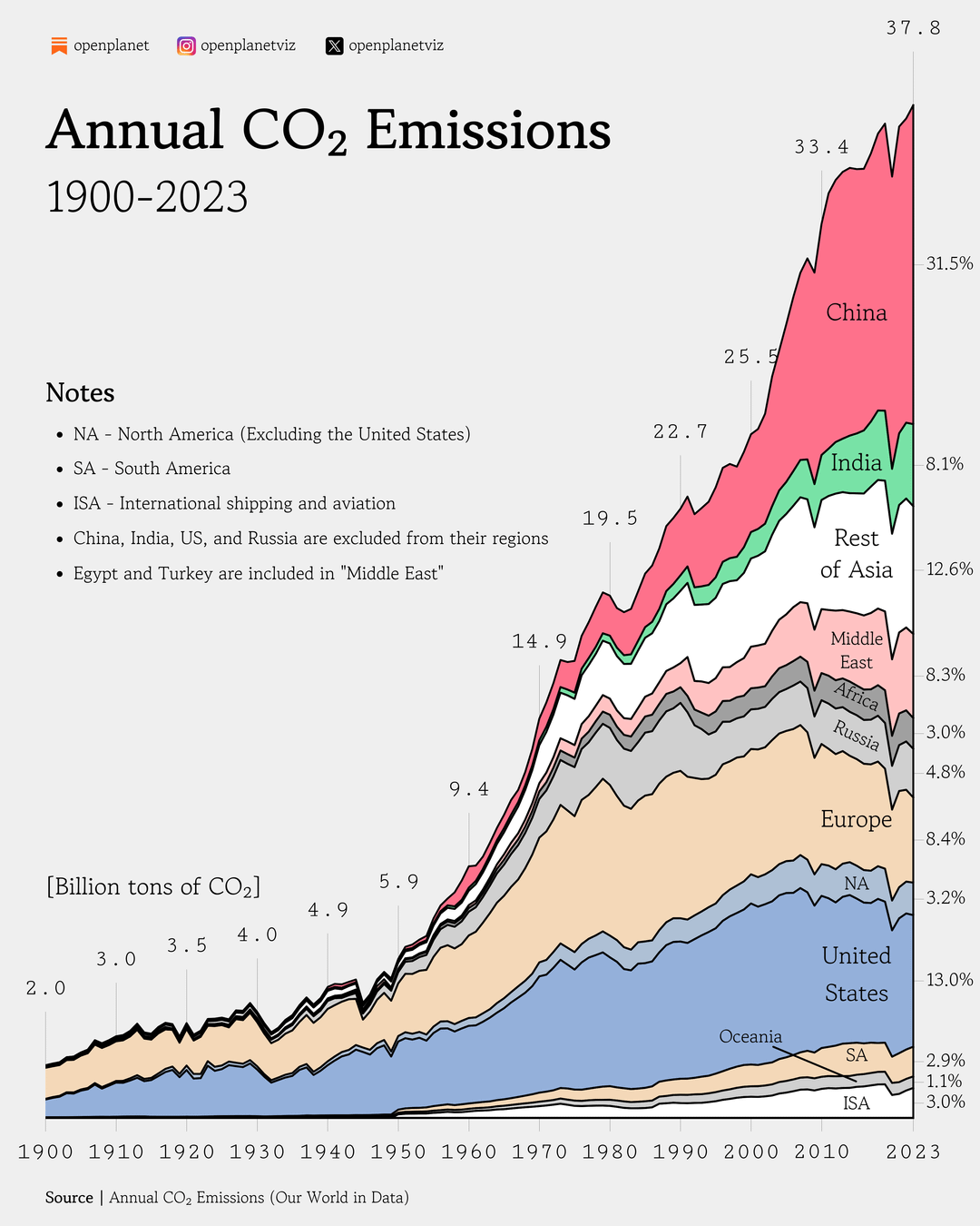
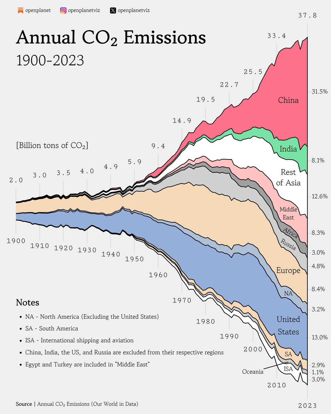
Data source: Annual CO₂ emissions (Our World in Data)
Tools used: Matplotib
Yesterday, I posted a visualization showing a stacked areachart with CO2 emissions over time. I got a lot of great feedback in the comments and decided to create two new versions.
The changes are:
- Remove the y-axis and add percentages instead
- Don't center the chart around the 50% mark
Let me know which one you like the best! 🙂
Posted by oscarleo0
3 Comments
I like how you did the vertical stack two ways as its sometimes easier to appreciate/compare one way or the other. Another interesting piece that could be a separate graph or possibly a table with this is the recent trend, something like the last 5 or 10 years rate of change, as its hard to see with 125 years of history.
This is probably a rant but every post like this there are always people who push:
1) This isn’t fair to China because…. Seriously guys give it a rest, yes they have some of the largest green initiatives out there, but they’re also burning enormous amounts of coal and continuing to expand that too. The numbers are what they are.
2) This doesn’t show how the US dominated CO2 output for decades because…. The US and Europe industrialized 1st so yea that happened, and Europe was individual nations which could be split up here but would make this impossible to read. You’re welcome to make your own graph if you don’t like it. Again, the numbers are what they are.
I like the graph and style – how come the Soviet Union has no influnce in the 1950s-70s. I cannot imagine that their emission where negligible and less than today’s Russia.
Here’s another chart that shows historical CO2 levels for the last 800,000 years. The influence of the Industrial Age on emissions is unmistakable.