I need deciphering to get something meaningful here.
jo_nigiri on
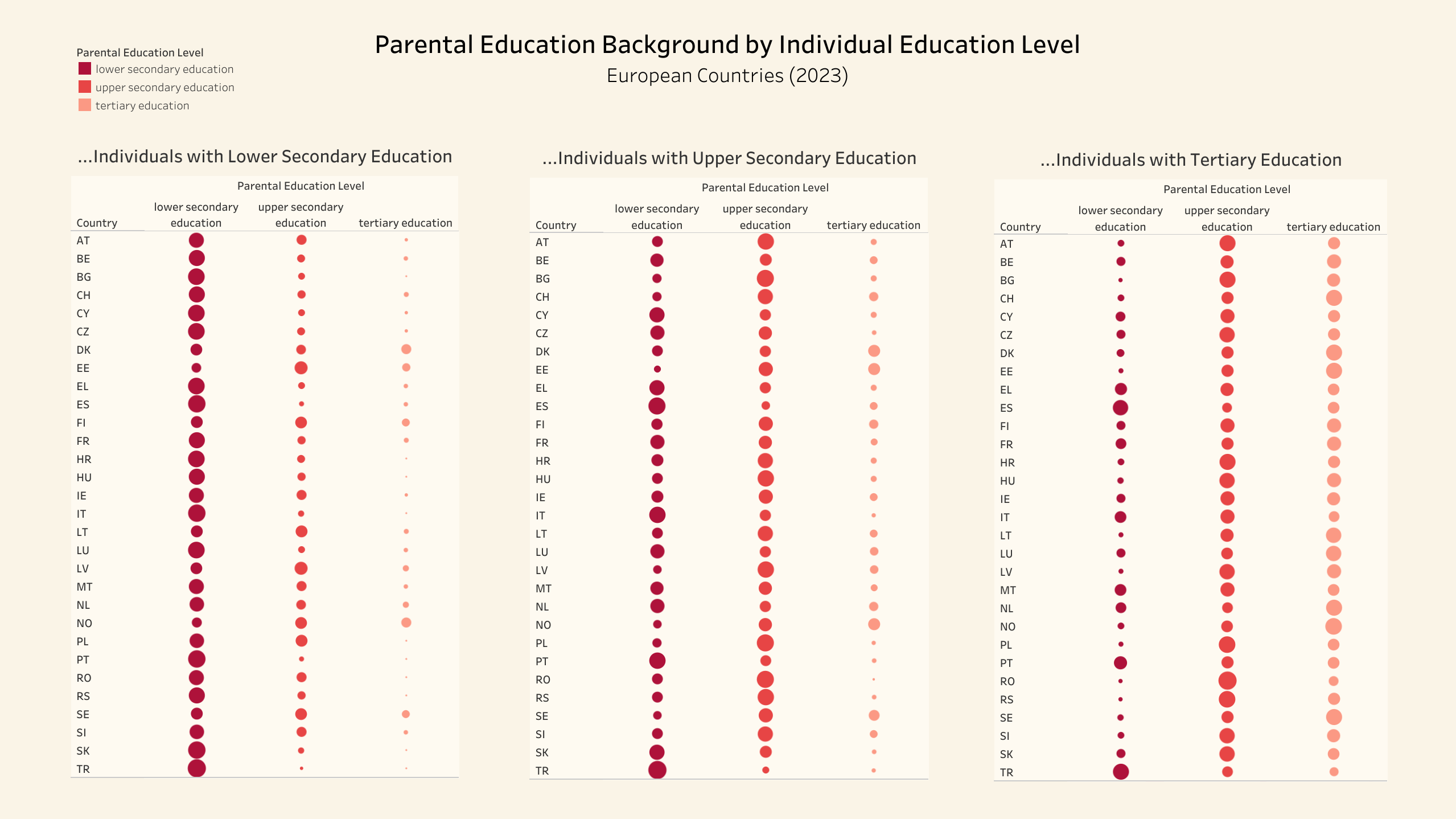
I like this method of displaying information, but I find it a bit hard to compare the social mobility between countries
Jacknerik on
Why would you make everything visualized as circle sizes when they’re already sorted into rows in a way that would make bar graphs work better?
sudomatrix on
This data is not beautiful. The topic is interesting. I’d like to see something meaningful, but I can’t figure out what this graphic is showing. What do the dot sizes mean? Sort by social mobility, not alphabetically to highlight the story the data tells.
antizana on
Would it kill you to spell out the countries? I mean I know HR is Croatia but that isn’t always obvious… and how do you not have Germany ?
geeses_and_mieces on
Education Level **≠** Social Mobility
Your graph shows the relationship between parental education and the education level of their offspring. Nothing more, nothing less.
Mangalorien on
Massively wasted potential here. You should print out the full name of each country, there will be very few people who will know all these abbreviations. Since each line has the same country over all three data sets, you don’t need to print out the name of the country 3 times.
theleopardmessiah on
The colors aren’t useful here, since all the information in the colors is also shown by the column headers.

![Social Mobility in various European Countries [OC]](https://www.byteseu.com/wp-content/uploads/2025/06/a5ruqmdvcq6f1-1536x863.png "Social Mobility in various European Countries [OC]")
10 Comments
Source: [https://ec.europa.eu/eurostat/databrowser/view/ILC_IGTP01__custom_1619253/default/table](https://ec.europa.eu/eurostat/databrowser/view/ILC_IGTP01__custom_1619253/default/table)
Tool: Tableau Public
How did you miss Germany and UK in your dataset?
I need deciphering to get something meaningful here.
I like this method of displaying information, but I find it a bit hard to compare the social mobility between countries
Why would you make everything visualized as circle sizes when they’re already sorted into rows in a way that would make bar graphs work better?
This data is not beautiful. The topic is interesting. I’d like to see something meaningful, but I can’t figure out what this graphic is showing. What do the dot sizes mean? Sort by social mobility, not alphabetically to highlight the story the data tells.
Would it kill you to spell out the countries? I mean I know HR is Croatia but that isn’t always obvious… and how do you not have Germany ?
Education Level **≠** Social Mobility
Your graph shows the relationship between parental education and the education level of their offspring. Nothing more, nothing less.
Massively wasted potential here. You should print out the full name of each country, there will be very few people who will know all these abbreviations. Since each line has the same country over all three data sets, you don’t need to print out the name of the country 3 times.
The colors aren’t useful here, since all the information in the colors is also shown by the column headers.