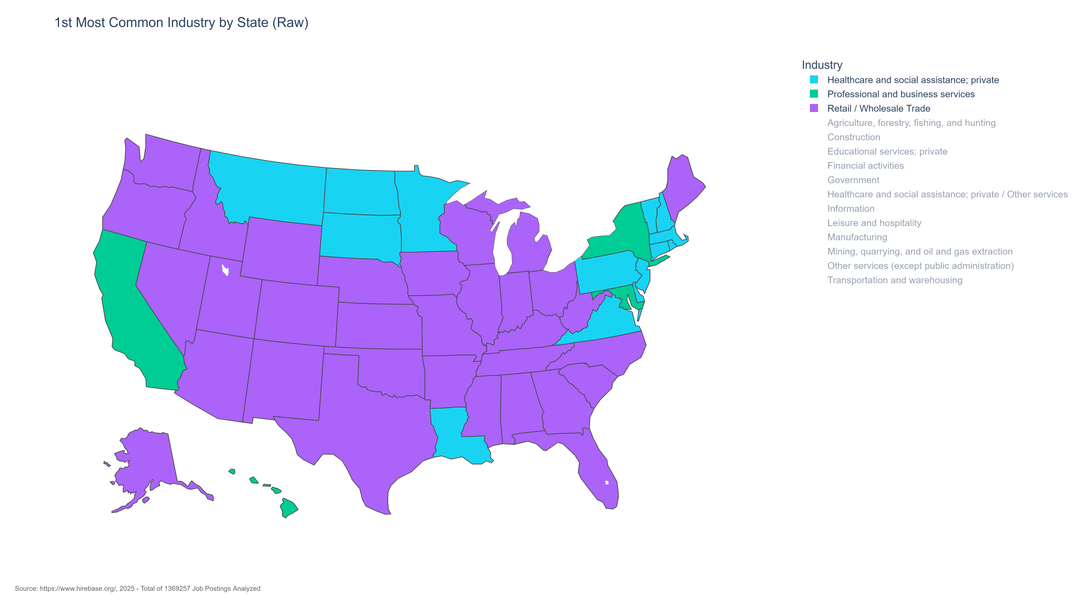
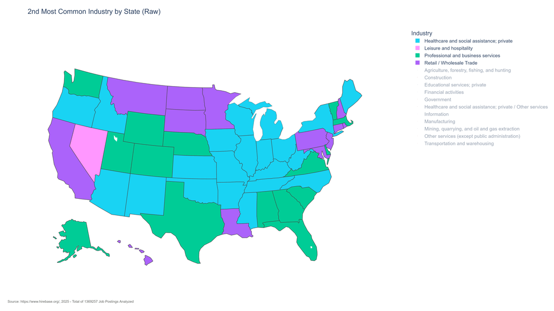
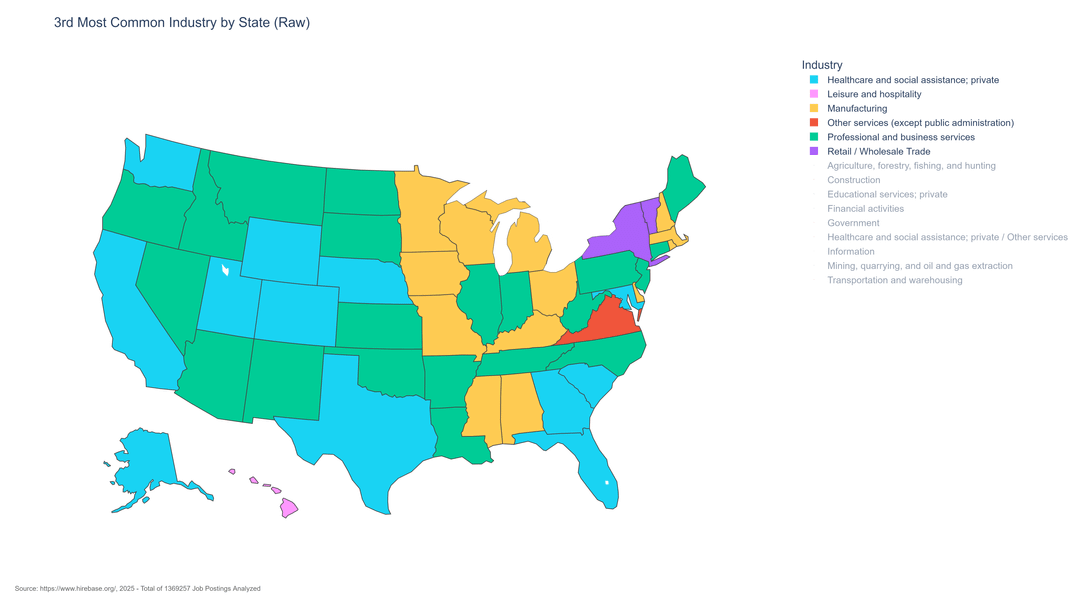
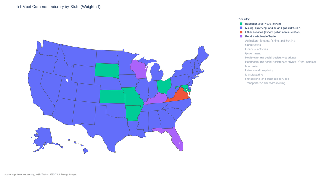
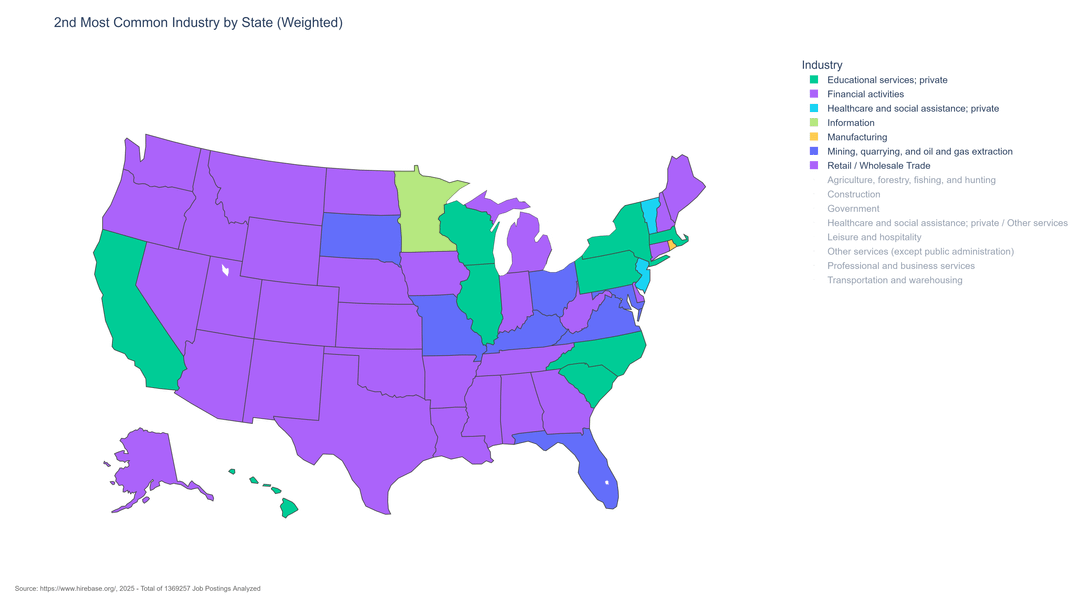
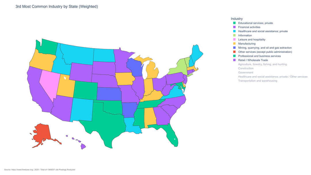
[OC] Top 3 Most Common Job Postings by Industry in the USA, Raw and Weighted by Bureau of Labor Statistics Categories
Posted by Knightery

![[OC] Top 3 Most Common Job Postings by Industry in the USA, Raw and Weighted by Bureau of Labor Statistics Categories](https://www.byteseu.com/wp-content/uploads/2025/06/ih59efeyn48f1-1024x576.png "[OC] Top 3 Most Common Job Postings by Industry in the USA, Raw and Weighted by Bureau of Labor Statistics Categories")
[OC] Top 3 Most Common Job Postings by Industry in the USA, Raw and Weighted by Bureau of Labor Statistics Categories
Posted by Knightery
4 Comments
Info: Created with Plotly, jobs scraped from job boards for a project I’m working on right now called Hirebase. Category data is from the Bureau of Labor Statistics, and the formula used for weighting was a simple total no. of jobs divided by % representation on a national level according to BLS (i.e. 1000 government jobs divided by 13.5% representation would be higher than 2000 retail jobs divided by 50% representation).
Data is ONLY online formal posting data, so informal/gig work such as Uber or DoorDash is not represented and likely leads to some distortion.
Nifty. Unfortunately, the differences between some colors are too subtle for my eyes: the greens of Educational Services and Professional…services; and the purples of Financial Activities and Retail…Trade.
Data CAN be beautiful by changing colors to be more different but this is off to a great start
Can it become a sub requirement that pictures are high res?