
![[OC] I mapped the lives of 4000+ of my daughter's ancestors over four centuries](https://www.byteseu.com/wp-content/uploads/2025/06/6gajbpkcin8f1-1024x572.gif "[OC] I mapped the lives of 4000+ of my daughter’s ancestors over four centuries")
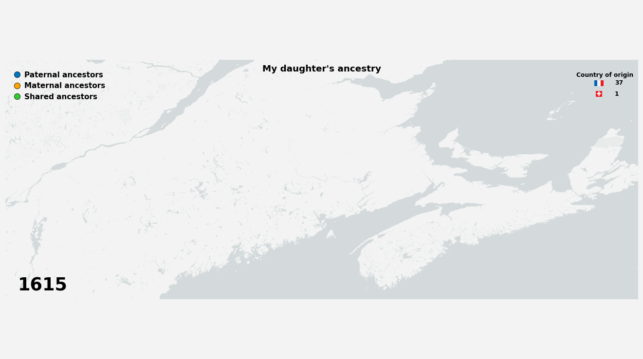
This animation shows the geographic movements of my daughter's ancestors from the 1600s to today. Each dot represents an ancestor, appearing when they're born and following their life journey across different locations. Green dots indicate shared/common ancestors – individuals who contributed to my daughter's lineage through both her father's and mother's family lines. The numbers next to the flags are cumulative totals of ancestors from each country (using modern borders).
As her father, my ancestors are represented by the blue and green dots.
Posted by Ugluk4242
17 Comments
Genealogical data gathered in the last 6 years from church records and notarial documents.
Animation made using Python and several packages (matplotlib, imageio, gedcom, geopy).
Highly impressive, and very interesting. I only wish I had the talent to do that
This is very cool. I don’t have nearly as much information on my family, I don’t even know the origins of 2 of my own grand parents.
That is awesome.
Its insane that you found that many ancestors. Even more insane that you found geographic location. Crazy that they shared such a confined geography. Hilarious that so many are shared (we’re all inbred if we go back far enough).
And a really, really cool graphic. Properly beautiful data.
Would be more beautiful if there was a single indication somewhere either on the map or in a label where in the world the map is showing. I was able to figure out that it was Maine-ish /Quebec-New Brunswick-ish, but not from anything in the post/map.
Very cool but I don’t understand where it is
It’s amazing to think that everyone lived in one section of the world like that.
(I and my parents are from California, my grandparents are from Ohio, Chihuahua, and Michoacan, and it just gets further dispersed from there.)
It was always crazy to me how some people’s ancestors have been in the Americas for so long (except for the Amerindians, that’s obvious).
oh wow, the darker stuff ist supposed to be water..
maps like this should be illegal..
The shared ancestors part is interesting. But if that’s only from your daughter’s perspective, it might be more useful showing ancestors with more than one descendant that is an ancestor of your daughter. In other words, what about your shared ancestors?
People generally have a very poor understanding of how genealogy and inheritance works over centuries and longer, and just how interrelated we all are. For instance, every single person with European ancestry is descended from royalty multiple time.
Crazy amount of data. How did you end up finding all this information though?
This is beyond fascinating. I aspire to this level of data collection and visualisation 🙏🏼😅
This is very cool – and a really fun project to have completed! Thank you for sharing it
I’m a bit confused by the visualisation though, it looks like lots of people lived in a different place each year between Québec city and Montreal over decades? I guess this is how you have shown people moving from one to the other – but surely they spent almost all their time in a few places, this visualisation has most people moving once per year
I’m so thrilled to see the rapid decrease in green dots over time. Just so happy.
I wish I could do this for mine. Fantastic stuff!
Have you seen [this page](https://www.bertrandchesnay.com/bce/)? Lot of neat French Canadian genealogy in there. If you can find any ancestors on that page, we’re probably distant cousins!
Pretty astounding you gathered the information for this, amazing!