
![Home Price Growth vs Rent Growth (May 25 vs May 24) [OC]](https://www.byteseu.com/wp-content/uploads/2025/06/7loynleydp8f1-1536x1187.png "Home Price Growth vs Rent Growth (May 25 vs May 24) [OC]")
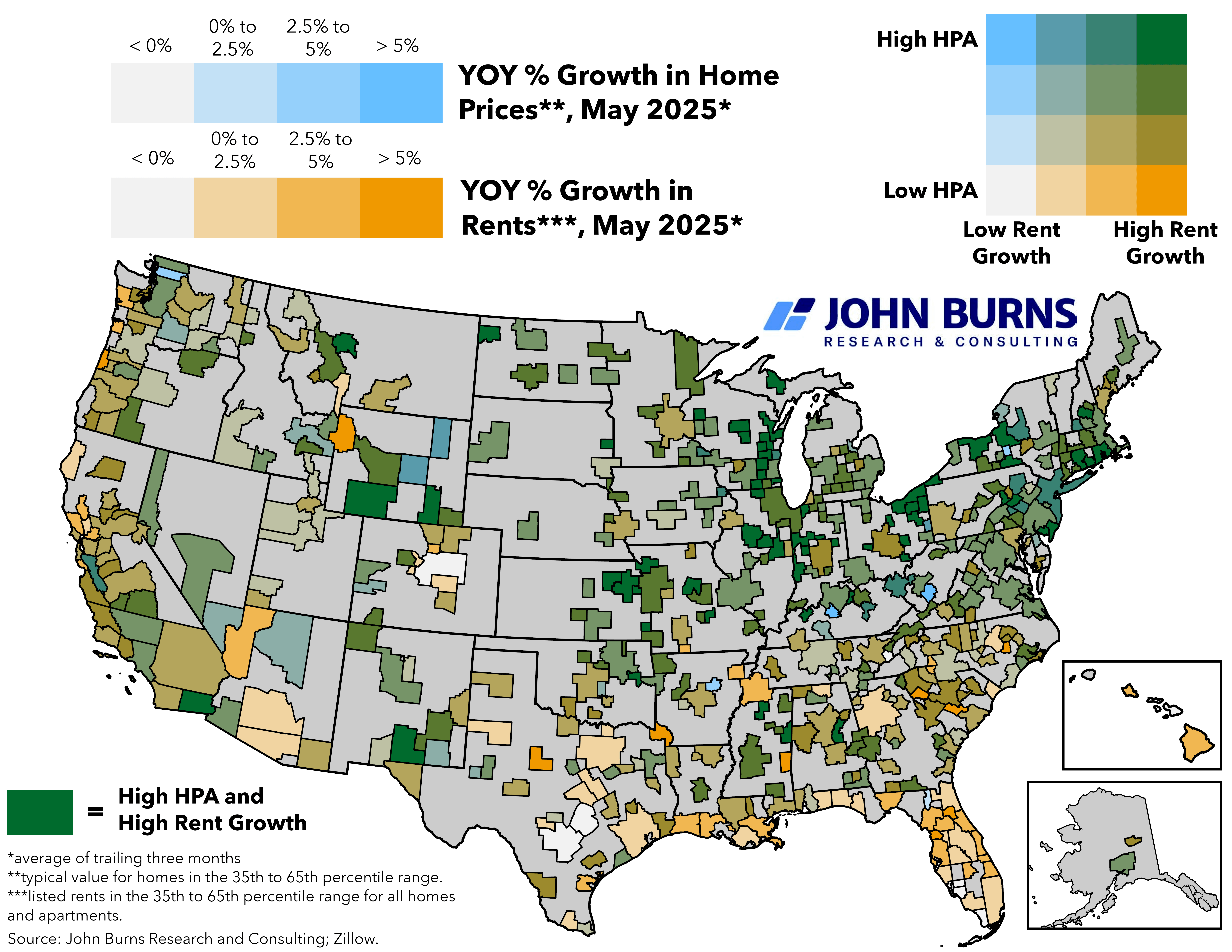
Where are existing home prices AND rents growing in tandem, and where are they diverging?
*Note: Average of trailing three months for home price and rent growth (i.e., average of March-May 2025 vs March-May 2024)
Sources: John Burns Research and Consulting, LLC; Zillow.
Posted by SweetYams0
18 Comments
I’ll be honest, this map doesn’t feel very easily readable to me. I feel like it’d be a lot clearer if you kept it to just 1 axis from “home prices grow faster than rent” to “rent grows faster then home prices”.
Data is Beautiful **if** it’s also informative. What is this HPA you speak of? Google is not forthcoming.
Love this 2D gradient, idk that I’ve seen something like that before.
YoY data when you’re talking about the entire USA for a single year with arbitrary start and end points isn’t that useful as real estate is considered a longer duration asset.
Recommend you produce a series of graphs by year, or alternatively if you want only a single graph, set the period for 2020-present or something.
What does HPA stand for? (this kind of explanation belongs in the title/key of a chart…)
3×3 grid would be much better for legibility. Very difficult to distinguish between any of the middle 4.
Common Austin, Denver, San Antonio W
Other people have valid criticisms but this is kind of interesting data. Seems like rent increases usually correlate with property value increases (expected) except in places where property is, based on my admittedly subjective knowledge, growing more likely to be destroyed by the ravages of climate change (hurricanes, wildfire). This makes economic sense because property owners in those places are getting charged higher insurance premiums, or else are becoming increasingly likely not to merit property insurance at all. Seems like property owners are passing those costs on to consumers.
Would be interested to see these trends expanded upon with fuller data.
Acronym usage aside, the biggest takeaway I get from this chart is that Florida has depreciating home costs but increasing rent. Is that a hurricane effect?
What geographical subdivisions are you using? They aren’t counties …
[Supporting data](https://xkcd.com/1138/)
As others have said, this reads way too much like it’s insider data for an insider audience. What’s HPA? Why is the 2D grid of colors relevant? Why this date range in the off-middle of the year? What are the subdivisions being used, since they’re definitely not counties.
This also makes the biggest mistake of data viz: Don’t treat your image like a Reddit post. Treat it like the only thing people are going to see. There’s no title in the image, nor any other text contextualizing the information for non-subject-matter-experts.
This is very hard to read. The different shades of green/gold are hard to distinguish what is what, and what it correlates to.
And it’s full of jargon – YoY, HPA.
Not to mention it’s not cut by county lines in some areas but is in others? Like, southwest PA isn’t one county, but it’s being shown as one area. But then on North East Ohio you have several areas of the same color next to each other.
So is it metro areas? Counties? Some other delineation?
Confusing at first, but useful information with a bit of time.
Around here (a light green block in the midwest) all we hear about is that housing prices are the faults of NIMBY city folks of the past, but some of those deep green fields are in super empty parts of the country without any zoning at all. Seems much more like retirees migrating for the weather and wisely not wanting to buy in the soon-to-be-ocean states.
I wish we had a value scale. % shows growth yes but a location with almost no homes and gets development will see massive rises in both making it deceptive that costs went up when it’s more of a development of an area. I can see a trend of location with higher rent going up but I assure you if the rent is going up so is the home price in the area. In a roundabout way you then have to look at this graph as a rent vs development chart to find developed areas being affected by price hikes and low developed areas experiencing growth. I don’t know if that was the intent though
I live in a city where the median income is like 30K. We are a poor town that is larger, its nice place to live if you dont mind just bars and churches.
However, now that the “investment” companies have swept in and pretty much own every rental in the area, the prices for a decent 2BR apartment went from 700 to over 1200 sense the pandemic. Mind you, people here are not making more money, nor have we gotten a huge influx of wealthy people. So already half your monthly income is ALREADY GONE JUST TO have a roof over your head. We are not talking about anything else.
Im a conservative by choice, however it might shock many on reddit that most of us conservatives dont think alike. With that said, I fully support banning “investment companies” from owning rentals or homes for that matter. We need to get away from homes being thought as an “investment” and into something that it might go up in value as time goes on, but that is due to improvements and inflation… not because some investment firm says it is.
Hmmm is that blueish green or greenish blue
Yea Cleveland managed to stay real steady thru 2008 but since covid is “to the moon”