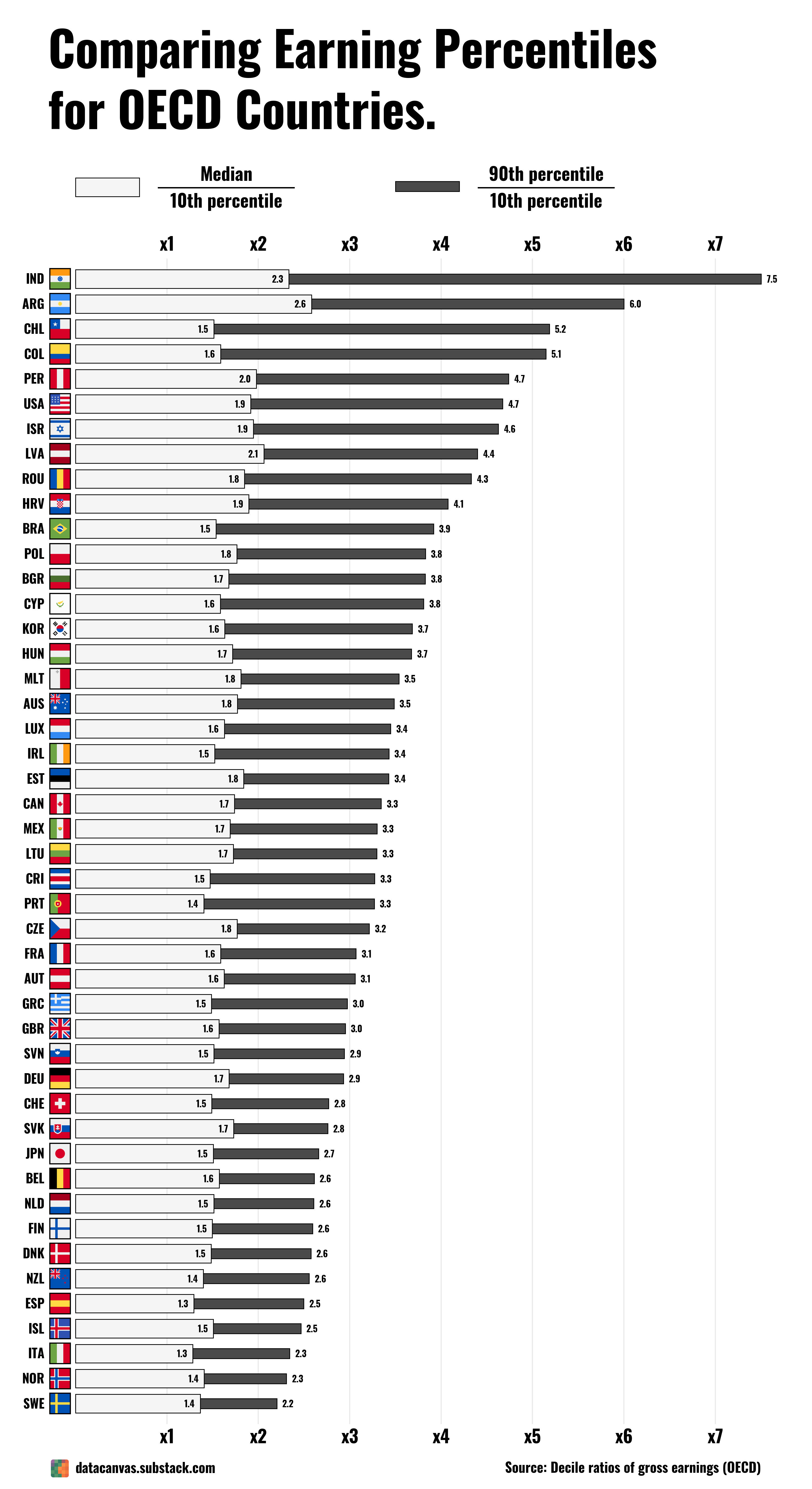
The countries with the highest ‘wealth inequality’ are at the bottom of the income equality.
rickdeckard8 on
The current paradigm in Sweden is that the inequalities between rich and poor is much more pronounced here than in other European countries and that the differences have increased a lot in the recent years. Hard to find proof for that in this figure.
zolbear on
Can I just double check I’m reading this right: if I take India for instance, am I seeing that the median income is 2.3x the 10th percentile and the 90th percentile is 7.5x the 10th percentile? In other words if the median income there is $3840pa, then the 10th percentile makes $1670 and the 90th percentile makes about $12.5k?
ZarafFaraz on
I don’t understand how to make sense of this information
Corant66 on
Not all data is beautiful it seems.
anonchurner on
In Sweden, the 90th percentile earners make 2.2x that of the 10th percentile earners? If that is accurate, I find the multiple sickeningly low.
kanithor on
im from Chile and i can confirm, inequality is wild
ObviouslyTriggered on
The data is not correct the black bars seem to be for closer to 90th/Median not 90th/10th…..
For example the bottom 10th of income in the UK is £10k p/a whilst the 90th is circa £75k.
Same goes for another 7 countries that I’ve looked up.
NZ for example the bottom 10th earn $11K p/a whilst the 90th earn above $100K.
And doesn’t align directly with median either (unless old data was used) but it’s far closer than the 90th/10th.
Splinterfight on
Interesting chart, takes a minute to get your head around. The white box is how much more money a middle of the road person makes compared to someone at the top of the poorest 10%, and the dark line is how much more someone on the lower edge of the top 10% makes than that lower 10% person. (All of this done by earnings)
Sad to see Australia as middle of the pack here, we have work to do
Zagrebian on
So a lower median/10th is… good? I would think that a higher median compared to the bottom 10% is desirable, but I guess not.
funwidjack on
What does the unit represent? You may want to add more data labels?

![[OC] Comparing Earning Percentiles for OECD Countries.](https://www.byteseu.com/wp-content/uploads/2025/06/kdr5y36yga9f1-838x1536.png "[OC] Comparing Earning Percentiles for OECD Countries.")
12 Comments
The countries with the highest ‘wealth inequality’ are at the bottom of the income equality.
The current paradigm in Sweden is that the inequalities between rich and poor is much more pronounced here than in other European countries and that the differences have increased a lot in the recent years. Hard to find proof for that in this figure.
Can I just double check I’m reading this right: if I take India for instance, am I seeing that the median income is 2.3x the 10th percentile and the 90th percentile is 7.5x the 10th percentile? In other words if the median income there is $3840pa, then the 10th percentile makes $1670 and the 90th percentile makes about $12.5k?
I don’t understand how to make sense of this information
Not all data is beautiful it seems.
In Sweden, the 90th percentile earners make 2.2x that of the 10th percentile earners? If that is accurate, I find the multiple sickeningly low.
im from Chile and i can confirm, inequality is wild
The data is not correct the black bars seem to be for closer to 90th/Median not 90th/10th…..
For example the bottom 10th of income in the UK is £10k p/a whilst the 90th is circa £75k.
Same goes for another 7 countries that I’ve looked up.
NZ for example the bottom 10th earn $11K p/a whilst the 90th earn above $100K.
And doesn’t align directly with median either (unless old data was used) but it’s far closer than the 90th/10th.
Interesting chart, takes a minute to get your head around. The white box is how much more money a middle of the road person makes compared to someone at the top of the poorest 10%, and the dark line is how much more someone on the lower edge of the top 10% makes than that lower 10% person. (All of this done by earnings)
Sad to see Australia as middle of the pack here, we have work to do
So a lower median/10th is… good? I would think that a higher median compared to the bottom 10% is desirable, but I guess not.
What does the unit represent? You may want to add more data labels?
Was there no data on Turkey the OECD country?