Source:
https://worldpopulationreview.com/country-rankings/cattle-population-by-country
https://en.wikipedia.org/wiki/List_of_countries_and_dependencies_by_population_(United_Nations))
Tools used: Datawrapper
Posted by aRandomUser12023

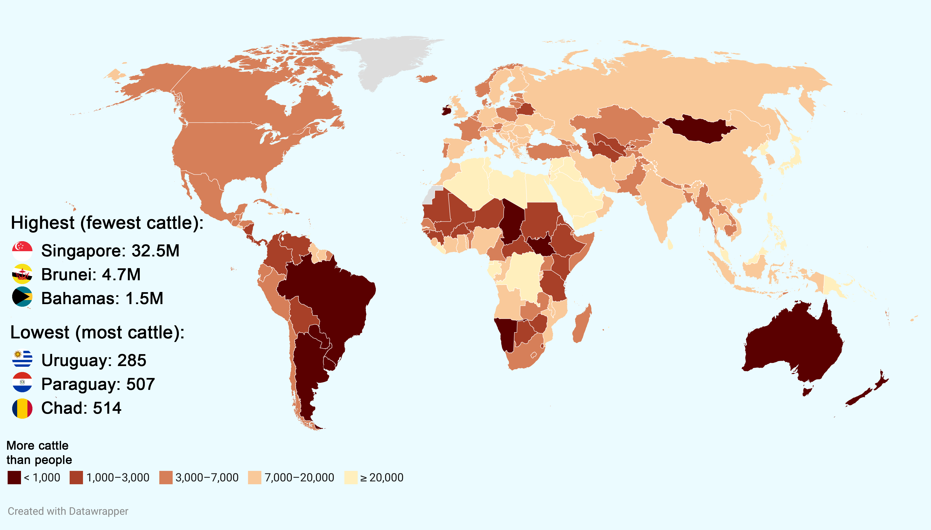
![[OC] People per 1,000 cattle](https://www.byteseu.com/wp-content/uploads/2025/06/wqx69ke0gj9f1-1536x875.png "[OC] People per 1,000 cattle")
Source:
https://worldpopulationreview.com/country-rankings/cattle-population-by-country
https://en.wikipedia.org/wiki/List_of_countries_and_dependencies_by_population_(United_Nations))
Tools used: Datawrapper
Posted by aRandomUser12023
6 Comments
No cattle in greenland or no data?
Is it just me or would this have been much more intuitive if it showed number of cattle per person instead of people per cattle?
The colour visualization on the world map does a fine job of showing where all the cattle are.
… but “cattle per X people” would be a lot more intuitive in the accompanying text. Saying “Singapore has 32.5 million people per 1000 cattle” might be technically true, but it doesn’t have *either* 32.5 million people *or* 1000 cattle, so it’s one of those “2 popes per square km” statistics. Also, the choice of 1000 cattle as the counting unit feels very arbitrary, when the interesting countries have millions of cattle.
It would have been funnier if the “highest” countries were designated with increasing sizes of hats.
What are the colors supposed to represent? What does “less than 1000” or “greater than 20,000” mean in terms of “more cattle than people”?
Why does Singapore have 178 cattle?