
![US Population By Age-group, 1960 - 2003 [OC]](https://www.byteseu.com/wp-content/uploads/2025/06/0e7trafchg9f1-1536x867.png "US Population By Age-group, 1960 – 2003 [OC]")
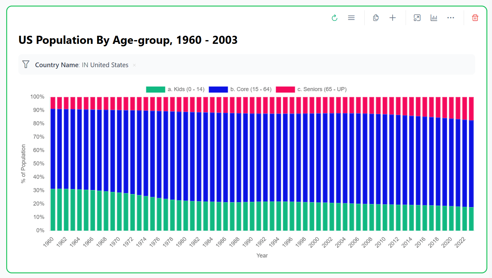
Detail data as of 2023:
||
||
|Year|a. Kids (0 – 14)|b. Core (15 – 64)|c. Seniors (65 – UP)|
|2023|18%|65%|17%|
Feel free to drag & drop, change filters, create new pivot tables on the data by visiting my analysis hosted on Pivolx: https://www.pivolx.com/analysis-13#stepmceqeemzvo9it
Data Source: World Bank
Posted by FridayTea22
4 Comments
Adding data details for recent years for your reference:
https://preview.redd.it/k3hdrj10jg9f1.png?width=1140&format=png&auto=webp&s=e485fd3ed15d83517f058a62a92279ae07075bf2
Interesting data, vividly presented. My one tiny gripe with wide charts like this is that I’d like to see the y-axis duplicated on the right side, so I don’t have literally or figuratively run my finger across to follow the percentages.
But that’s just me. Otherwise, well done.
EDIT: By the way, not as much of a change in those proportions as I would have guessed.
I think there is enough data point to justify a stacked line chart, it would make it look cleaner imo
Impressive. I too thought the changes would be greater though the green band really jumps out to show the significant change in births. Would love to do this for my Philadelphia suburban town (Lower Merion Township) for as many years possible. Any suggestions as to where to start.