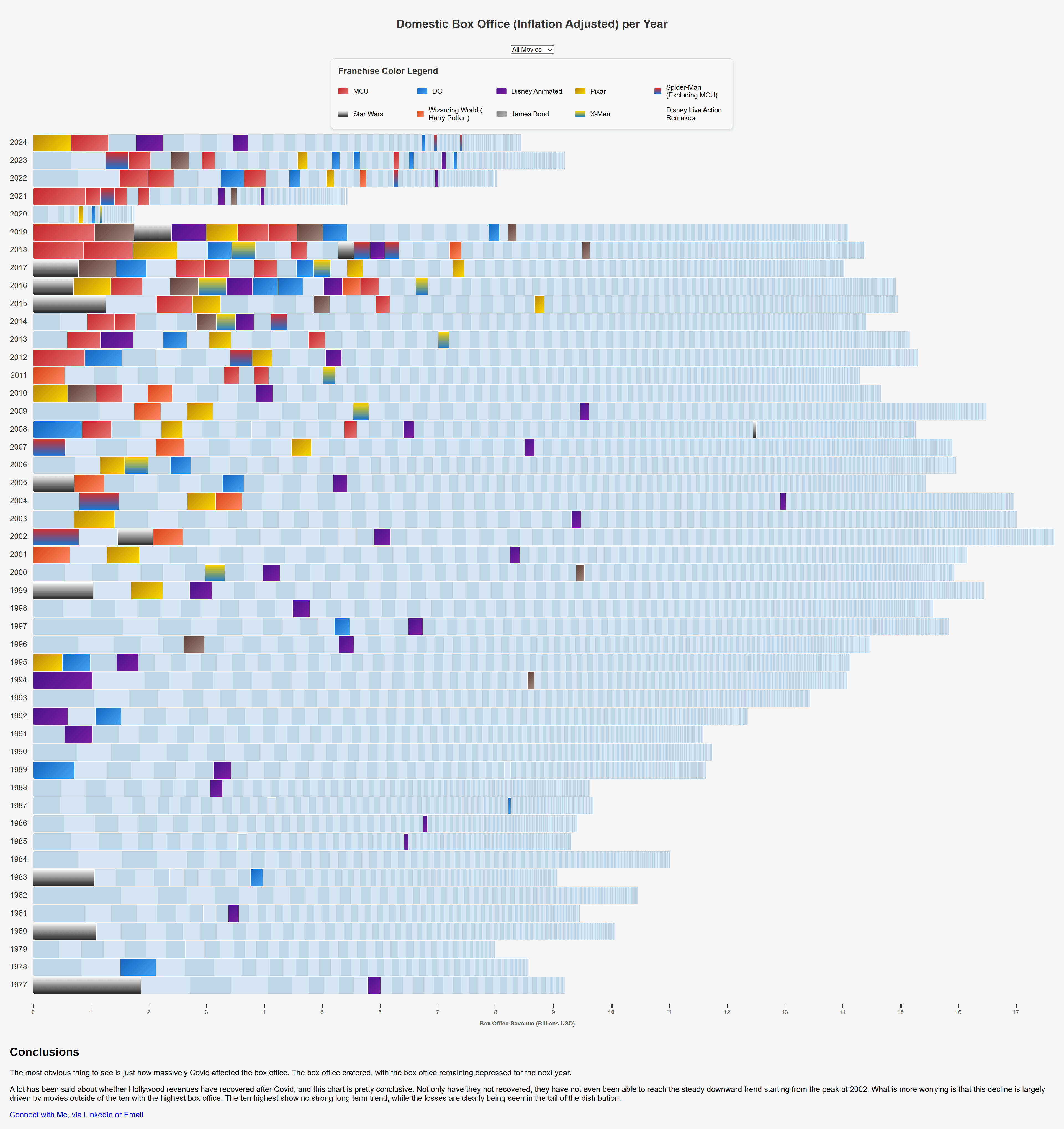
Very box is a single movie- its size corresponds to its box office take.
https://brandon-chambers.github.io/box_office_chart/box_office_chart.html?v=1
Posted by BChambersDataAnalyst

![[OC] Domestic Box Office (Inflation Adjusted) per Year, Delimited by Title, Ten Largest Franchises Highlighted](https://www.byteseu.com/wp-content/uploads/2025/07/rzkdaris86cf1-1447x1536.png "[OC] Domestic Box Office (Inflation Adjusted) per Year, Delimited by Title, Ten Largest Franchises Highlighted")
Very box is a single movie- its size corresponds to its box office take.
https://brandon-chambers.github.io/box_office_chart/box_office_chart.html?v=1
Posted by BChambersDataAnalyst
4 Comments
Source: Scraped from TheNumbers
Tools: Javascript/jQuery
Data and Code are available on my GitHub.
A series of functions was written to map year and title to franchises.
What *two* Spider-man movies came out in 2024?
Your use of overlapping color gradients is delightfully mentally disturbing, mind if I send you some power points; I could use your talent/expertise to get my manager to stop asking me to make presentations
I love the idea of this visualization, but the color choices (and gradients?) make it really hard to read. In particular, MCU and Harry Potter are two of the bigger categories and they look almost identical to my old eyes.