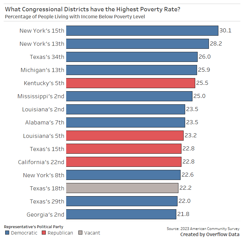
The data in this visualization comes from the 2023 American Community Survey 1-year estimates and the [congress.gov](http://congress.gov) api. Tableau was used for creating the visualization.
CorrectCombination11 on
30% of people below the national poverty line? Okay. 30% of what number? 100? 1000? 10000?
BostonDrivingIsWorse on
The em dashes are a dead giveaway.
AuntieMarkovnikov on
I wonder what this chart would look like if there was no gerrymandering.
Pathetian on
How exactly is poverty defined for this data? Is it just a flat income level regardless of cost of living in an area?
lolexecs on
Why focus on poverty? This site shows all the districts from the 119th and median income.
I’m curious does this data control for COL? Because, having lived in or near these districts COL in Michigan 13 is significantly lower than NY 15 or 13.
For the record these districts are
1. Most of The Bronx except for around Yankee Stadium
2. Harlem and the rest of the Bronx around Yankee Stadium.
3. Coastal Texas, south of Corpus Christi to the Mexican Border
4. Detroit and Wayne County from Romulus(west) to the Grosse Pointes(typically wealthy) and the Canadian Border (East) and 8 mile(North) to Downriver (South). Excluding Dearborn.
5. Eastern Kentucky / Appalachia
6. Mississippi along the River
7. New Orleans to Baton Rouge
8. Mid West Bama, with a spur through Tuscaloosa and Birmingham
9. Louisiana along the River to LA 6.
10. Gerymandered…narrow N/S strip from east of San Antonio and west of Corpus Christi to Mexican Border.
11. Central Valley SE of Fresno
12. BedSty, hooks downward to and westward across Coastal Brooklyn.
13. Gerrymandered N. And Downtown Houston
14. Gerrymandered N and East Houston
15. The Dead Zone of South Georgia from Macon South to Florida, West of I- 75.
Most of these are areas that are rural resource extraction zones, have heavy immigrant traffic, have been devastated by economic and natural disasters, and/or are gerrymandered to hell and back.
rutherfraud1876 on
And yet poverty isn’t the issue Ritchie Torres is yelling at his own party about…
Cyclamate on
It would be helpful to see a geographic outline of each district… if only to illustrate why one probably shouldn’t draw conclusions from data that are grouped by congressional district
thegooddoktorjones on
The way gerrymandering works for some states, I would not be surprised if the most economically crushed neighborhoods all get looped into one district.
Ps11889 on
Ah, yes, another person confused about correlation vs causation. Is it their elected officials causing poverty or some other socioeconomic condition? I’ll give you a hint, it’s not their elected officials.
R3miel7 on
Guess what the top issue is for the rep of New York 15th? Hint: it’s not poverty

12 Comments
The data in this visualization comes from the 2023 American Community Survey 1-year estimates and the [congress.gov](http://congress.gov) api. Tableau was used for creating the visualization.
30% of people below the national poverty line? Okay. 30% of what number? 100? 1000? 10000?
The em dashes are a dead giveaway.
I wonder what this chart would look like if there was no gerrymandering.
How exactly is poverty defined for this data? Is it just a flat income level regardless of cost of living in an area?
Why focus on poverty? This site shows all the districts from the 119th and median income.
[https://proximityone.com/cd119.htm](https://proximityone.com/cd119.htm)
I’m curious does this data control for COL? Because, having lived in or near these districts COL in Michigan 13 is significantly lower than NY 15 or 13.
For the record these districts are
1. Most of The Bronx except for around Yankee Stadium
2. Harlem and the rest of the Bronx around Yankee Stadium.
3. Coastal Texas, south of Corpus Christi to the Mexican Border
4. Detroit and Wayne County from Romulus(west) to the Grosse Pointes(typically wealthy) and the Canadian Border (East) and 8 mile(North) to Downriver (South). Excluding Dearborn.
5. Eastern Kentucky / Appalachia
6. Mississippi along the River
7. New Orleans to Baton Rouge
8. Mid West Bama, with a spur through Tuscaloosa and Birmingham
9. Louisiana along the River to LA 6.
10. Gerymandered…narrow N/S strip from east of San Antonio and west of Corpus Christi to Mexican Border.
11. Central Valley SE of Fresno
12. BedSty, hooks downward to and westward across Coastal Brooklyn.
13. Gerrymandered N. And Downtown Houston
14. Gerrymandered N and East Houston
15. The Dead Zone of South Georgia from Macon South to Florida, West of I- 75.
Most of these are areas that are rural resource extraction zones, have heavy immigrant traffic, have been devastated by economic and natural disasters, and/or are gerrymandered to hell and back.
And yet poverty isn’t the issue Ritchie Torres is yelling at his own party about…
It would be helpful to see a geographic outline of each district… if only to illustrate why one probably shouldn’t draw conclusions from data that are grouped by congressional district
The way gerrymandering works for some states, I would not be surprised if the most economically crushed neighborhoods all get looped into one district.
Ah, yes, another person confused about correlation vs causation. Is it their elected officials causing poverty or some other socioeconomic condition? I’ll give you a hint, it’s not their elected officials.
Guess what the top issue is for the rep of New York 15th? Hint: it’s not poverty