[OC] “The Fraud Behind Election Fraud”: Interactive visualizations show how basic statistics disprove the viral vote-machine claims
Posted by HannasAnarion

[OC] “The Fraud Behind Election Fraud”: Interactive visualizations show how basic statistics disprove the viral vote-machine claims
Posted by HannasAnarion
6 Comments
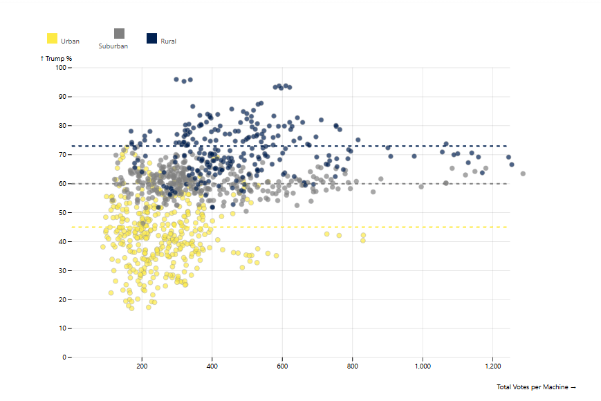
Can’t believe the machines conspired to put more rural votes per machine just to make it *look* like Trump was more popular. /s
A few weeks ago I finally read the ETA analysis and realized it was so bad, and so many people were sharing it as definitive, I couldn’t let it go. So I made this set of interactive visualizations, simulations, and games to ELI5 why they are wrong.
Tools:
Data analysis done in Python.
Visualizations made with [Observable Plot](https://observablehq.com/plot/).
Source: [Clark County Nevada Official Cast Vote Records](https://www.clarkcountynv.gov/government/departments/elections/reports_data_maps/)
Code: [https://github.com/Trevortds/clark-county-election-analysis](https://github.com/Trevortds/clark-county-election-analysis)
(new submission comment because an edit to the original one might have hit a filter, let me know if you’re now seeing duplicate)
The little popup about the control panel *not staying closed* after I closed it was infuriating.
This is an excellent analysis that is similar to many of my own thoughts about the ETA analyses.
I do feel the need to point out, however, that ETA has in fact done another analysis on PA vote data, so I would think about removing this part of your article:
> So why did ETA not release any more analyses?
if we make it harder to vote, it will help keep the “wrong people” from voting. by luck, the only way to stop a non existent problem is to make it harder for young and poor people to vote.
These graphs really fail to make the points you’re using them for, im honestly rather confused at the people praising them.
Like, look at the early voting graphs. You’re trying to make a point about truncation changing how the graphs can be interpreted, then choose a different truncation from the graph you’re comparing to and talk about how the graphs look identical!
Look at the grouping around 800 votes cast. In prior year data you see the tabulators are still tightly bound together, but diverge in current year. The truncation *you chose* obscures this. How can anything useful be taken from this?