IMO, rule #1 of graphic visualization is: never make your viewer do any “work” to fully understand the data being presented.
Using country flags breaks that rule because someone unfamiliar with all the flags of Asian countries is forced to copy/paste the flag images and do Google image searches, or find some other way to identify the country.
uninformedbasic on
What’s the source for this? Does the remaining go to running costs, welfare schemes, transfers, and interest payments?

3 Comments
IMO, rule #1 of graphic visualization is: never make your viewer do any “work” to fully understand the data being presented.
Using country flags breaks that rule because someone unfamiliar with all the flags of Asian countries is forced to copy/paste the flag images and do Google image searches, or find some other way to identify the country.
What’s the source for this? Does the remaining go to running costs, welfare schemes, transfers, and interest payments?
HDI in South Asia:
* **Sri Lanka = 0.78**
* Maldives = 0.762
* Bhutan = 0.681
* **Bangladesh = 0.67**
* **India = 0.644**
* **Nepal = 0.601**
* **Pakistan = 0.540**
* Afghanistan = 0.462
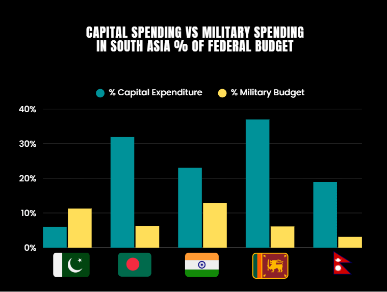
Countries in South Asia that have higher capital expenditure have higher HDIs
Source for HDI: [https://hdr.undp.org/content/human-development-report-2023-24](https://hdr.undp.org/content/human-development-report-2023-24)