
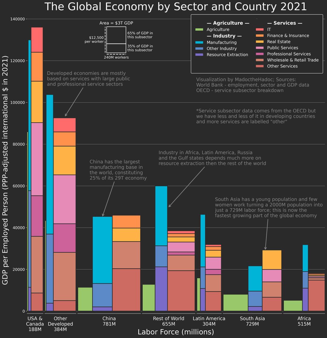
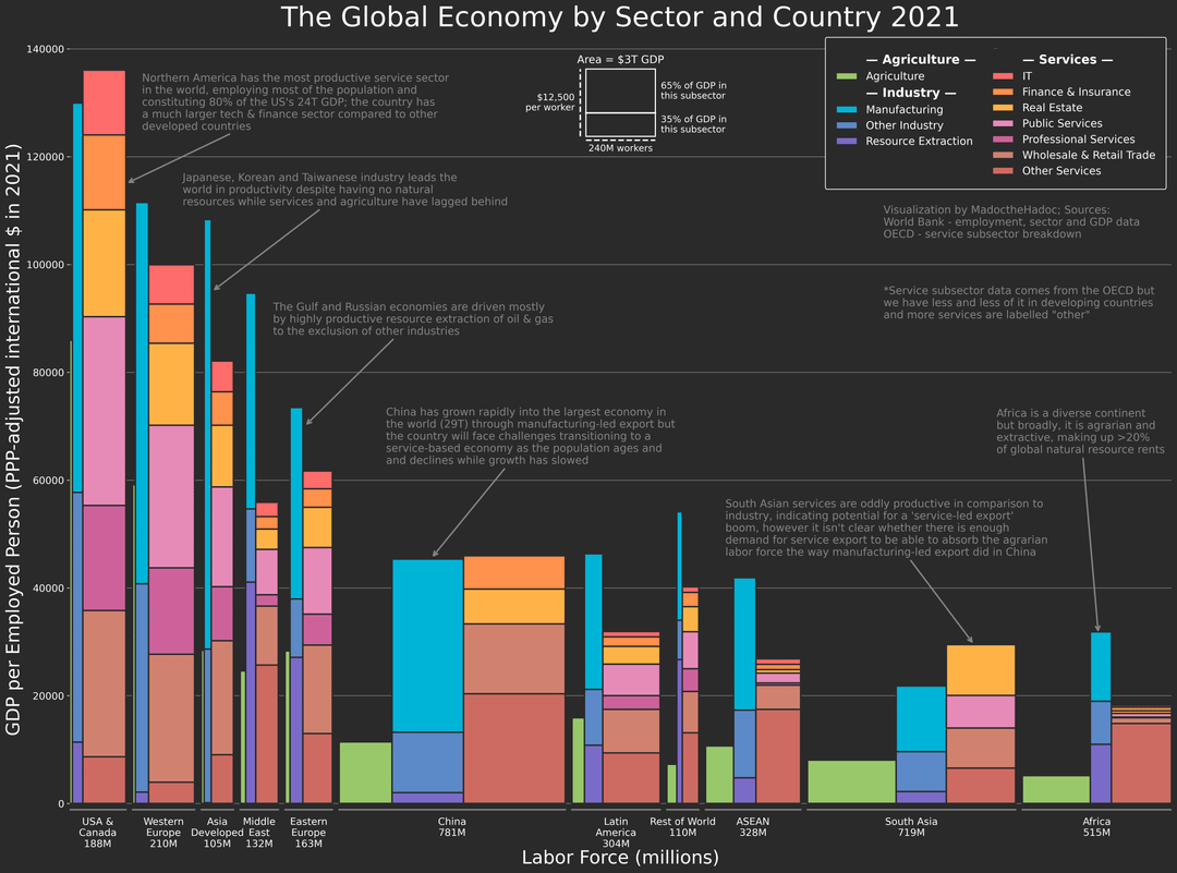
![[OC] The Global Economy by Sector and Country 2021](https://www.byteseu.com/wp-content/uploads/2025/08/spraj98zdejf1-991x1024.png "[OC] The Global Economy by Sector and Country 2021")
Tools:
– I programmed this visualization myself using Matplotlib, it's a revamped (and much better looking) version of a visualization I posted here a week ago
Sources:
– I used the World Bank python API for almost all of the data
– I used the OECD for service sector data although as explained in the visualization, this dataset is patchy outside high-income countries
– The annotations are entirely my opinion as reading about this has become something of a hobby of mine recently, I intentionally made this text quite dark to let the data speak for itself more
To me, this visualization was worth making because the details connect so many others stories I know about:
– the failure of European tech compared to the US
– the fragility of resource dependence in extractive economies with little service productivity to back up the industrial base
– China's complete manufacturing dominance
– the abandonment of agricultural self-sufficiency in Japan
– India's surprising success in services and failure to industrialise, with parents who worked in agriculture having children that work as doctors, consultants and IT professionals
Posted by MadoctheHadoc